
I love bad tattoos. They sit right at the intersection of really poor choices and strange, brilliant ideas. You go to the tattoo shop hoping to get one of the talented artists, and instead, you walk out with a tattoo that looks like it was drawn during math class. Tattoo historians will tell you the same thing: bad tattoos generally come from rushing to pick an artist, ignoring the stencil, and trying to save money. Like the tattoo version of trying to get a custom picture of Taylor Swift and ending up with a picture of a vague “aunt from Facebook.”
This article will look at a few wonderful bad tattoos, and instead of shaming the people wearing them, I hope to show why these tattoos don’t work and how a better choice of design, technique, and placement could have changed everything. Consider this a friendly guide to what not to do, whether you’re into full sleeve projects, tiny ankle doodles, or fun pieces for women and men alike.
The Sleepy Blue Tiger That Lost Its Roar
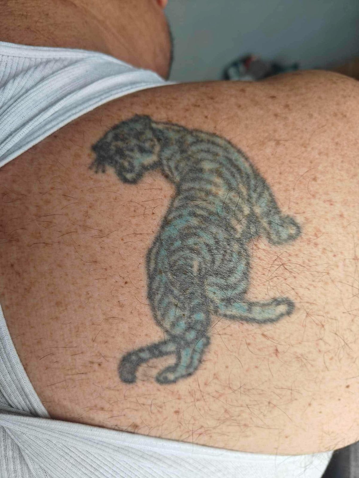
This shoulder piece clearly started life as a tiger or leopard caught mid-prowl. Over time, though, the lines have blurred, the stripes have melted into each other, and the once-bold colors have faded into a soft blue-green haze. The animal’s head is turned down, almost sulking, and the back legs float in space with no real sense of weight or anatomy. Instead of a powerful predator, the result is a sleepy, slightly deflated house cat taking a nap on someone’s shoulder blade.
What went wrong? First, the structure. The torso bends in an odd way, as if the spine has no joints, and the hind legs don’t connect convincingly to the body. Second, the shading is patchy; darker areas don’t follow the muscle groups, so the eye can’t quite read the movement. Finally, the color choice—that murky turquoise—doesn’t match any real tiger aesthetic, so the whole thing feels more like a watercolor accident than a wild animal.
A good artist could rescue this with a creative rework: deepening the blacks, reshaping the head and legs, and turning that strange blue into an atmospheric background or smoke. As far as cover-ups go, big cats are forgiving. Done right, this could transform from one of those funny bad tattoos into a genuinely striking shoulder piece.
The Horse With the Human Haircut
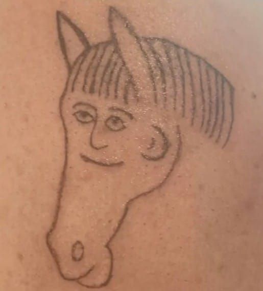
At first glance, this looks like a child’s drawing that somehow escaped a notebook and landed permanently on skin. The concept seems simple enough: a horse head profile. But then you spot the fringe—a perfectly straight, human-style bowl cut—and the small face with sleepy eyes and a tiny smile floating in the middle of the head. It’s half pony, half cartoon person, and completely bewildering.
The linework is thin and hesitant, like the artist wasn’t sure where to commit. There’s almost no shading; everything relies on outlines. That can be charming in naive tattoos, but here it exaggerates the weird proportions: a huge snout, minuscule facial features, and ears that look pasted on at the last minute. As an unintentional comedy piece, though, it’s brilliant. If you told me this was inspired by a surreal meme designs contest, I’d believe you.
Could it be improved? Possibly, if the wearer leans fully into the joke. A skilled artist might add a body in the same doodle style or some text that acknowledges the absurdity. Sometimes the smartest move isn’t to “fix” a bad tattoo but to double down and make the humor deliberate. This is one of those pieces that will always get a reaction—especially from beautiful horse-girls who know exactly how elegant equine portraits should look.
When a Lion King Tribute Turns Unintentionally Tragic
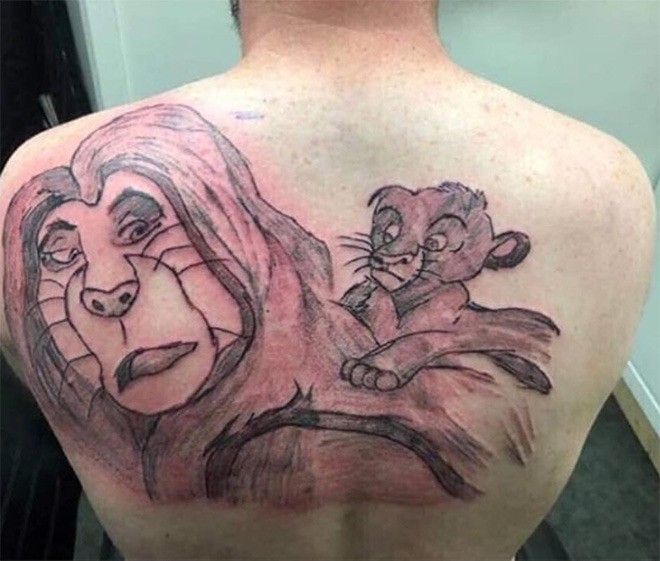
Large back pieces are ambitious. They demand planning, patience, and an artist who understands anatomy, composition, and storytelling. Here, the goal seems clear: a touching scene inspired by a beloved animated lion and cub. Instead, we get a huge lion whose face looks oddly human, with heavy eyelids, sagging cheeks, and lips that feel more soap opera than savannah. The cub on the right fares slightly better, but even that expression reads more confused than playful.
The shading is harsh and patchy, with thick, dark lines carving the lion’s cheeks into strange geometric shapes. Fur is suggested with random strokes rather than flowing direction, so the whole mane appears stiff. It has the vibe of those viral portraits where someone asks for Michael Jackson or MJ and ends up with a vaguely familiar but unsettling stranger. If you’ve ever seen a warped Heisenberg breaking bad portrait or a wobbly Taylor Swift face on Pinterest, you know the feeling.
Because the placement covers most of the upper back, this isn’t easy to hide. A full rework would likely mean turning the whole thing into a new scene—perhaps a night sky, a landscape, or a dark fantasy motif. The important lesson here? Large, character-driven tattoos are unforgiving. You can improvise a small symbol. You can’t improvise a lion the size of a dinner plate.
RIP Toenail: A Tiny Tombstone With Dark Humor
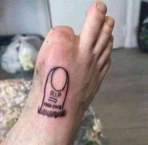
This one is hilariously simple: a miniature tombstone inked on the side of the foot, complete with “R.I.P.” and a date, placed exactly where a missing toenail would be. It’s morbid, clever, and undeniably funny. Technically, it isn’t the worst-executed tattoo here. The lines are relatively clean, the lettering is legible, and the idea instantly reads.
So why does it land in a collection of bad tattoos? Mainly because of commitment. The foot is a high-movement, high-friction area, and the ink is already softening. Over time it may blur into an odd grey blob with a ghost of text. It’s also extremely specific to the wearer’s situation; anyone who doesn’t know the backstory might stare at it, wondering if they’re missing some inside joke.
That said, I kind of love it. This is the kind of irreverent idea you see on late-night Reddit threads: a reminder that tattoos don’t always have to be deep; sometimes they’re just about laughing at yourself. If the owner ever wants to upgrade, an artist could expand it into a full mini-cemetery scene or incorporate it into a quirky “toe sleeve” concept with other tiny icons.
The Tiger With the Confused Face
Here we have another tiger stretching down a back, but this time the expression is the first thing you notice. The face is fierce in theory—open mouth, visible teeth—yet the eyes are droopy and framed by what looks like eyeliner and lower-lash dots. Instead of a terrifying predator, the overall mood is theatrical: somewhere between stage makeup and a vintage circus poster.
The body twists in a dramatic S-curve, but the anatomy doesn’t quite support the pose. Limbs taper strangely, the paws lack structure, and the tail curls away in an awkward hook. The stripes don’t follow the muscles; they sit on top like decorative ribbons. There’s energy, but not much realism, which makes the animal feel flat rather than powerful.
This is a classic example of an artist aiming for a traditional Japanese-inspired aesthetic without understanding how those references actually work. In strong irezumi designs, tigers feel heavy and grounded, with bold negative space and deliberate flow across the body. Here, the idea is there, but the execution falls short. A larger background and some strategic redrawing could still save it, but it would require a high-level specialist—and yes, that means serious money.
The Grumpy Little Scribble Creature
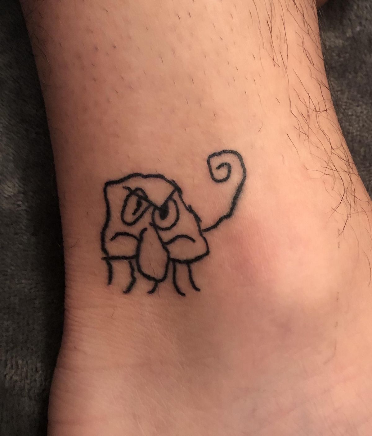
This ankle tattoo looks like the result of a dare: a tiny, squiggly creature with furrowed brows, a drooping nose, and a spiral tail, drawn in one continuous wobbly line. There’s no shading, no detail, just a raw outline that resembles a doodle from the margin of a school notebook.
Surprisingly, this is the kind of piece that can split opinion. Some people will label it instantly as one of those internet-famous bad tattoos; others will see it as charming, almost minimalist art. There’s a growing micro-trend—especially among younger clients and women who like quirky ink—for intentionally naive, “bad on purpose” styles. When done thoughtfully, they can be genuinely cool.
The challenge here is intent. If the wearer walked into a studio asking for a realistic animal and walked out with this, that’s a problem. If it was meant to be a funny little character from the start, it fits into a very specific niche of ideas: strange, personal symbols that nobody else has to understand. Either way, it’s a reminder to communicate clearly with your artist before that needle touches skin.
The Pin-Up Girl Trapped in an Ear
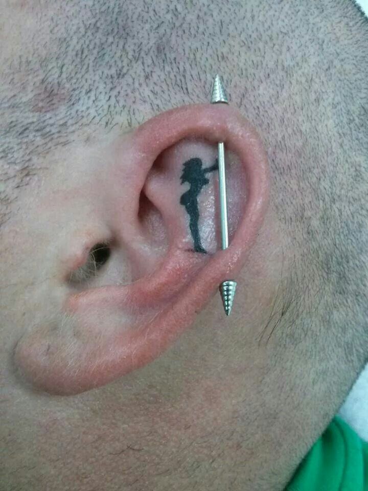
Finally, a tiny silhouette of a woman posing like a classic pin-up, tucked inside the ear so that an industrial barbell passes right in front of her face. It almost looks like she’s leaning against the metal rod, caught mid-pose. Conceptually, it’s smart: playing with placement to interact with a piercing rather than just sitting beside it.
But ear skin is tricky, and this tattoo shows why. The lines are soft and a bit fuzzy, and because the space is small and curved, the proportions of the figure are hard to read. You can tell it’s meant to be a woman, but the details blur quickly. On top of that, ears age and change shape; over time this could stretch into an indistinct black smudge.
Still, there’s something oddly stylish here—a tiny, secret scene only visible up close. If you’re looking at bad tattoos for women or for anyone who wants something spicy yet subtle, this is a cautionary tale: clever concept, but choose an area with a smoother canvas if you want longevity. A similar idea on the wrist or behind the ear, done by a precision-focused artist, could be genuinely beautiful.
When a Rock Legend Becomes a Caricature
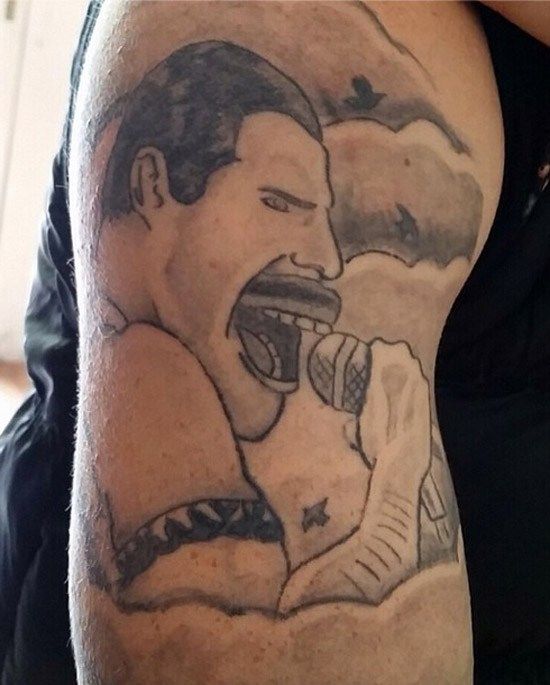
This upper-arm piece is clearly meant to honor a larger-than-life frontman mid-performance: mic in hand, mouth wide open, arm raised. The problem is that every feature is pushed just a little too far. The jaw juts out like a cartoon, the teeth are a dark rectangle, and the moustache sits on the face like a sticker. The cloudy background tries to add drama, but its muddy shading only flattens everything.
Portrait tattoos are unforgiving. Without a precise stencil, smooth gradients, and a good grasp of anatomy, a hero can end up looking like a parody. Here the singer lands somewhere between stadium icon and late-night meme, almost like a mash-up vs. a budget Michael Jackson impression. It’s a textbook reminder that if you want realistic designs of famous men or women, you don’t bargain-hunt; you save the money and choose someone who specializes in portraits and clean placement.
Joker Smile Meets Leafy Obsession
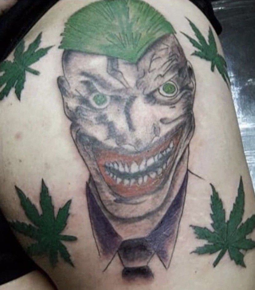
This wild chest or thigh piece takes an already chaotic comic-book villain and turns the dial even higher. The face stretches into a long, almost melted mask; the grin is packed with jagged little teeth, and the green hair radiates like a spiked helmet. Around the head, four green leaves float like a lopsided halo, making the whole composition feel like a crossover between a comic panel and a 4:20 poster. The execution may lean more towards the side of bad tattoos despite all the intensity. The eyes glow an off-palette green, and the miniature skin tones have muddy, rough patches.
The leaves are clip-art flats and of lesser quality. The overall execution and planning evoke chaotic vice, rather than a sharp graphic villain portrait. Instead of a sharp graphic villain portrait with a clever nod to vice, it feels disorganized and like a chaotic mash-up of half-formed ideas. This piece may eventually scream expert cover-ups or a fully villain-themed sleeve to fit it out.
The Surreal Giant, the Hands and the Grater
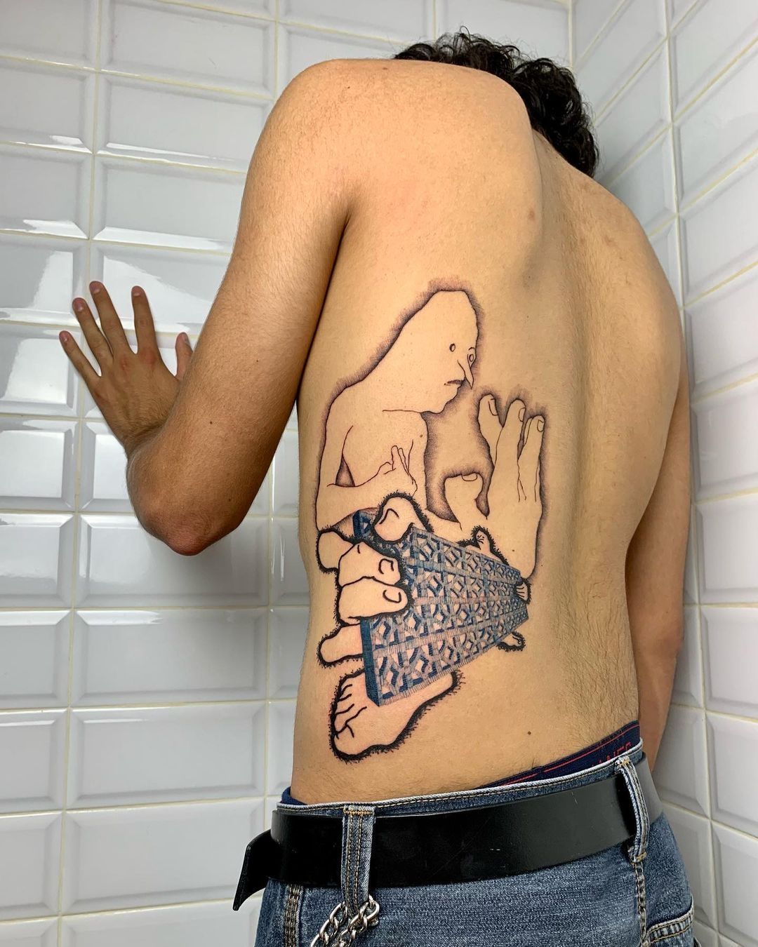
Surrealism enters the scene with this large back tattoo. A featureless, soft-angled figure dips into the ribs as oversized hands clutch an oddly shaped triangle. The triangle, with its unique pattern, looks unsettlingly similar to a cheese grater. Feet, fingers, and limbs overlap and ignore perspective in a way that creates an intentionally out-of-place, awkward, dreamlike scene. This segment of body art bends the realm of surrealism but feels forced in a way that is quite the contrast to bad tattoos.
Unlike some accidental bad tattoos, this one feels purposeful. The linework is sketchy but confident, as if the artist leans into outsider-art aesthetic rather than realism. It’s more gallery wall than flash sheet. Still, the sheer size and unusual composition mean it’s not for everyone; plenty of people will see it and think of those infamous Heisenberg Breaking Bad portraits gone wrong. Others—especially artsy women and men who love experimental ink—will see a bold statement. It sits right on the edge between “what happened here?” and “this belongs in a zine,” and that tension is exactly what makes it fascinating.
The Eyebrow Handshake
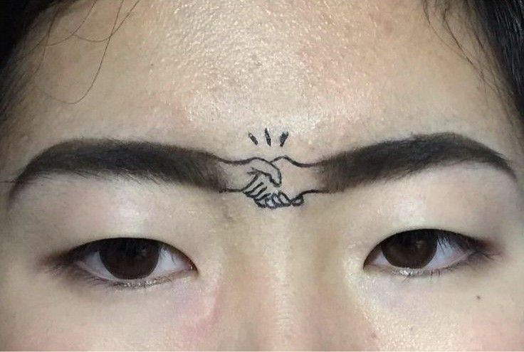
Here, two strong brows become the stage for a tiny handshake. A miniature pair of hands links the eyebrows across the bridge of the nose, with a few motion lines suggesting a friendly grip. It turns a potential unibrow into a peace treaty, more conceptual art than classic tattoo.
On one level, it’s brilliantly funny: a literal connection where people usually try to separate. On another, it’s dangerously committed. Facial tattoos are serious placement choices; they shape first impressions before you’ve said a word. A small, quirky design like this can be a playful marker of identity for women who love unconventional self-expression and for anyone drawn to micro-surrealism. But it’s also a good example of why artists and clients need to talk through long-term impact. Laser removal on the forehead is no joke, and there’s no quick Netspend refund when you decide you’re done shaking hands with your own brows.
Sacred Art Meets School Notebook
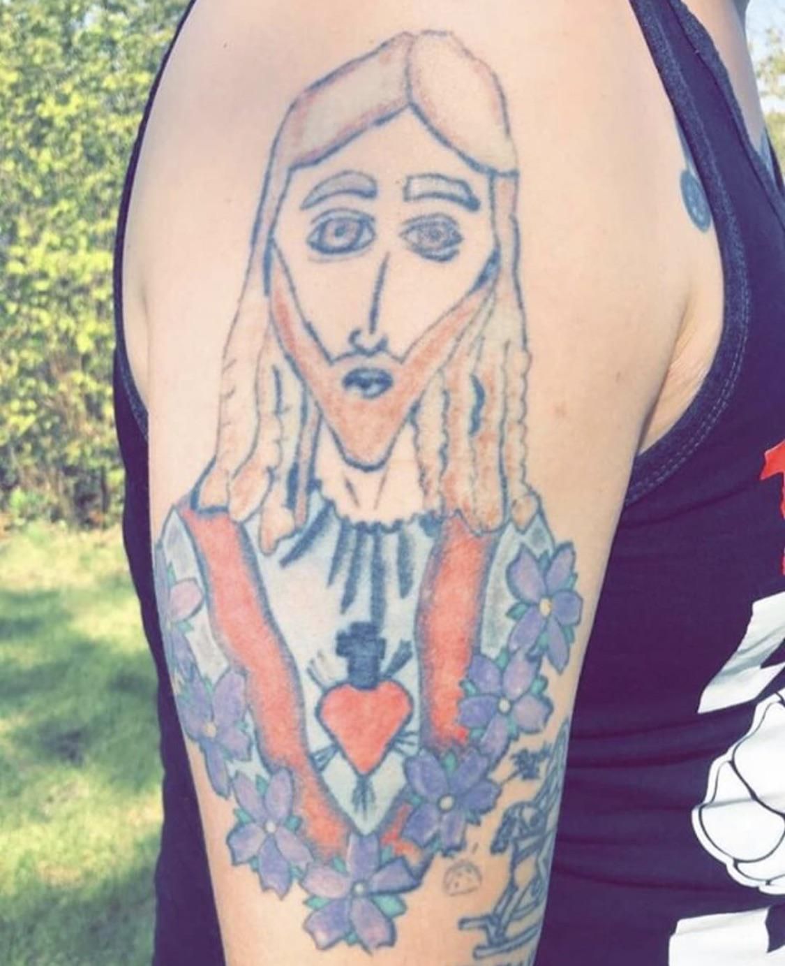
This upper-arm piece aims for a traditional sacred-heart composition: robed figure, radiant heart at the center, and floral frame. Instead, the holy figure has the wide, slightly stunned eyes of a cartoon and a long triangular nose that recalls a doodle from religious education class. The hair and beard fall in stiff, repetitive strands, and the robe colors sit in flat blocks without much depth.
Religious tattoos can be powerful for women and men alike, especially when they blend reverence with refined artistry. Here, the intention is heartfelt, but the execution drags the result firmly into the “so bad it’s endearing” category. The flowers and heart feel like separate stickers rather than part of a cohesive design. With a skilled specialist in devotional pieces, the motif could be gently reshaped—sharpening features, reworking the halo, deepening the shading—but it would take time, expertise, and more money than doing it right from the start.
Glam Shrek With Lip Gloss and Lashes

This ankle tattoo is impossible to ignore. A familiar green ogre head appears, but instead of swamp mud and stubble, there’s full glam: thick glittery eyeshadow, sharp brows, false lashes, rosy blush, and over-lined glossy lips. Long manicured fingers frame the face, all surrounded by comic-style sparkles. It looks like someone asked, “What if a fairy-tale ogre stole a Taylor Swift makeup campaign?”
Technically, it’s not the worst piece in this collection; the color packing is solid, the linework mostly clean, and the expression wildly confident. The reason it lands in a bad tattoos roundup is the sheer chaotic concept. It smashes cute fan art, drag-show styling, and meme culture into one loud image. For some women who care about beautiful and queer fashion, its design could be the epitome of camp. For others, it’s the kind of tattoo you see once and don’t forget, whether you like it or not. Either way, it shows that being “bad” can also mean being extremely and unapologetically extra.
Belly Eyes and Morning Coffee
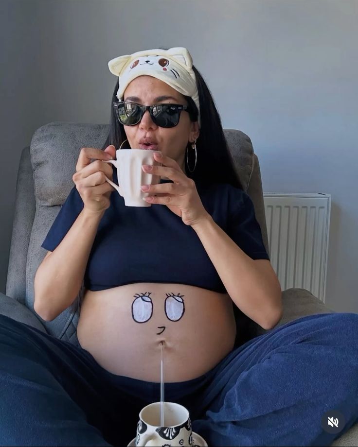
Finally, a fun body art piece that transforms a pregnant belly into a cartoon face that’s sleeping. Two big, lash-drawing eyes are positioned above the navel, while the belly button transforms into a slightly puckered mouth. When the wearer sits in loungewear, holding a mug, the whole scenario looks like a conversation between the mom and the bump, especially when a straw or a stream is cleverly placed so it looks like the belly face is drinking too.
This might be temporary ink or a semi-permanent tattoo, but the spirit is the same: humor over solemnity. It’s a reminder that not all body art has to be edgy or hyper-cool. Sometimes it’s about joy, about documenting a strange, beautiful season of life with a joke you’ll show future kids. Compared to portraits gone wrong or clumsy villain designs, this kind of playful experiment feels refreshingly human. It may never end up on a serious tattoo blog, but it will always be a story worth telling at family gatherings—and that, in its own way, is the best argument for personal, slightly ridiculous body art.
The Toe Tag That Turns Life Into a Crime Scene Joke
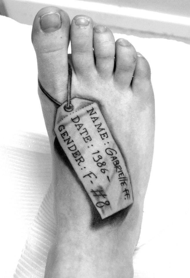
Here, the entire top of the foot is occupied by a hyper-realistic tag tied around one toe, as if the wearer has just been wheeled into a morgue. The tag lists a name, birth year, and gender, complete with drop-shadow shading that makes it look three-dimensional. Technically, the stencil and shading are done with care; the shadows beneath the tag are soft and believable, and the string curves naturally around the toe. It’s the concept that shifts this firmly into iconic bad tattoos territory: walking around with permanent toe-tag paperwork is a very specific sense of humor.
The placement adds to the shock factor. Every time sandals come out, so does this little memento mori. For some women and men, it will be a fantastic icebreaker. For others, it’s uncomfortably morbid, like a punchline about your own mortality that never goes away. It’s a reminder that even when the designs are executed well, the underlying ideas matter just as much.
The Cat With the Existential Half-Empty Glass

This small calf tattoo shows a chubby, humanoid cat standing upright in socks and holding a tall glass in front of its face. Inside the glass, the same cat’s grumpy reflection stares back, while the “real” cat’s other eye peeks out from behind the glass. The linework is deliberately simple: thin, wobbly outlines, no shading, no color, just pure cartoon minimalism.
It’s a perfect example of how modern meme culture has influenced tattoo aesthetics. The concept feels like a comic panel about self-perception—half “this is fine,” half “absolutely not.” As a piece, it’s more intentionally odd than accidentally bad, yet it still fits into our collection because most people’s first reaction will be “What on earth is going on here?” It proves that funny tattoos don’t always need detail; sometimes a single weird, slightly annoyed cat says it all.
Just Don’t: The DIY Sportswear Logo Back Piece

Across this entire back runs a huge swoosh and the hand-poked phrase “JUST DO IT” in uneven letters, followed by four long vertical lines scratched down the spine. The lines look more like tally marks than design elements, and the logo itself wobbles as if traced freehand without a proper stencil. It’s a minimalist tribute to a billion-dollar brand that somehow feels like the bootleg version you’d buy with a prepaid Netspend card at 2 a.m.
From a distance, the composition is bold, but up close the shaky outlines and random stripes strip away any sense of sleek sports aesthetic. It’s little more than a logo plus a slogan, yet it’s treated like a full-sleeve-level commitment in terms of skin real estate. This is the eternal tension of brand tattoos: personal cool vs. corporate ad space. Done with crisp lines and thought-out placement, it could have been a graphic, poster-style statement. As it stands, it’s a cautionary tale in giant, permanent handwriting.
Child’s Drawing of a Dog… and a Dinosaur Sidekick

On the back of an upper arm sits a tall, wobbly dog with uneven eyes, stick-like legs, and a slightly haunted expression. Beside one paw there’s what looks like a takeaway cup, and underneath, a long-necked dinosaur trots along with tiny dotted markings. Everything is rendered in shaky, continuous lines, like a sketch done with the non-dominant hand.
This is a style some studios now market as “naive linework”: tattoos that look deliberately unpolished, channeling children’s drawings or outsider art. On one level, it’s undeniably funny and sweet; maybe these were drawn by a loved one, making them deeply personal for women or men who wear them. On another level, to anyone outside the story, it reads as straight-up bad. It shows how context can turn questionable designs into cherished keepsakes—but also why you should think twice before letting every fridge drawing become permanent.
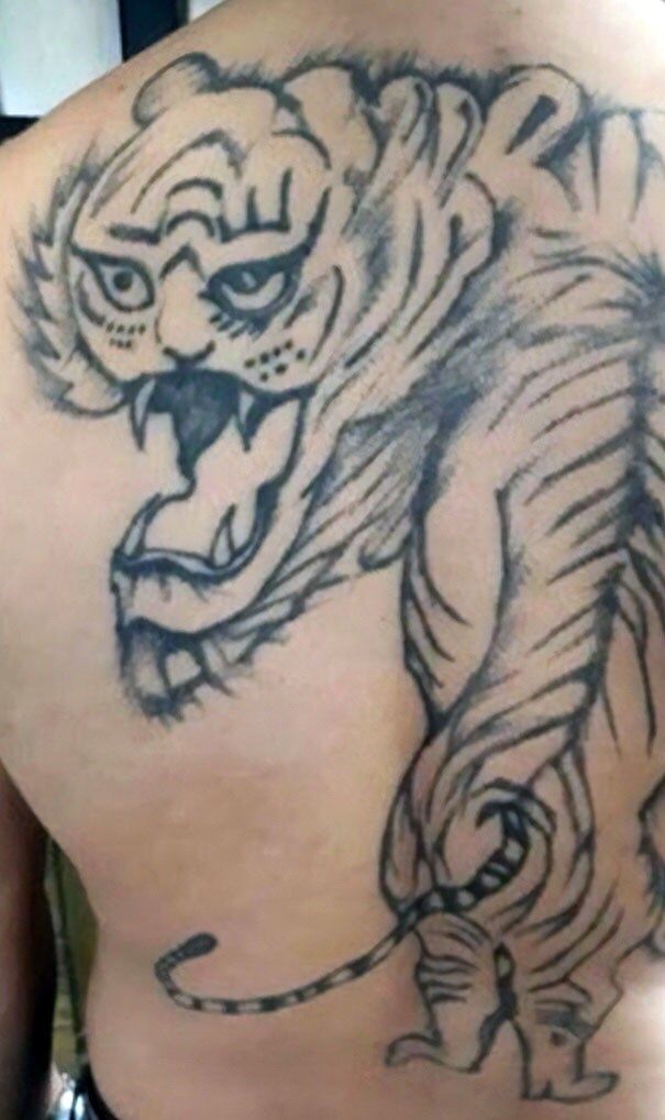
The Oversized Tiger Guarding an Entire Back
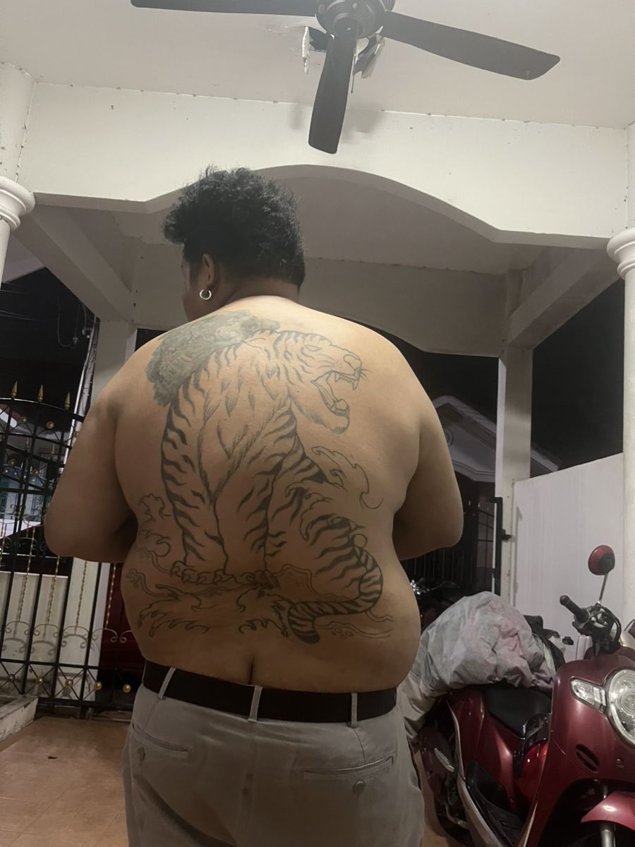
This huge back tattoo features a crouching tiger, spine arched, claws splayed, and head lifted in a roar. The stripes are bold but repetitive, marching down the body in similar shapes, and there’s little shading to give the animal weight. The result is a flat, outlined tiger spread across a wide canvas, more like an unfinished coloring-book page than a fully realized piece.
Large animal pieces like this are high stakes; they demand strong anatomy and an understanding of how a design flows over moving muscles. Here, the tiger’s hindquarters and legs don’t quite align, and the tail ends abruptly. It’s imposing because of sheer size, but it lacks the depth that would make it truly powerful. The wearer could still turn this into something impressive with an experienced artist: reworked stripes, proper shadows, maybe a background to balance everything out. Until then, it’s a reminder that going big without a plan can land even the bravest clients in the realm of memorable bad tattoos.
The Lion With the Unintentional Soul Patch
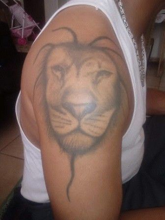
On the shoulder, a softly shaded lion face appears, framed by wispy strands of mane. The eyes are gentle, the nose lightly highlighted, but the overall effect is more airbrushed portrait than sharp wildlife realism. The most distracting detail is the thin, tapering line of fur that drops from the chin like an accidental goatee, giving the king of the jungle an oddly human “soul patch.”
The shading around the muzzle and cheeks is smudgy, so the features blend instead of standing out. You can see the artist reaching for realism but stopping just short, creating a piece that feels timid rather than regal. With stronger contrast and a rethink of that chin detail, this could move from awkward to striking. As it is, the lion looks slightly bored, like a background character from an off-brand documentary. It quietly proves that in portrait-style designs, commitment to detail is everything.
The Noose Wrapped Around the Hand
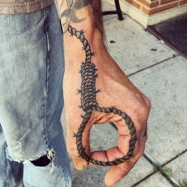
This hand tattoo depicts a rope wound around the back of the hand, looping into a noose that circles the index finger like a ring. The rope is detailed with twists and knots, giving it a rough, tactile look. Technically, it’s one of the more precise pieces in this set: the linework is confident, and the perspective of the loop over the knuckle is well thought-out.
But symbolism matters. A noose is a heavy, historically loaded image; seeing it permanently inked where everyone can’t help but notice can feel unsettling. For some, it may represent dark humor or a sense of living on the edge; for others, it evokes painful histories and self-destructive themes. It’s a stark example of how ideas and placement can turn even well-executed art into something many will classify among disturbing bad tattoos. If a friend ever showed up planning something similar, most tattooers—and mental-health-aware opinion leaders in the industry—would suggest exploring alternatives that carry the same intensity without such harmful associations.
The Talking Foot: Comedy on the Sole
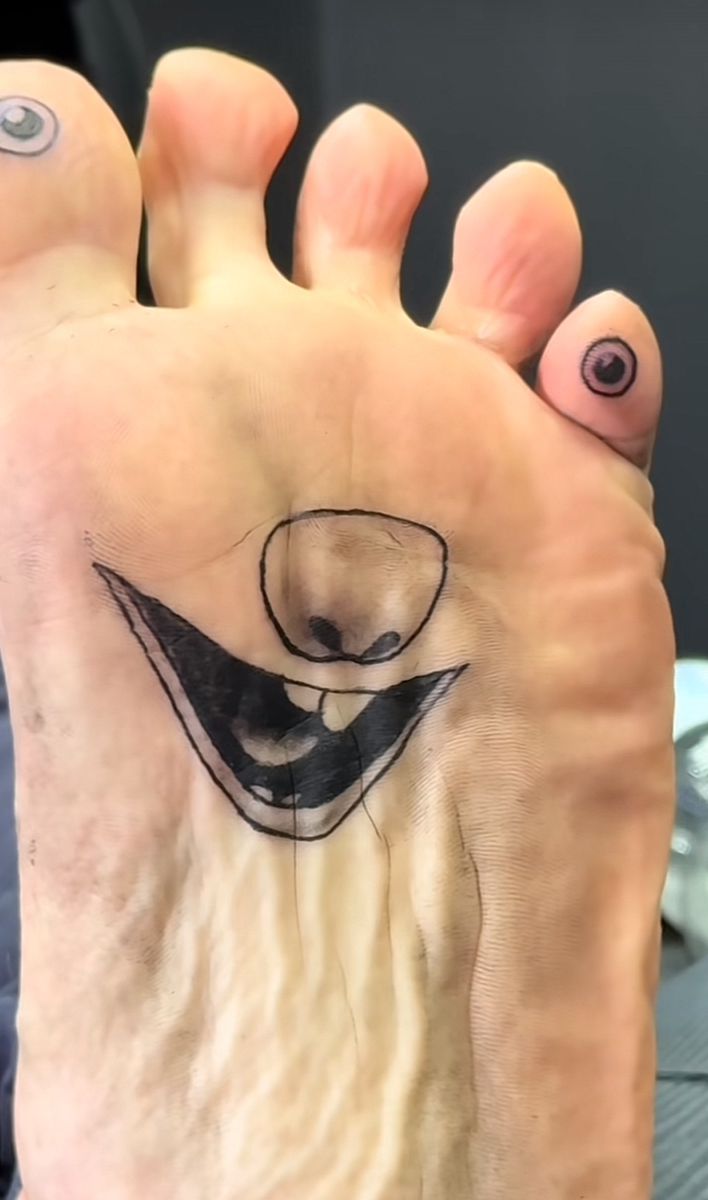
This design turns the sole of the foot into a cartoon face: the arch becomes a wide, black-ink grin with a single tooth; a rounded nose is centered above it; and two toes are tattooed as eyes. When the toes curl, the “face” moves, giving it a kind of low-budget animation.
From a technical point of view, it’s a nightmare location. The sole carries weight all day, constantly rubs against socks and shoes, and sheds skin fast. Any artist will tell you that money spent on a sole tattoo is money spent on a short-term joke. Lines blur, shading drops out, and you’re left with a ghost of what was once a really funny idea.
Style-wise, this is the definition of a party trick tattoo. You’re not framing it in a sandal ad; you’re flashing it at friends on the sofa. If you are going to commit to something like this, at least keep the rest of the foot neutral—no heavy polish or distracting anklets—so the cartoon reads clearly when you show it off.
Lesson: funny gimmick Tattoos have their place, but remember the stop-and-think rule—ideas vs. execution. A good artist would have explained how badly this will age and maybe relocated that goofy face to the ankle or calf, where it could actually survive.
The Armpit Troll: When Body Hair Becomes a Prop
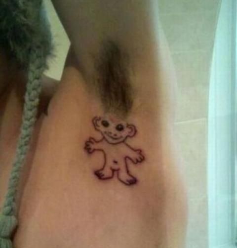
Here a small, simple line drawing of a naked little creature sits directly under the arm. The armpit hair becomes the character’s wild, fuzzy hairdo, like a throwback troll doll from the ’90s. Two dots for eyes, a sweet smile, outstretched arms—pure mischief.
There’s something undeniably clever about this. The placement uses natural hair as part of the design, which a lot of modern tattoo blogs highlight as a playful trend. But it also ties the tattoo to your grooming habits. Shave regularly, and the gag disappears. Grow it out too much, and the character vanishes in a forest.
For styling, this is the kind of tattoo that only appears in more revealing outfits: racer-back tops, bikinis, or loose tank sleeves. If you’re planning to show it, keep the surrounding skin well moisturized and hair shaped rather than chaotic; that keeps the linework visible and the joke sharp instead of sloppy.
It’s also a classic reminder that bad tattoos for women aren’t always about poor drawing; sometimes they’re about how harshly people judge the joke. There’s still a double standard here—men get told their funny body-hair tattoos are “legendary,” while women beautiful enough to wear whatever they like are told to be “ladylike.” Really, women’s ideas vs. men’s expectations is a whole sociology paper hiding in this one troll.
Angry SpongeBob With a Chainsaw: Copyright Chaos
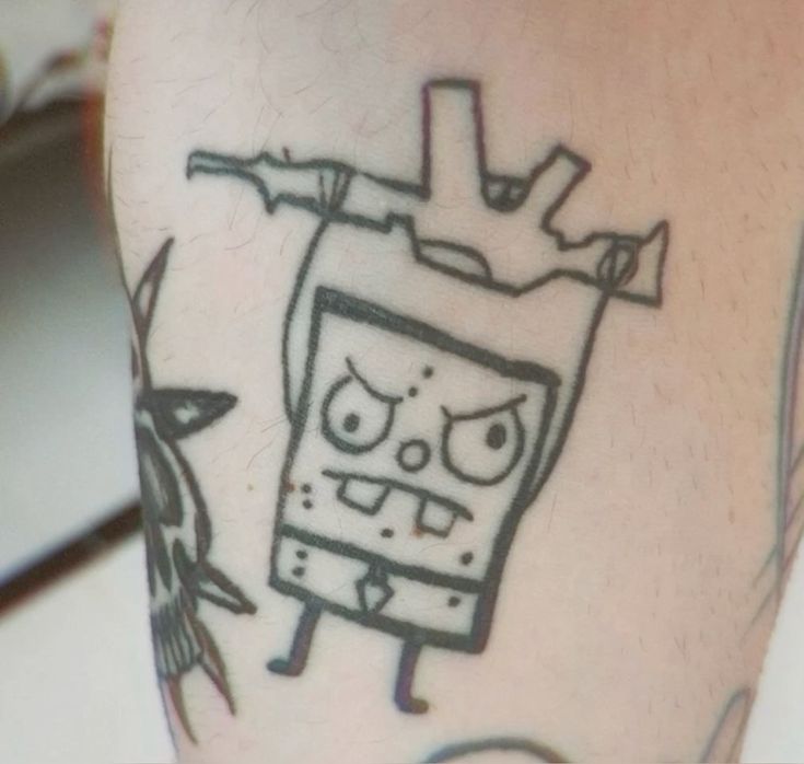
This piece riffs on SpongeBob SquarePants: a square little character with skinny legs, a tie, buck teeth, and freckles. Except here, the character looks furious, eyebrows knitted, teeth bared, and holds what appears to be a chainsaw or jagged weapon above its head.
It’s a mash-up of children’s cartoon and horror movie, but the execution is rough. Lines wobble, proportions are off, and there’s no shading to give it depth. It feels like the artist drew it freehand without a proper stencil, which is exactly how parody designs turn into legal-gray-area eyesores.
From a styling perspective, this sits on a limb among other tattoos, so it competes for attention. If you wear shorts or T-shirts that show this area, everything else in your outfit should be fairly minimal—plain sneakers, solid colors—otherwise the chaotic character fights with every pattern you put on.
The bigger takeaway: if you’re going for pop-culture ink—whether it’s Heisenberg from Breaking Bad on your forearm, a tiny MJ portrait, or Taylor Swift lyrics curling around your ankle—quality matters. Look through portfolios, compare stencil placement and healed results, and never choose the cheapest option just because your Netspend card has a little leftover space. Parody or not, you’re still paying real money to carry that design forever.
Cave-Pig Cartoon: When Kids’ Doodles Become Permanent
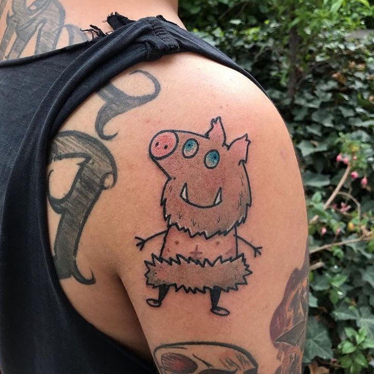
On the upper arm sits a scruffy cartoon character that looks like a cross between a pig and a caveman. There’s a snout, mismatched round eyes, a shaggy beard-like outline, and a jagged fur skirt. The coloring is patchy, as if a felt-tip marker ran low halfway through.
This sort of piece is often sold as “child-like” or “naïve” art. Sometimes people literally get their kid’s drawing tattooed as a sentimental gesture, which can be incredibly sweet. The problem is when the drawing wasn’t done by a child but still looks clumsy, and the artist hasn’t cleaned it up for skin.
The placement on the shoulder makes it a focal point whenever the wearer chooses cut-off tees or tank tops. If you’re going to have a big, goofy character there, dress around it intentionally. Lean fully into the playful aesthetic: distressed denim, vintage tees, and bright sneakers. Treat the tattoo like a graphic print instead of pretending it isn’t there.
Artists often say that if you want funny tattoos, go for designs that are deliberately simple, not accidentally. Think of classic, strong cartoon lines instead of half-hearted scribbles. And remember, bad tattoos are expensive to fix. Good cover-ups for characters like this usually require a darker, larger piece—maybe transforming the cave-pig into a full animal-themed sleeve men and women can both own with pride.
The Lion That Thinks It’s a Gorilla: Anatomy Disaster on the Shoulder
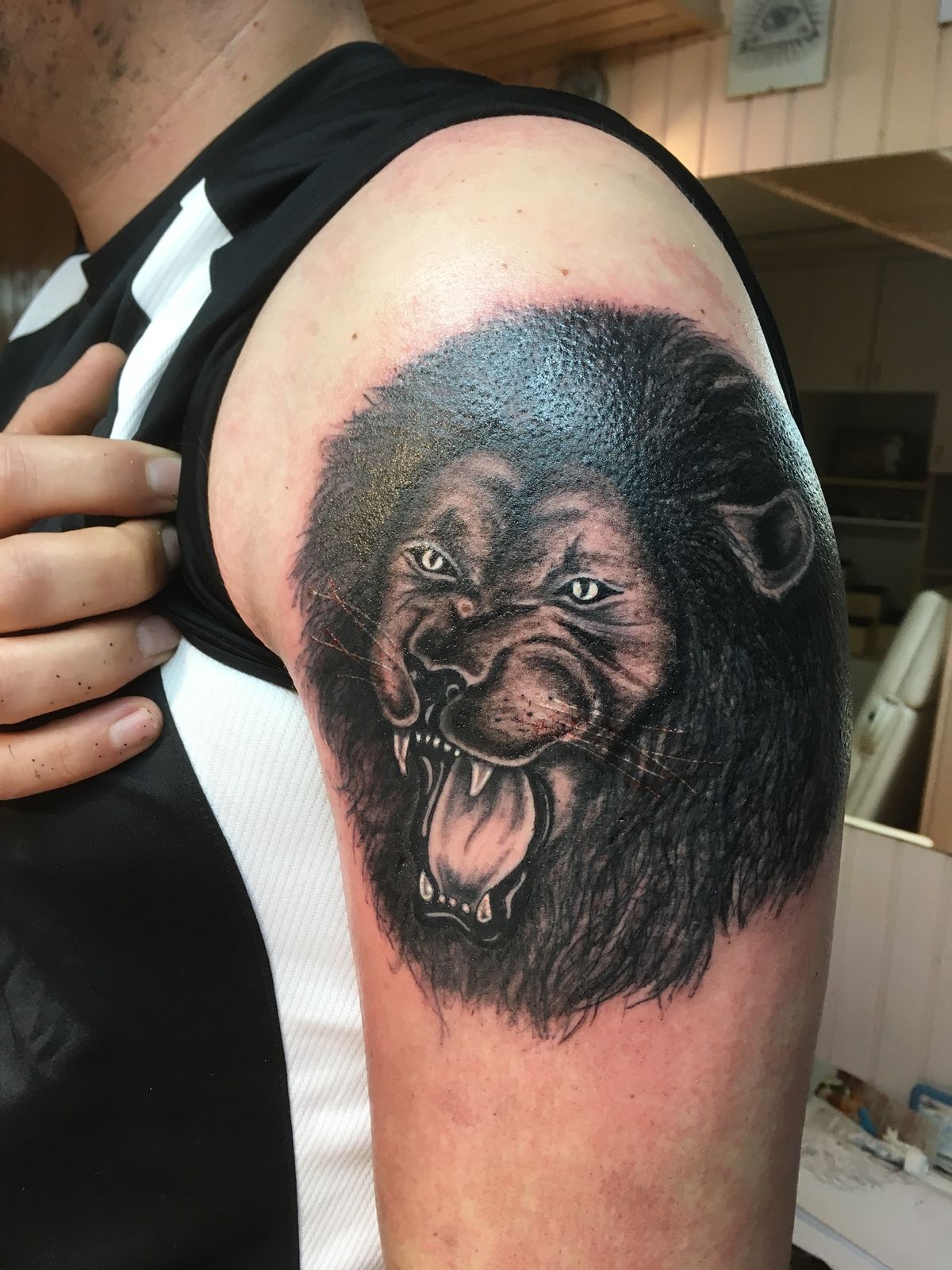
Here the upper arm is dominated by what is supposed to be a roaring lion’s head. The mane is dense and dark, covering the shoulder, but the face reads more like an angry ape: close-set eyes, short muzzle, and teeth that don’t quite match feline anatomy. The heavy shading gives the whole thing a muddy look, like a charcoal sketch that someone forgot to refine.
This is where the technical side of tattooing really shows. Realistic animal portraits require a strong understanding of bone structure and light. A skilled artist can make fur look soft, eyes wet, and teeth sharp with just black and grey. When that knowledge is missing, you get this kind of uncanny hybrid.
There’s also an issue with stencil placement. The mouth stretches around the curve of the arm in a way that distorts when the wearer moves; the nose sits slightly off-center. Small misalignments become very obvious on large pieces.
Because it’s so bold, clothing choices have to work with it. Sleeveless jerseys, like the one visible around the tattoo, amplify the aggressive vibe. A softer wardrobe—loose linen shirts, neutral knits—can calm the effect and make the piece feel less shouty.
Think of it this way: if you’re considering a giant animal on your arm, look at the portfolios of big-name artists online—the people Inked or Tattoo Artist Magazine interview all the time. Compare this lion-gorilla to their wolves and big cats. The difference in depth, line weight, and aesthetic is the gap you’re paying for.
Portrait With a Nipple for an Eye: Placement Gone Wild
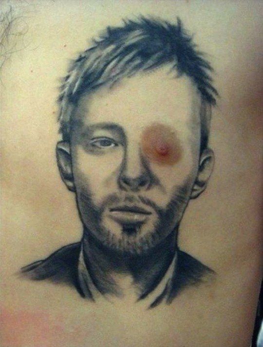
This chest piece is a realistic black-and-grey portrait of a man staring straight ahead. The shading is careful, the hair detailed, and the beard subtle. And then you notice: one of the eyes lines up perfectly with the wearer’s nipple, so the pupil is replaced by that natural bump of skin. It’s impossible to look away. Whatever emotional depth the portrait was meant to convey gets wiped out by the anatomical gag. It’s like a dare: can you keep a straight face looking at this? Most people can’t.
Technically, the artist clearly has skill. The real failure is planning. No professional who thinks long-term would ignore the fact that a nipple will always draw the eye—literally, in this case. When tattooers talk about “reading the body,” this is what they mean: respecting natural landmarks rather than fighting them.
From a style angle, this piece dictates what tops you can wear. Unbuttoned shirts or low-cut tanks will showcase the portrait, but you have to be okay with the nipple-eye joke becoming your default party story. If you’d rather not explain it at every pool party, plan on higher necklines or layered jewelry that partially obscures the face.
It also sums up the larger conversation around celebrity work. People line up for Michael Jackson or Taylor Swift portraits, or even an MJ-era “Thriller” scene, and forget that placement can ruin even beautiful linework. The same way a badly placed Heisenberg breaking bad tattoo on a knee can distort every time you walk, a nipple running through an eye socket is a permanent punchline.
The Wolf That Looks a Little Too Friendly: Full-Back Commitment
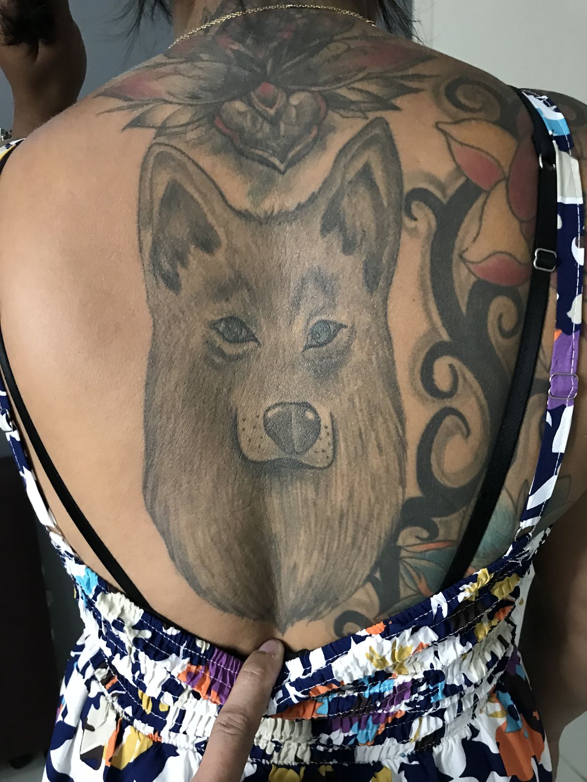
Across the entire upper back spreads a large animal face, meant to be a wolf or dog, framed by existing decorative tattoos above and around it. The snout runs down the spine; the fur is rendered in long, soft strokes; the eyes are narrowed but strangely calm, giving the animal an almost plush-toy vibe.
Scale is both the strength and weakness here. A back piece is prime real estate—what many artists dream of when designing cohesive, aesthetic sleeves and torso work. Done well, it’s breathtaking. Here, though, the wolf isn’t quite fierce enough or stylized enough. It just sort of…sits there.
The wearer’s outfit—a colorful, elastic-top sundress with thin straps—means this design becomes part of the entire look when the back is exposed. A solid black cocktail dress or an open-back top in a muted shade would turn the tattoo into a statement feature. Busy patterns, on the other hand, compete with the already complex background flourishes.
This is also a textbook case for future cover-ups. If the wearer ever decides the wolf doesn’t fit, an artist could layer darker shading, turn the face into part of a forest scene, or extend it into a full-back landscape. It’ll cost serious money, but that’s the issue with large-scale work: once you start, you’re committing like someone funding a long tour, not just tapping a prepaid card.
Sites like Tattoodo often recommend starting with smaller pieces, especially for women who feel pressured by social media to jump straight into dramatic back tattoos because “women with big, beautiful ink get more likes.” Ignore that noise. Build up gradually, make sure each piece suits your body and your wardrobe, and remember that even full-back designs should feel like you, not like an impulse decision.
Bad tattoos happen for all kinds of reasons: rushed decisions, budget panic that turns a big project into a cheap Netspend impulse, artists working outside their strengths, or clients insisting on concepts that just don’t translate well to skin. The good news is that tattoo culture keeps evolving. More studios talk openly about red flags, about researching portfolios, and about planning for future cover-ups if something doesn’t age well.
If you’re thinking about new ink after seeing these, take them as gentle warnings as well as entertainment. Check multiple portfolios, look at healed work, and don’t be afraid to walk away if something feels off. And if you already have one of your own legendary bad tattoos, I’d honestly love to hear the story. Share it in the comments—disasters, fixes, and all—because sometimes the worst tattoos make the very best stories.