
There is something unusually powerful about a tattoo made from only two words. Amor fati, a Latin phrase commonly translated as “love of fate,” is closely associated with Stoic philosophy and the idea of accepting life as a whole—not simply tolerating difficult circumstances, but learning to embrace what comes with them.
That philosophy makes amor fati tattoo ideas especially interesting because the same words can take on completely different personalities depending on the design. A delicate cursive inscription can feel intimate and almost secret, while Gothic lettering makes the phrase much more assertive. Add a bird, radiating sun, symbolic hands, or an unexpected placement, and its character changes again.
The 29 designs here show just how flexible the concept can be. Some rely entirely on typography; others turn the phrase into part of a larger symbol. Together, they offer useful inspiration for choosing fonts, placement, scale, and details that make the words feel personal rather than generic.
Fine Line Amor Fati Tattoo with a Radiating Sun
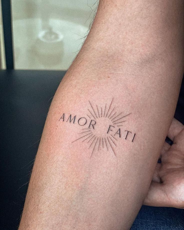
This is one of those designs that looks simple at first glance but becomes more interesting the longer you study it. The words AMOR FATI are arranged horizontally in a slender serif font, while the space between them is occupied by a circular burst of fine rays. The center remains almost completely open, so the tattoo never becomes visually heavy.
That negative space is important. Rather than illustrating the phrase too literally, the artist uses a sun-like symbol to suggest illumination, energy, cycles, and movement. It complements the traditional meaning of amor fati without turning the piece into an obvious philosophical diagram.
The fine line technique is particularly well suited to this design. Every ray is narrow and intentionally spaced, while the letters have enough structure to remain the focal point. Anyone looking at different fonts lettering options could use this as a strong example of how a classical design font can coexist with geometric elements.
The inner arm placement also feels natural. It gives the composition enough horizontal room without requiring an oversized tattoo. This could be adapted for men or women, and a slightly smaller version could work on the forearm, upper arm, or even the back of the arm.
I especially like that the design does not try too hard to explain itself. With philosophical tattoos, restraint often makes the message stronger.
Amor Fati Bird Tattoo with Vintage Illustration Details
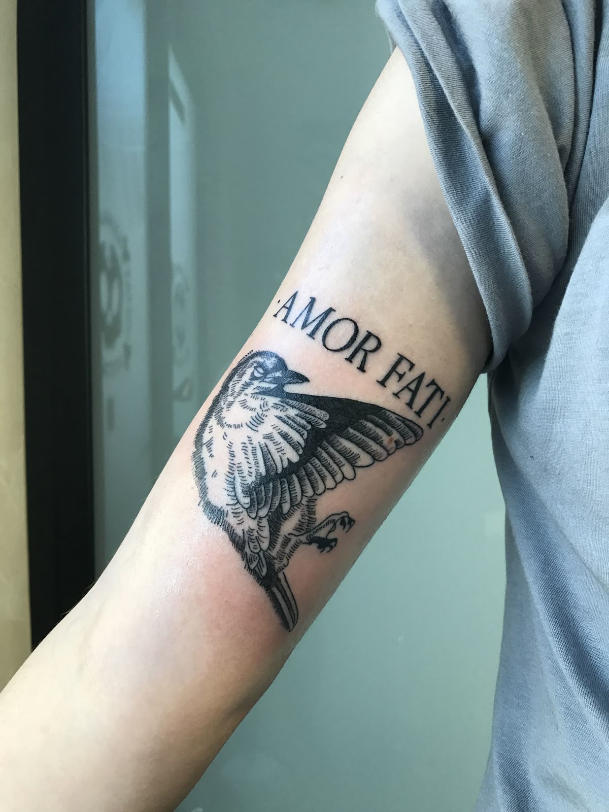
Here, the phrase becomes part of a much more illustrative composition. AMOR FATI appears above a bird rendered in detailed black ink, with the wings spread as though it has just taken flight or is preparing to land.
The contrast between typography and illustration immediately gives this tattoo a different mood. The uppercase serif letters are clean and relatively formal, while the bird is filled with fine feather lines, darker areas of black, and engraving-like texture. It has an almost vintage natural-history quality rather than the smooth appearance of a modern minimalist tattoo.
A bird can be interpreted as a symbol of freedom, transition, perspective, or accepting movement through different stages of life. Combined with amor fati, those associations fit naturally without forcing a single meaning onto the wearer.
This is also a useful reference for anyone who wants more than a lettering tattoo. Instead of treating the words and illustration as separate ideas, the two elements are visually connected. The curve of the arm helps the bird occupy the available space, while the lettering establishes a clear upper boundary.
For a custom stencil, the species of bird could easily be changed. A swallow would produce a more traditional feel, while a raven could make the design darker and more dramatic. The same concept could also be expanded into a larger arm or back piece.
Small Cursive Amor Fati Tattoo
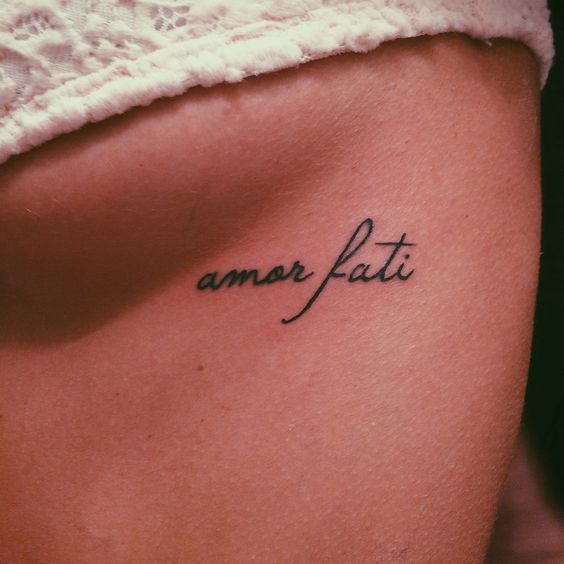
Not every philosophical tattoo needs a complicated symbol. This tiny amor fati inscription demonstrates how effective the phrase can be when typography does all the work.
The lettering uses a flowing handwritten script with a particularly elegant elongated stroke through the letter f. The black ink is crisp, and the modest scale allows the words to sit lightly on the skin rather than dominate the placement.
Among fonts cursive options, this style feels personal because it resembles handwriting more than conventional type. That can be particularly attractive for someone who wants the tattoo to read like a private reminder rather than a public statement.
Small lettering designs also offer considerable flexibility. Similar ideas can work on the arm, ribs, foot, shoulder, hip, or near the collarbone. The main consideration is longevity: extremely tiny gaps and ultra-thin strokes can become less distinct as a tattoo ages. A skilled tattoo artist can recommend enough spacing to preserve the original character of the script.
For me, this is the kind of tattoo whose simplicity is the entire point. There is nowhere for the words to hide behind decorative imagery; the philosophy itself becomes the design.
Behind-the-Ear Amor Fati Script Tattoo
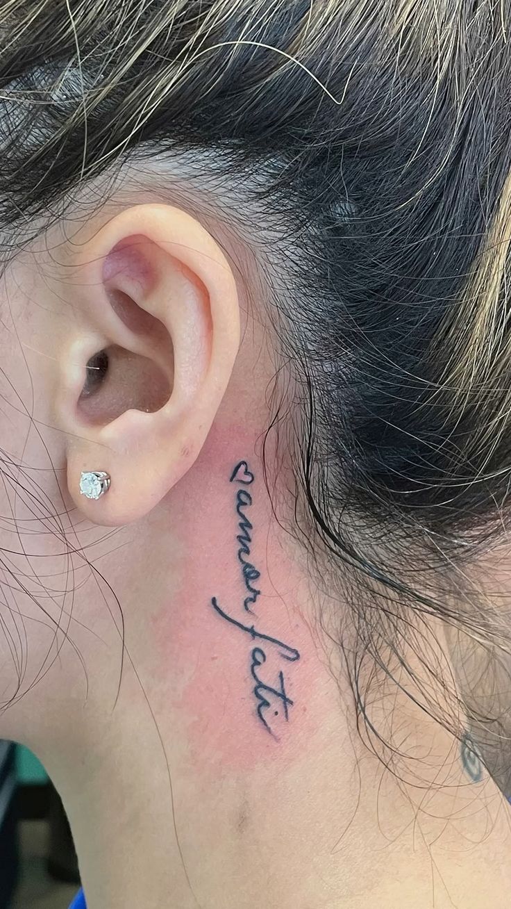
Placement completely changes the personality of this version. Instead of positioning the phrase across a broad, flat area of skin, the script follows the narrow space behind the ear and extends toward the neck.
The handwriting has a relaxed, organic character, with connected letters and pronounced loops. Because the words run vertically along the natural contour of the area, the tattoo feels almost like it was designed specifically for this part of the body.
A neck placement naturally attracts more attention than an inner-arm design, even when the tattoo itself is relatively small. At the same time, hair can partially conceal it, creating an interesting balance between visibility and privacy. For searches using the Portuguese term pescoço, this is a particularly relevant style reference.
This design women approach works especially well for someone drawn to script tattoos but wanting something less predictable than a wrist or forearm placement. The narrow shape is important: a wide symbol or block font would crowd the area, whereas cursive lettering follows it comfortably.
The result feels personal and slightly rebellious without requiring a large composition.
Amor Fati Tattoo with Two Reaching Hands
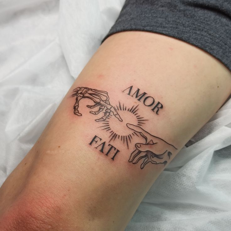
This interpretation turns amor fati into a complete visual scene. Two hands reach toward one another from opposite sides, framing a circular burst of rays at the center. AMOR sits above the composition and FATI below it in capital serif lettering.
The arrangement immediately recalls classical art without copying the entire scene from which the gesture is culturally familiar. One hand has a skeletal structure, while the other appears living. That contrast introduces additional possibilities for interpretation: mortality and life, beginnings and endings, inevitability and choice.
Those themes work particularly well with the significado of amor fati. Loving fate does not mean expecting everything to be pleasant; the concept becomes meaningful precisely because life includes change, loss, uncertainty, and experiences outside our control.
From a design perspective, the circular rays act as an anchor. Without them, the hands and lettering might feel disconnected. Instead, every component points toward the center.
The arm placement gives the composition enough width to breathe. A larger adaptation could work beautifully on the back or chest, where the hands could be extended and additional shading introduced. Conversely, simplifying the fingers and reducing the number of rays could create a cleaner fine line version.
Bracelet-Style Amor Fati Fine Line Tattoo
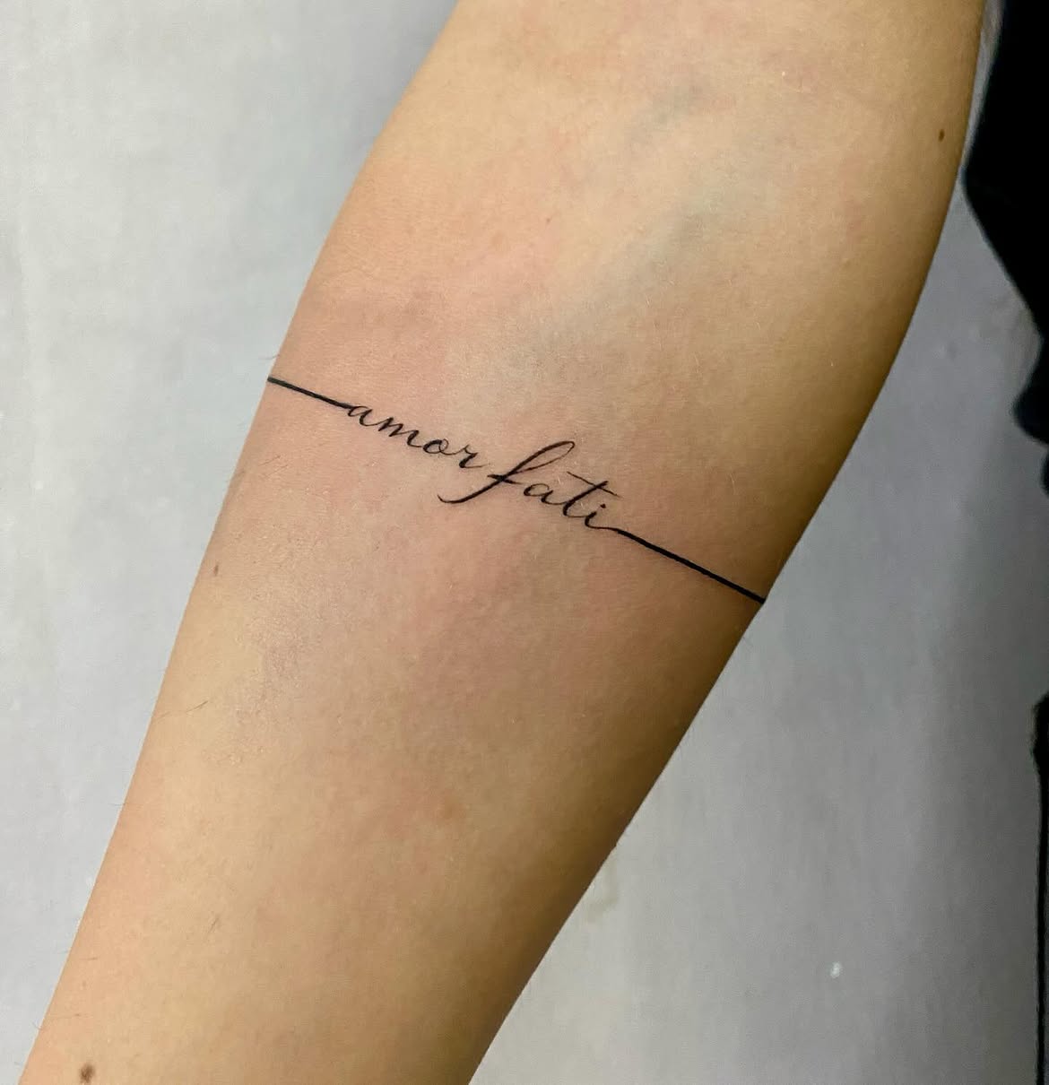
This design takes an entirely different approach to placement. A very thin black line wraps around the arm like a permanent bracelet, briefly transforming into the words amor fati before continuing around the limb.
It is an elegant example of how lettering can become structural rather than simply being placed on top of the skin. The line and words are one continuous visual idea. There is no separate frame, symbol, or illustration competing for attention.
The script is delicate and elongated, with the larger loop of the f providing just enough variation to keep the composition from looking mechanical. Because the surrounding line is so precise, the tattoo has a clean contemporary character.
This idea would suit someone comparing minimalist arm tattoos or subtle designs for men and women. It could also be personalized considerably. The band might remain perfectly straight, become slightly irregular, or incorporate a tiny date or symbol on the opposite side.
There is one practical detail worth discussing with an artist: bands are deceptively difficult to execute. A line that looks straight from one angle must still follow a three-dimensional limb convincingly. Experienced tattoo artists generally plan the stencil around the arm rather than treating it like a flat strip of paper.
That technical challenge is exactly why a seemingly effortless design can require considerable precision.
Red Gothic Amor Fati Lettering
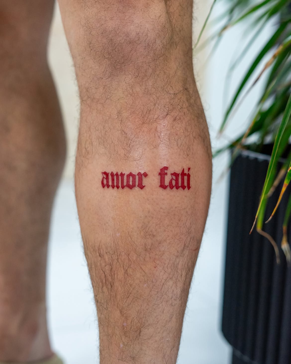
Color and font can transform the same two words almost beyond recognition. This version uses saturated red ink and a bold Gothic or blackletter-inspired typeface, creating a much stronger graphic statement than the fine cursive examples.
The lowercase amor fati lettering has sharp terminals, compact spacing, and medieval associations. Red makes those shapes even more prominent. Rather than appearing delicate or meditative, the phrase feels direct, contemporary, and deliberately noticeable.
This is an excellent example of why choosing fonts should be treated as seriously as choosing placement. A serif font can make amor fati feel classical; cursive can make it intimate; Gothic lettering introduces intensity and visual weight. The words have not changed, but our first emotional impression of them certainly has.
The arm provides a straightforward canvas and leaves plenty of empty skin around the lettering. That breathing room is valuable because the font already contains substantial detail. Adding elaborate illustrations could easily make the composition feel overcrowded.
Red ink is also worth discussing carefully with a professional tattoo artist because healed color can look different from freshly applied pigment and results vary with skin tone and individual healing.
For someone who wants an amor fati tattoo that does not resemble the more familiar black fine line ideas, this approach has a distinctive identity.
Delicate Amor Fati Rib Tattoo in Fine Cursive
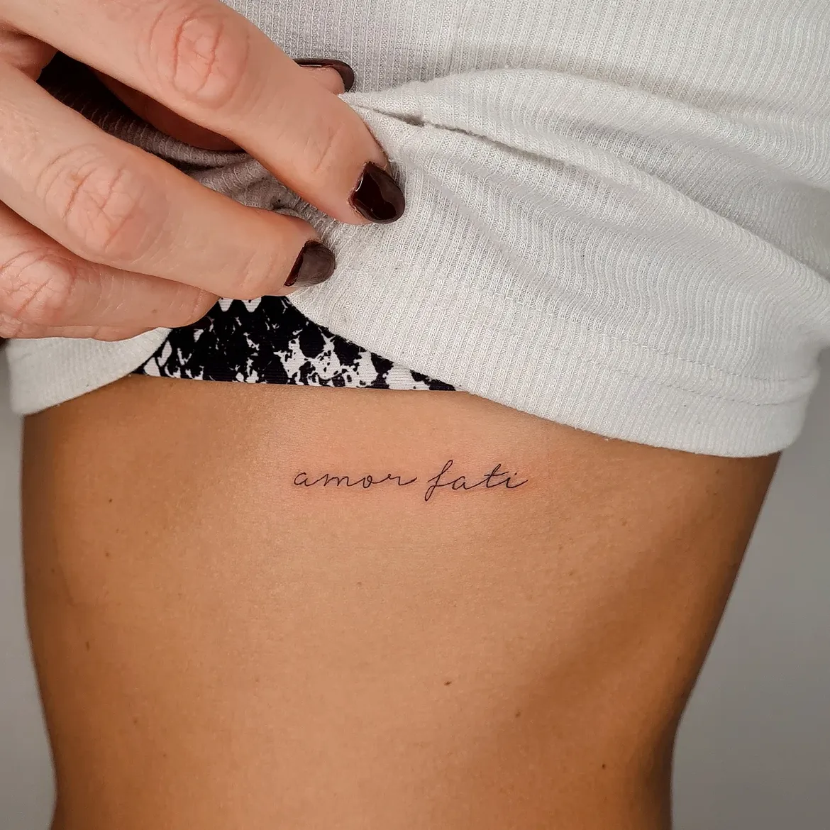
Few placements suit delicate lettering quite as naturally as the ribs. Here, amor fati is written in a restrained handwritten script, with thin black strokes and generous spacing between the letters. There are no accompanying symbols, borders, or ornamental details, which gives the words plenty of visual space.
The placement makes the tattoo feel particularly private. Unlike a hand or forearm design, it can disappear completely beneath clothing and become visible only when the wearer chooses. That intimacy works beautifully with the meaning of the phrase: instead of presenting a philosophy to everyone around you, it can function as a personal reminder.
The fonts cursive style is also worth noticing. It avoids exaggerated calligraphy and instead resembles neat handwriting. For a design women concept centered on subtlety, this is an excellent direction. A similar stencil could be made slightly shorter, moved closer to the waist, or enlarged while retaining the same fine line character.
This is proof that meaningful tattoo ideas do not necessarily need an elaborate illustration. Sometimes two carefully positioned words are enough.
Ultra-Fine Amor Fati Forearm Tattoo
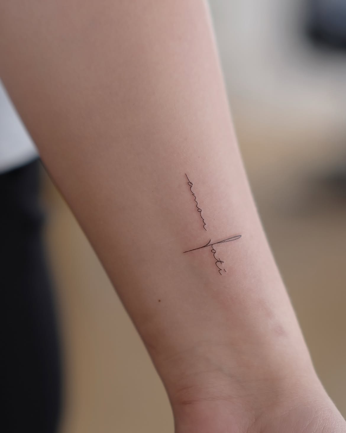
This tiny forearm design takes minimalism considerably further. The two words are arranged with unusual orientation rather than following one conventional horizontal baseline. Amor runs along one direction while fati intersects the composition through an extended calligraphic stroke.
That change sounds minor, but visually it makes the lettering far more distinctive. There is an almost abstract quality to the design from a distance; only when viewed more closely does the phrase become obvious.
The extremely thin lines place this firmly within contemporary fine line tattooing. There is virtually no shading and no unnecessary decoration. Even the long stroke crossing through the design remains feather-light.
For anyone researching design font possibilities, this is a good reminder that typography is not just about selecting fonts. Orientation, spacing, scale, and the relationship between individual words can turn ordinary lettering into a recognizable composition.
The inner arm is also a sensible placement for such a small tattoo. It leaves plenty of untouched skin around the design, which prevents the tiny script from feeling lost or cluttered.
Tiny Amor Fati Finger Tattoo
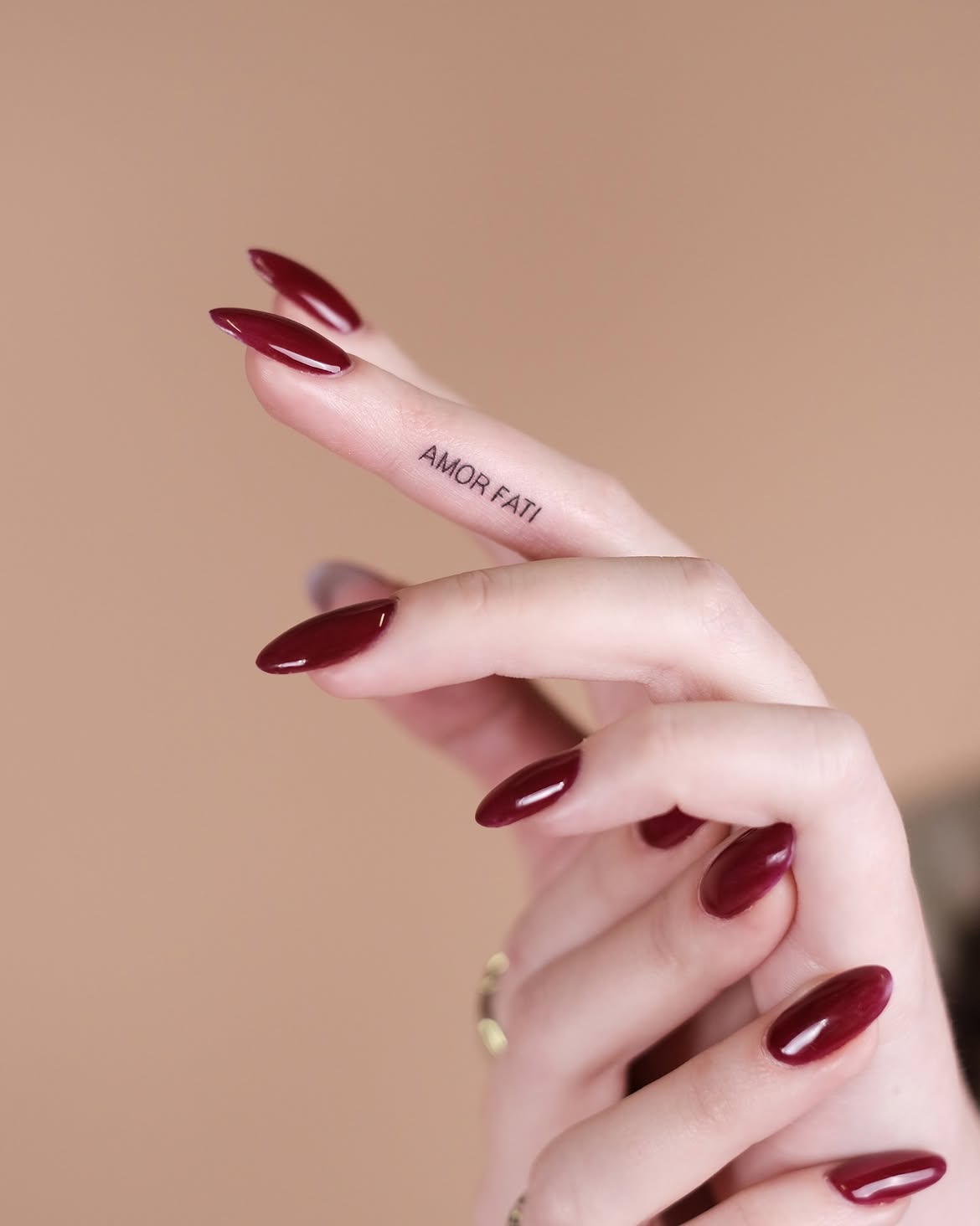
A finger tattoo changes the scale dramatically. Here, AMOR FATI appears in tiny uppercase letters running along the side of a finger. The design is stripped down to the absolute essentials: black ink, straightforward typography, and two words.
The hand is one of the most visible placement options available, so even a tattoo this small can have a noticeable presence. At the same time, positioning the lettering along the side of the finger makes it subtler than a design placed across the knuckles or back of the hand.
The simple uppercase font is a smart choice. Intricate fonts lettering would be difficult to preserve at this size, whereas these uncomplicated characters remain relatively easy to read.
Finger tattoos deserve a practical conversation with an experienced artist before committing. Hands experience frequent washing, friction, movement, and sun exposure, and tattoos in these areas can behave differently from those on the upper arm or back. An artist can advise whether the proposed letter size and line spacing are suitable.
Conceptually, however, this is one of the most discreet amor fati tattoo ideas in the collection: tiny in dimensions, but constantly close at hand.
Floral Amor Fati Tattoo with a Heart Detail
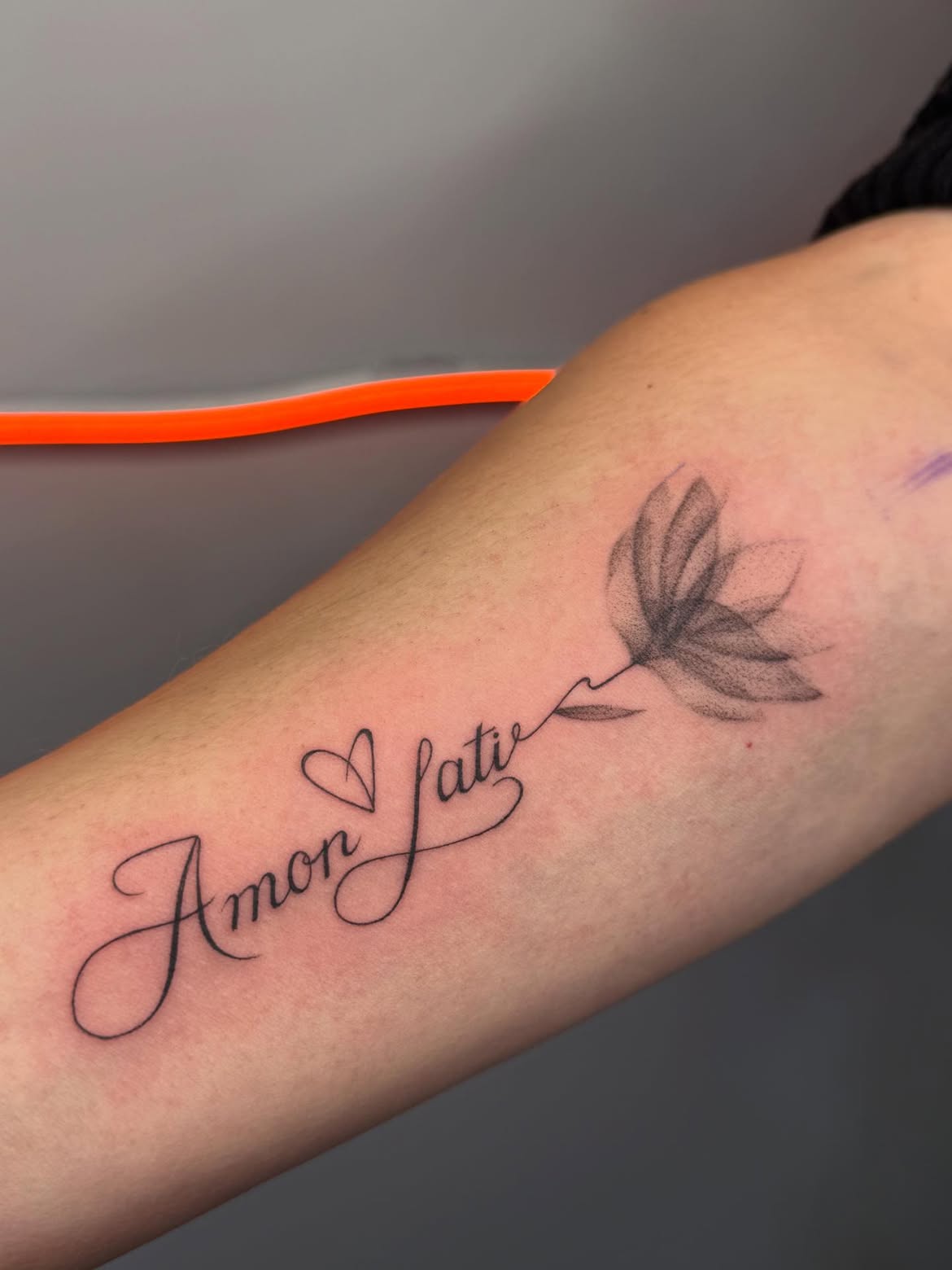
This design takes the phrase in a softer, more decorative direction. Large flowing letters spell Amor fati, with sweeping curves that give the typography a distinctly calligraphic personality. A small outlined heart appears above the lettering, while a flower grows outward from the end of the phrase.
The floral element is rendered with softer black-and-gray shading than the lettering. Its petals gradually fade toward the edges, producing an airy texture rather than a hard graphic outline. That contrast keeps the flower from competing with the words.
There is also a clever relationship between the text and botanical element: a stroke from the lettering appears to continue naturally toward the flower, effectively turning the phrase into its stem. It makes the whole tattoo feel designed as one piece instead of assembled from unrelated elements.
Flowers can carry highly personal meanings—growth, remembrance, affection, change—and those associations can complement the traditional amor fati meaning without prescribing a single interpretation.
For someone who finds plain lettering too restrained, this offers an attractive middle ground between a script tattoo and a full illustrative arm design.
Circular Sunburst Amor Fati Arm Tattoo
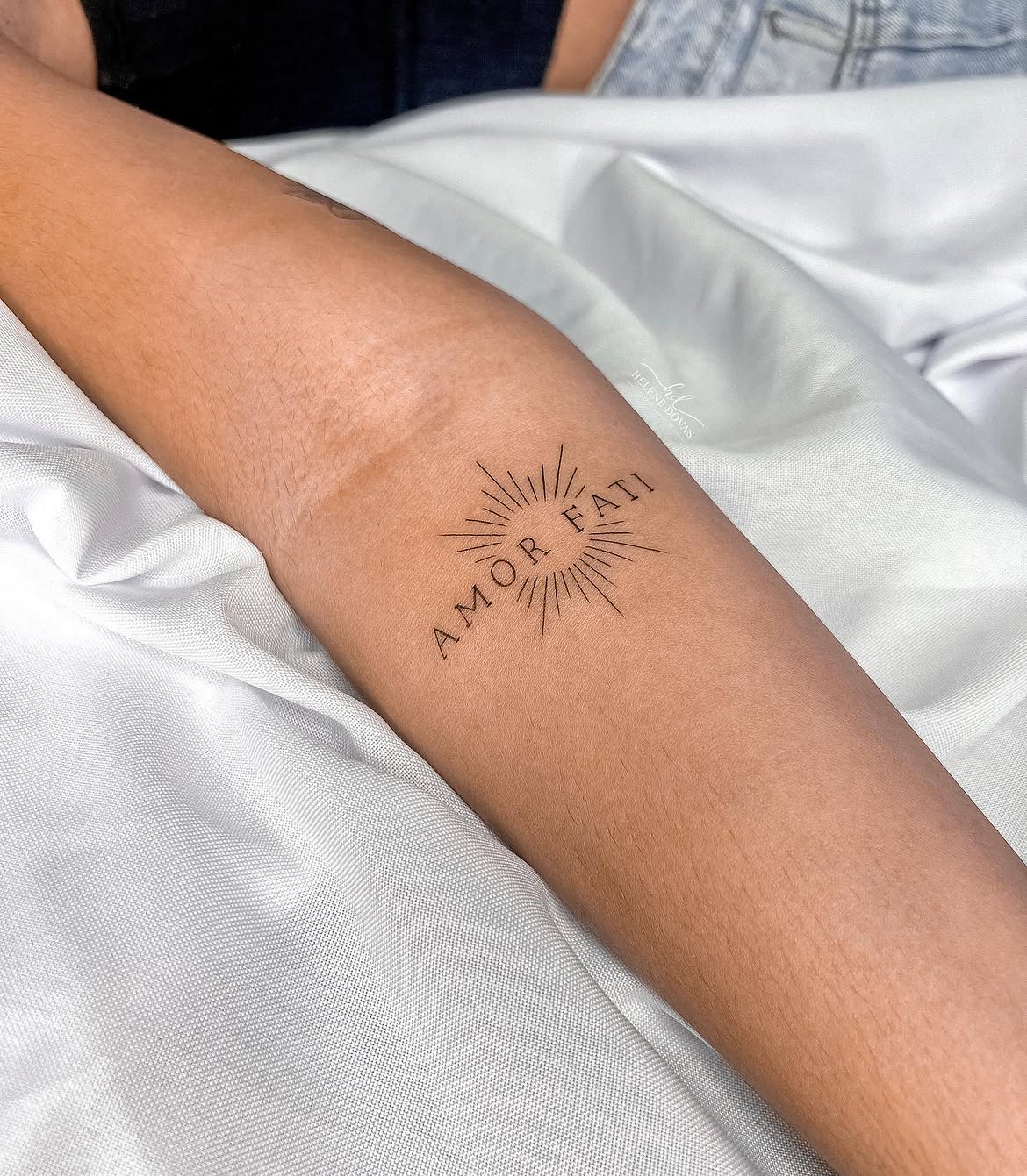
The sunburst idea returns here, but the execution is notably different from the earlier horizontal version. Instead of placing a sun between two words, AMOR FATI curves around the central open circle while dozens of narrow rays extend outward.
The result resembles a small emblem or philosophical seal. Some rays are noticeably longer than others, breaking the rigid symmetry and giving the symbol a sense of light radiating naturally from its center.
Typography is kept deliberately restrained. Thin uppercase serif letters follow the circular movement without overwhelming the fine lines around them. This balance is particularly important because both the lettering and rays need enough negative space to remain individually recognizable.
As a symbol, the sun can suggest renewal, continuity, vitality, clarity, or the recurring nature of life. Those associations make it a natural companion to the concept of accepting one’s fate in its entirety.
The arm provides enough room for all those narrow details while keeping the finished tattoo relatively compact. It could also translate well to the shoulder, upper back, or chest if a wearer wanted a slightly larger version.
Mixed-Font Amor Fati Upper Arm Tattoo
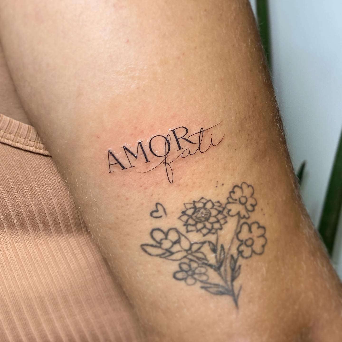
Mixing two contrasting type styles can easily look chaotic, but this design handles the idea with restraint. AMOR appears in tall uppercase serif letters, while fati flows across and beneath it in an expressive cursive script.
The contrast immediately establishes hierarchy. The first word feels architectural and formal; the second feels spontaneous and handwritten. A long sweeping stroke connects the two styles and prevents them from looking like separate tattoos.
This is one of the strongest references in the collection for anyone choosing between fonts lettering styles. There is no rule saying an amor fati design must use one font throughout. Combining a classical serif with fine cursive can create considerably more personality, provided the proportions are carefully planned.
Its upper arm placement offers another advantage: there is room to expand later. Existing floral linework nearby shows how lettering can coexist with other small tattoos without needing to become part of a tightly packed sleeve.
The composition feels feminine and refined without relying on stereotypically decorative imagery. It is the typography itself that supplies the character.
Ornamental Amor Fati Wrist and Forearm Script
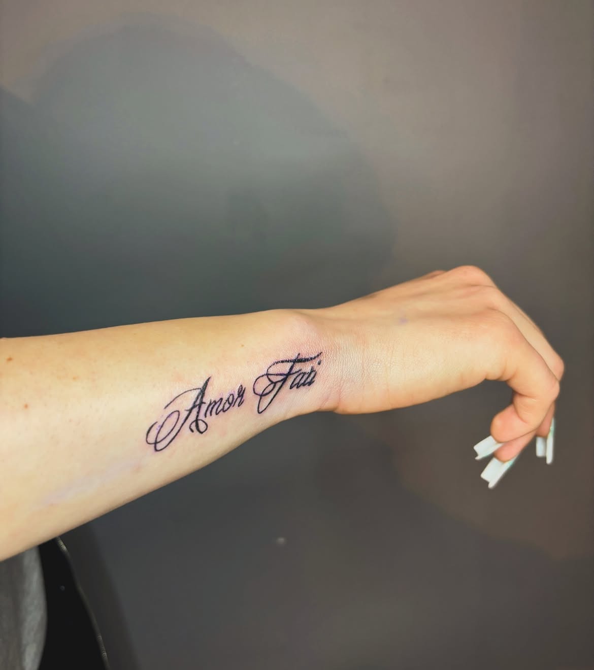
This final lettering concept goes in the opposite direction from the tiny finger tattoo. Instead of making the words nearly invisible, it celebrates calligraphy with pronounced loops, flourishes, and confident black strokes.
Amor Fati stretches along the lower forearm toward the wrist. Both capital letters become decorative focal points, particularly the elaborate A and F, whose extended curves give the phrase a traditional script-tattoo character.
Scale matters here. Larger lettering gives every loop enough space to remain readable and allows the artist to use more elaborate forms than would be practical in a tiny design. It also makes the words an intentional visual feature rather than a discreet detail.
The forearm placement complements the elongated composition beautifully. Following the direction of the arm naturally guides the eye through both words, while the open area around the lettering prevents the ornate font from appearing crowded.
For people who love classic tattoo script, this approach has considerably more drama than minimalist fine line ideas. The same concept could be simplified for the foot or enlarged for the arm, chest, or back, but its long horizontal proportions are especially comfortable on the forearm.
Amor Fati Fine Line Tattoo with a Tiny Heart
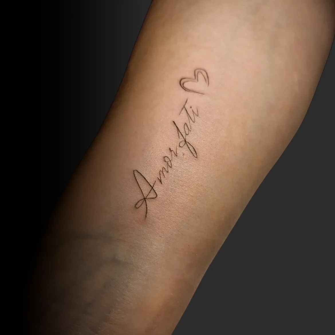
This version brings a warmer, more personal character to the philosophy of amor fati. The phrase is written diagonally along the inner arm in an elegant fine line script, ending near a small outlined heart. The heart is intentionally simple, so it reads as an accent rather than competing with the lettering.
The handwritten design font has an effortless quality. The capital A begins with a long sweeping stroke, while the rest of the letters become smaller and more restrained. This contrast gives the tattoo the rhythm of an actual signature rather than digitally typeset words.
Adding a heart also shifts the visual meaning. Amor fati already contains the idea of love within the phrase, so repeating that idea through a recognizable symbol feels appropriate rather than decorative for decoration’s sake. It can represent affection for life as it actually unfolds—the pleasant chapters as well as the difficult ones.
For this kind of design women style, the inner arm is an excellent placement because it provides enough length for cursive writing while keeping the finished tattoo relatively discreet.
Whisper-Thin Amor Fati Script Near the Elbow
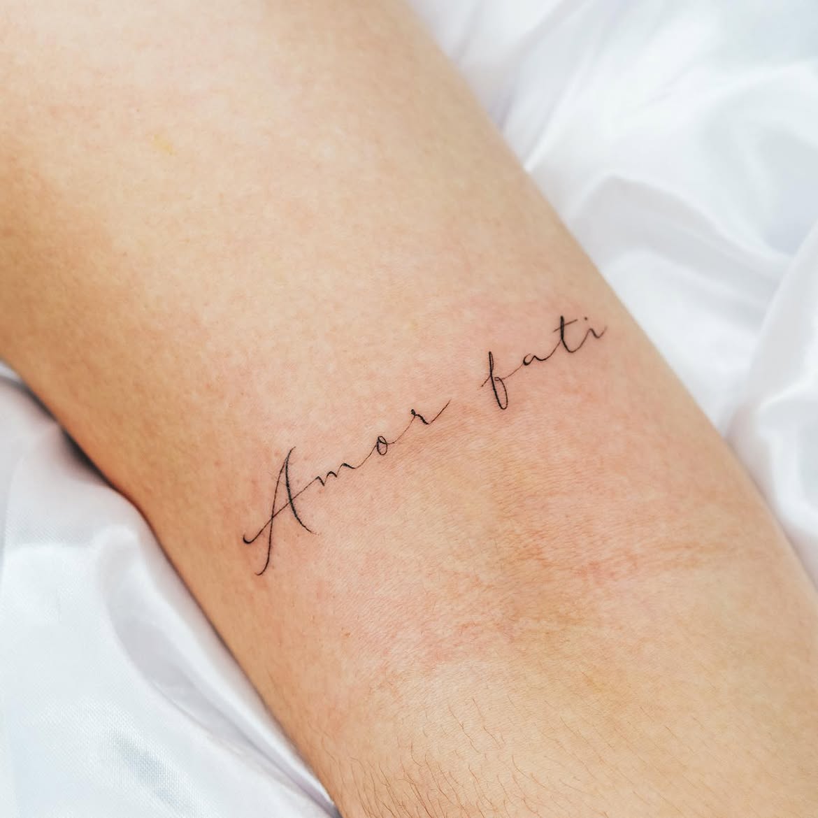
There is almost nothing extraneous in this design. Two words, extremely thin black lines, and a generous amount of untouched skin are enough to create a remarkably polished tattoo.
The script has the light irregularity of handwriting. Letters do not feel mechanically identical, and that is precisely what gives the composition personality. The capital A has a long descending flourish, while the lowercase forms remain narrow and understated.
Its position near the inner elbow is particularly effective. Instead of filling the entire available area, the lettering occupies only a small portion of it. That negative space makes the tattoo appear even finer.
This is a useful example for anyone comparing fonts cursive and minimalist stencil ideas. With lettering this delicate, scale matters as much as style. Making the words dramatically smaller could sacrifice readability, while thickening them would change the entire aesthetic.
The result feels like a note written directly onto the skin—a fitting approach for a phrase intended to serve as a personal philosophy.
Tiny Vertical Amor Fati Forearm Tattoo
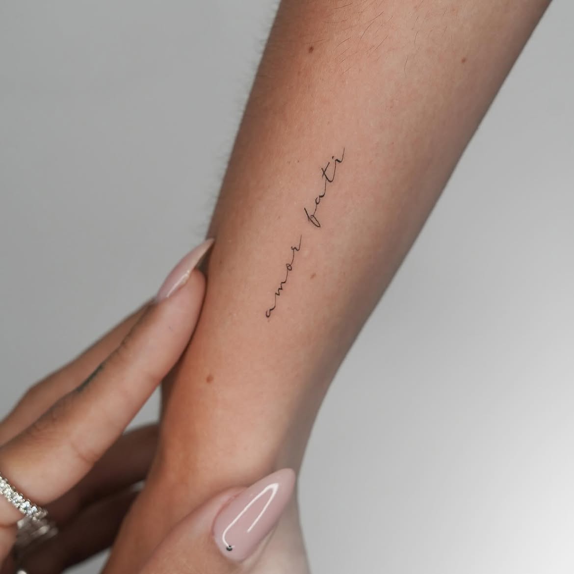
Turning the phrase vertically is a small design decision that makes this tattoo immediately different from conventional script lettering. The words follow the length of the inner forearm instead of crossing it, producing a narrow silhouette that complements the natural shape of the arm.
The lettering itself is extremely restrained. There are no exaggerated loops, shading, frames, or additional symbols. Thin black strokes form a casual handwritten script that remains legible without drawing attention from across the room.
Vertical placement works particularly well for tiny phrases because it uses the anatomy as part of the composition. The same principle could be adapted to the side of the wrist or other narrow areas where a horizontal design might feel awkward.
Among minimalist amor fati ideas, this is perhaps one of the most private-looking. It feels less like a decorative statement and more like a line someone chose to keep close for themselves.
That distinction is important with philosophical tattoos. Sometimes the strongest design is not the one that explains its meaning to everyone else.
Spaced Serif Amor Fati Upper Back Tattoo
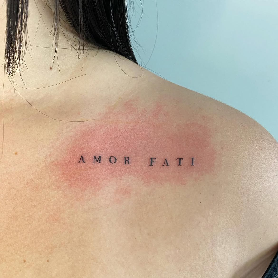
Moving the phrase onto the upper back changes its presence completely. AMOR FATI is set in small uppercase serif letters with unusually generous spacing between each character. Instead of cursive intimacy, the design has the orderly appearance of classic typography.
The broad horizontal placement beneath the shoulder line suits this approach beautifully. Because the back offers so much open space, the tattoo does not need large letters to command attention. In fact, keeping them relatively small makes the surrounding negative space part of the design.
The choice of fonts lettering also reinforces the phrase’s classical roots. Serif capitals subtly evoke inscriptions and printed philosophical texts without imitating an ancient Roman inscription too literally.
This could be an appealing option for someone who wants a back tattoo that is meaningful but not illustrative. It also demonstrates why placement should be planned together with typography: this widely spaced arrangement would lose some of its impact if squeezed into a tiny wrist area.
Simple lettering can feel surprisingly sophisticated when proportions are given enough attention.
Minimal Amor Fati Side Tattoo
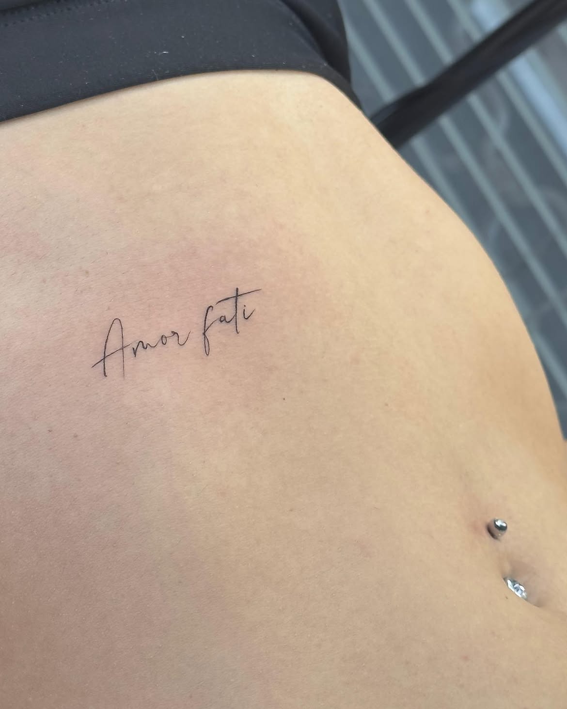
Placed high on the side of the torso, this Amor fati inscription uses slender handwritten lettering with almost no decorative embellishment. Its elongated capital A and tall crossbar on the t provide just enough visual interest to distinguish the script from an ordinary handwritten note.
This is another strong example of how location changes the emotional character of a tattoo. A phrase on the hand is almost constantly visible; a tattoo on the side can remain concealed through most of everyday life. That makes the latter feel inherently more personal.
The scale is also carefully judged. There is enough length to keep every letter open and readable, yet the tattoo remains modest relative to the available space.
For people exploring subtle design women ideas, this type of placement offers an alternative to the more common wrist and arm. A similar composition could sit along the ribs, hip, or slightly higher on the torso.
It does not need a flower, sun, or additional symbol. The restraint is what makes the design convincing.
Small Cursive Amor Fati Inner Arm Tattoo
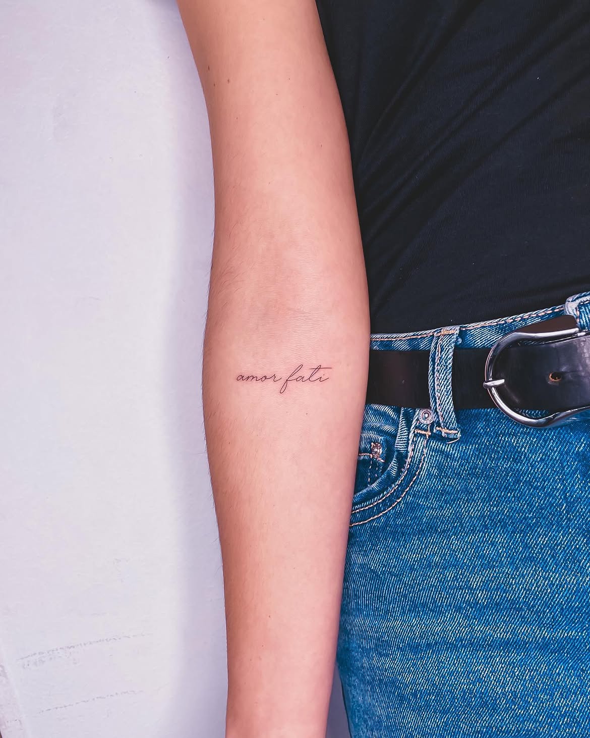
This tiny script tattoo sits neatly on the inner arm and demonstrates one of the most wearable interpretations of the phrase. The words are positioned horizontally, written in a flowing cursive font with a particularly graceful f connecting the two halves of the composition.
What works especially well is the scale relative to the arm. Rather than stretching from side to side, the lettering occupies a compact central area. The surrounding skin becomes its own frame, giving the words a clean, uncluttered presentation.
For anyone who wants an amor fati tattoo that can coexist with everyday style rather than dominate it, this is an easy reference point. It is visible when the arm is exposed but subtle enough not to behave like a major statement piece.
The fine line execution also suits the philosophical nature of the phrase. There is a quietness to it—almost as though the tattoo exists primarily as a reminder for its wearer.
When choosing a stencil for similarly small lettering, preserving adequate spaces inside the letters is more important than making every stroke as thin as technically possible.
Elegant Amor Fati Calligraphy on the Forearm
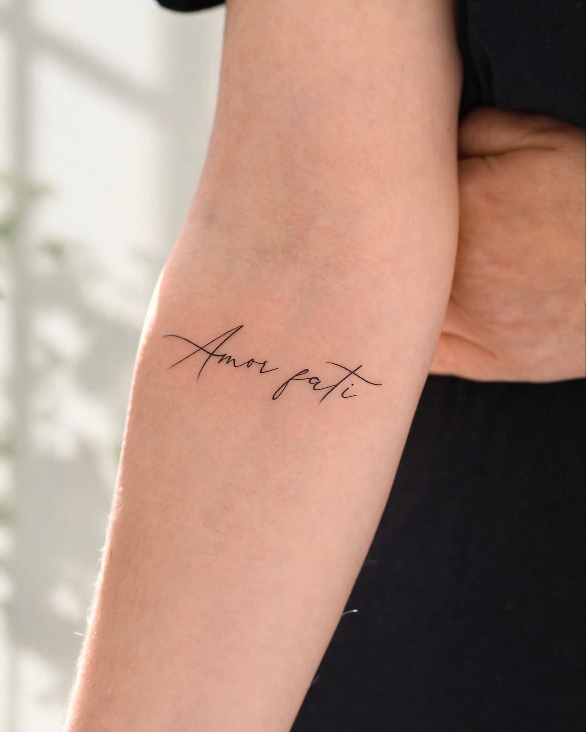
The last design gives minimalist lettering a more expressive personality. Amor fati stretches horizontally across the inner forearm in graceful calligraphy, with long strokes extending from both the capital A and the t.
Those sweeping lines make the words feel larger without requiring thick ink or heavy shading. It is an effective typography trick: the actual letters remain relatively delicate, but their extended flourishes create a broader silhouette.
The composition sits naturally across the arm, following its width rather than its length. That orientation makes the phrase immediately readable and allows the decorative strokes to remain open instead of overlapping one another.
Compared with the smallest handwriting examples, this design feels more intentional as an aesthetic feature. It still belongs comfortably within fine line tattooing, but the font is clearly meant to be noticed.
For someone who loves fonts cursive but wants something more polished than everyday handwriting, this balance works especially well. It could also be adapted for men with a less flourished script or enlarged for another placement while retaining the same basic proportions.
Delicate Amor Fati Tattoo Near the Inner Elbow
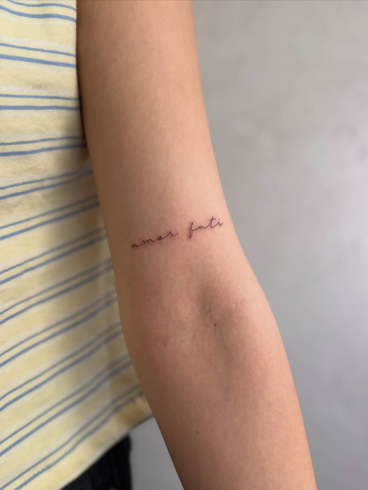
This minimalist amor fati tattoo sits just above the inner elbow, using the natural horizontal space of the arm for a clean and understated composition. The lettering is executed in an extremely thin handwritten script, with gently connected letters and no decorative elements around the phrase.
The small scale makes the design feel intimate rather than attention-seeking. Its fine line style works particularly well with this placement because the soft curves of the script contrast beautifully with the shape of the arm. There is plenty of negative space around the words, helping even the smallest details remain visually clear.
This is a strong reference for anyone searching for design women, minimalist lettering, or subtle arm placement ideas. The lowercase font gives the phrase a casual, personal quality, almost as though it were written onto the skin with a fine pen.
Vertical Amor Fati Fine Line Calligraphy
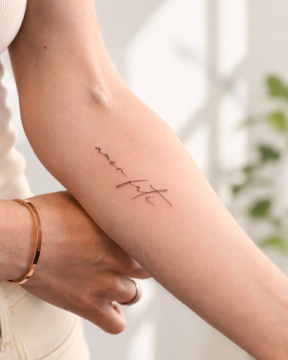
Here, the familiar phrase is transformed through orientation. Instead of running horizontally across the arm, the words follow a diagonal-to-vertical path along the inner forearm. This creates movement and allows the lettering to complement the length of the limb.
The word amor is especially restrained, while fati becomes the visual focal point through larger calligraphic strokes. Long crossing lines and an extended flourish create a graceful contrast between tiny handwriting and expressive cursive.
A tiny heart-like curve incorporated near the lower portion adds another subtle detail without turning the composition into a heavily illustrated tattoo.
This approach is worth considering when exploring different fonts cursive options. Varying the size of individual words can create hierarchy even when the entire design uses only black ink. The result remains minimalist but has more personality than a conventional straight-line inscription.
Amor Fati Tattoo with a Fine Line Flower
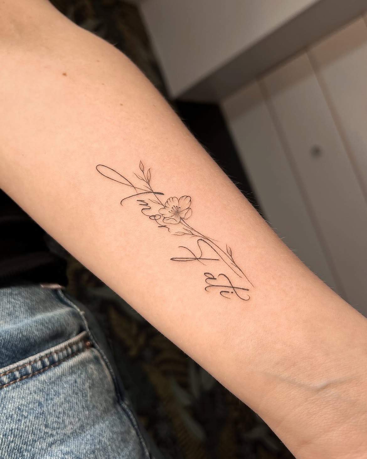
Adding botanical imagery gives this amor fati design a distinctly romantic character. The lettering flows through a delicate flower and slender leafy stem, making the words and illustration feel like a single continuous composition rather than two unrelated elements.
The flower occupies the center, with fine petals drawn using light outlines and minimal interior detail. Small leaves extend upward and downward, naturally directing the eye through the length of the tattoo. Instead of heavy shading, the design relies almost entirely on linework.
The script is more expressive than many minimalist examples. Large loops and elongated strokes weave around the floral element, giving the piece an airy, handmade appearance.
This is an attractive direction for someone who likes fine line design but wants more than lettering alone. Different flower choices could also personalize the stencil further, whether selected for appearance, symbolism, or a connection to a meaningful date or person.
Small Amor Fati Inner Upper Arm Tattoo
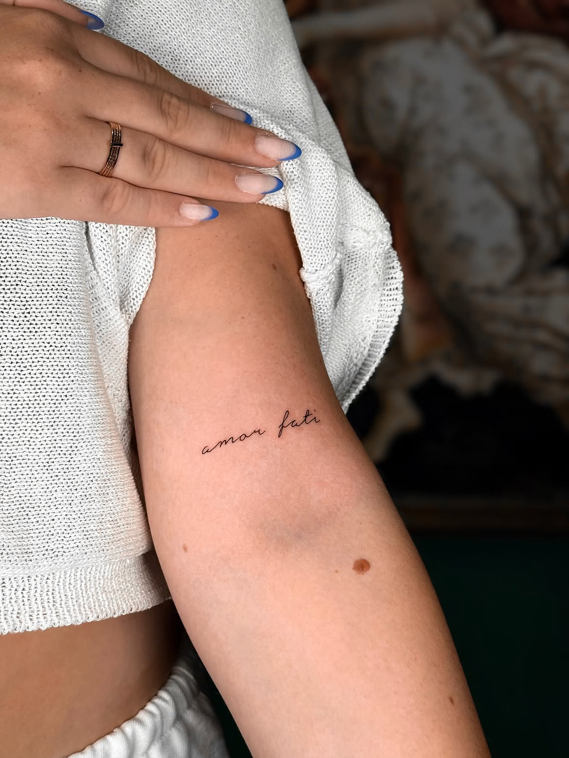
Placed on the inner upper arm, this tattoo keeps the phrase compact and discreet. The words are written in a simple lowercase cursive style, with enough spacing between the letters to maintain readability despite the small dimensions.
The location makes a significant difference to the overall mood. Unlike a hand or outer forearm tattoo, this placement can easily disappear beneath clothing. When visible, however, it sits naturally against the broad open area of the upper arm.
There are no additional symbols, borders, or ornamental flourishes. That restraint allows the meaning of amor fati to remain the entire focus of the design.
For those considering design women arm ideas, this example demonstrates that a meaningful tattoo does not need to be visually complex. The clean black line, handwritten font, and generous negative space create a timeless result that could work at several different scales.
Ultra-Fine Amor Fati Script on the Arm
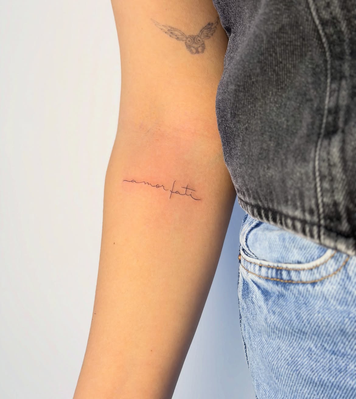
This design reduces amor fati lettering almost to its simplest possible form. A single thin continuous-looking line creates the lowercase phrase across the inner arm, producing an exceptionally light and delicate appearance.
The beginning of the tattoo features a subtle extended stroke before the first letter, while the final letters trail naturally toward the opposite side. There are no dramatic calligraphic loops, making this one of the quieter font choices in the collection.
Its placement takes advantage of a relatively flat section of the arm, allowing the inscription to remain easy to read from the front. At the same time, its modest size prevents it from visually dominating the area.
Anyone collecting minimalist, fine line, or tiny amor fati tattoo ideas could use this as a useful stencil reference. The simplicity also leaves room for future additions without making the existing tattoo feel unfinished.
Minimal Amor Fati Tattoo Above the Elbow
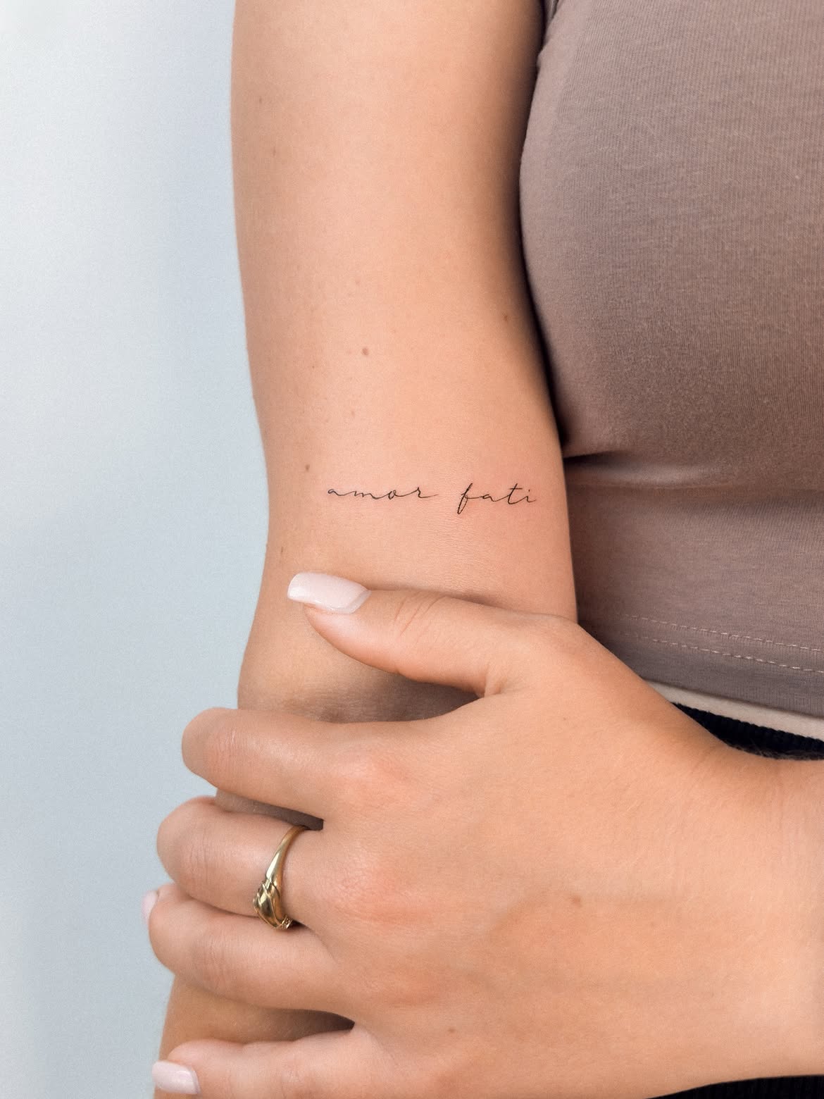
This example places the phrase close to the elbow crease, where the narrow horizontal lettering follows the natural width of the arm. The design uses very fine black lines and an understated handwritten font.
One of its most appealing features is the balance between the two words. Neither dominates the other, and the small gap between them prevents the inscription from appearing crowded. The letterforms remain casual and slightly irregular, preserving the feeling of genuine handwriting.
The design is particularly suited to people who want a tattoo that remains subtle even when uncovered. From a distance, it appears almost like a tiny handwritten note; only closer inspection reveals the individual letters.
This kind of placement can also work well alongside other small tattoos because the composition does not occupy much vertical space. It offers a simple foundation for a future patchwork collection while looking complete on its own.
Amor Fati Script with a Small Butterfly
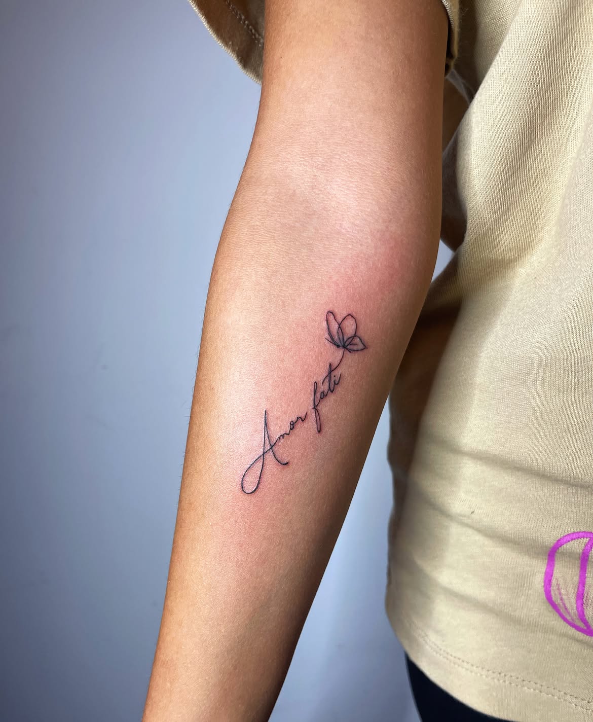
A small butterfly gives this script tattoo an illustrative finishing point. The words rise diagonally along the inner forearm, beginning with an oversized looping capital A before narrowing into finer cursive lettering.
Rather than placing the butterfly separately, the composition visually connects it to the phrase through the upward direction of the final stroke. This makes the image feel like an extension of the lettering. The butterfly itself is constructed from simple outlines with just enough internal linework to define its wings.
The combination creates an elegant design women option for someone who wants symbolic imagery without committing to a large illustrated tattoo. A butterfly can introduce themes of transformation, change, and movement, while amor fati centers the composition around embracing life as it comes.
The vertical orientation is also useful for the forearm because it creates a longer, slimmer silhouette than standard horizontal lettering.
Bold Amor Fati Hand Tattoo
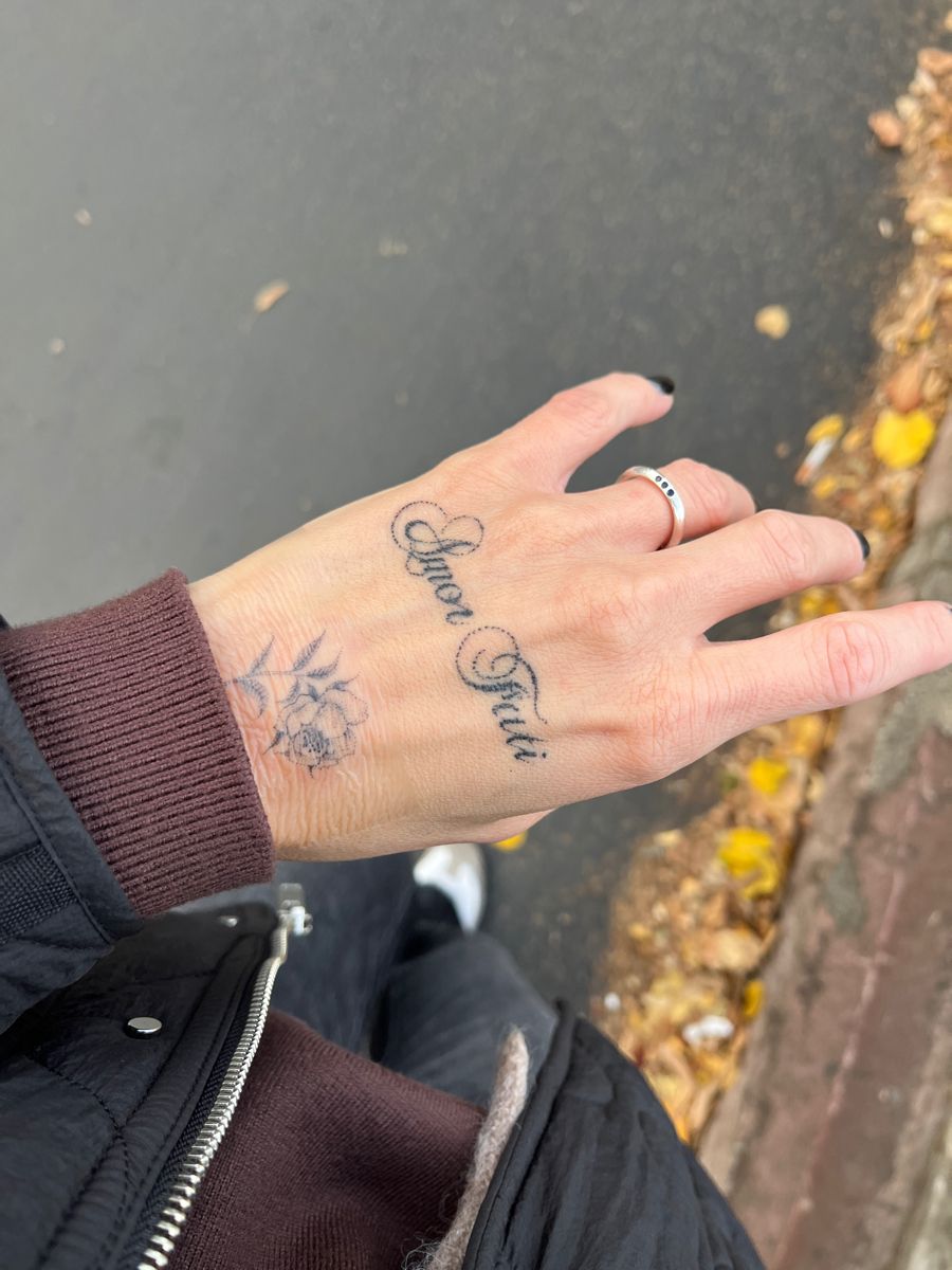
This hand tattoo takes the phrase in a noticeably bolder direction. Instead of whisper-thin minimalist lettering, Amor Fati is rendered in decorative black script across the back of the hand. Large capital letters feature pronounced loops, while dotted ornamental curves add extra texture around the typography.
Placement makes this version especially distinctive. Hand tattoos are naturally much more visible than inner-arm, back, or torso designs, so even a relatively compact phrase becomes a prominent part of the overall look.
The lettering also interacts with existing tattoo work near the wrist, demonstrating how amor fati can become part of a larger collection rather than functioning only as an isolated design. Its decorative fonts lettering style would suit someone looking for a more expressive alternative to tiny fine line scripts.
Across these designs, the most interesting lesson is how little the phrase itself limits the artwork. Amor fati can become a tiny handwritten reminder, a bold Gothic statement, a bracelet around the arm, or the philosophical center of a larger symbolic composition. Before settling on a stencil, consider not only the literal meaning but also how you want that meaning to feel when translated into ink.
Tattoo publications and artist-focused resources regularly demonstrate the value of looking beyond trends and studying an artist’s individual lettering, linework, and healed work before booking. For a phrase this concise, small decisions about spacing, font weight, scale, and placement can make an enormous difference.
Whether your preferred placement is the hand, arm, neck, foot, back, or chest, the strongest design is usually the one that leaves enough room for both the lettering and its meaning to breathe. Amor fati is already a powerful statement; it does not necessarily need elaborate decoration to become memorable.
Which version would you actually wear—the tiny cursive script, symbolic hands, bird illustration, bracelet line, sunburst, or red Gothic lettering? Leave a comment and share the amor fati style and placement you would choose.