
A ring tattoo is one of those tiny commitments that somehow feels big: you carry it through every handshake, every coffee run, and every milestone. Unlike metal bands, it never needs resizing, and it can be as minimal—or as symbolic—as you are. Below, I break down real-life ring tattoo designs across classic bands, knotwork, script, and minimalist symbols. I’ll share what works technically on the finger, what fades, and how to style each idea for men, for women, and for married couples who want a wedding-worthy mark without the jewelry. I’ll also point to voices I trust—artists featured in Inked Magazine and craft guides like the TattooSmart blog—because good tiny tattoos succeed on planning, not luck.
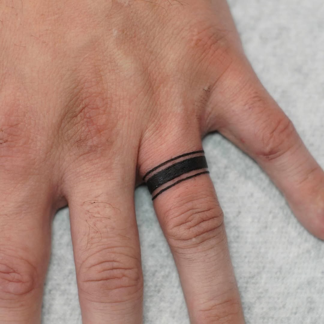
1) Ultra-Clean Double Band
A razor-straight twin stripe circles the ring finger like a charcoal halo. The lower band is bolder; the upper band is a whisper-thin line that adds dimension. This idea works beautifully for men who want something minimal yet graphic and for women who prefer jewelry that never comes off.
Why it works: thick + thin plays well on small canvases; the contrast keeps the design readable as the skin softens over time.
Styling tips: ask your artist to wrap the stencil around the hand while the finger is slightly flexed; this prevents a “step” where lines meet. Consider a matte-black heeled tone for a wedding alternative—add a date dot or micro initial on the palm-side seam if you want a secret accent.
Care note: rings live in splash zones; choose a studio that emphasizes single-needle control and touch-up policies.
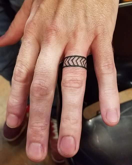
2) Chevron Band With Negative Space
Arrow-like chevrons march around the finger, broken by crisp negative space. It resembles a tiny piece of architecture—strong, decisive, and stylish for women who appreciate patterns, while also being equally sharp for men with a graphic wardrobe.
Symbolism: chevrons often signal movement or “forward,” a fitting message for engagements or anniversaries.
Wedding styling: pair with a thin outer outline to protect the points from wear; if you share it for couples, invert the V on one partner so the arrows point toward each other—subtle, romantic, and very wearable in everyday ddesigns ofwedding aesthetics.
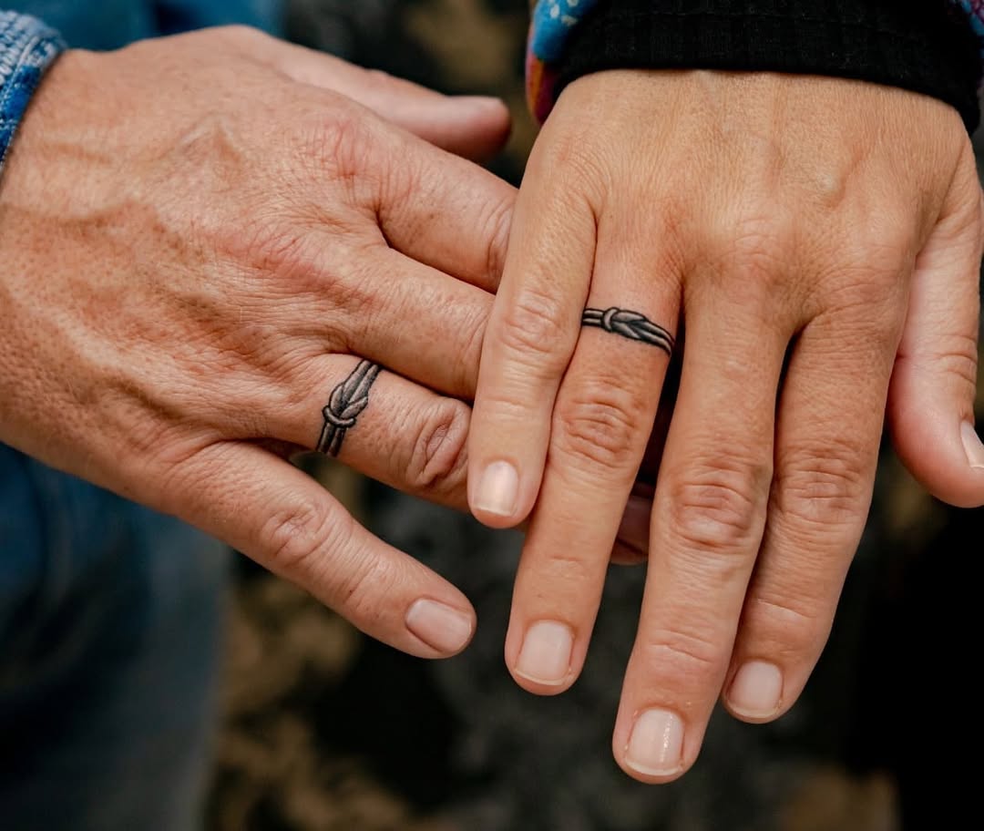
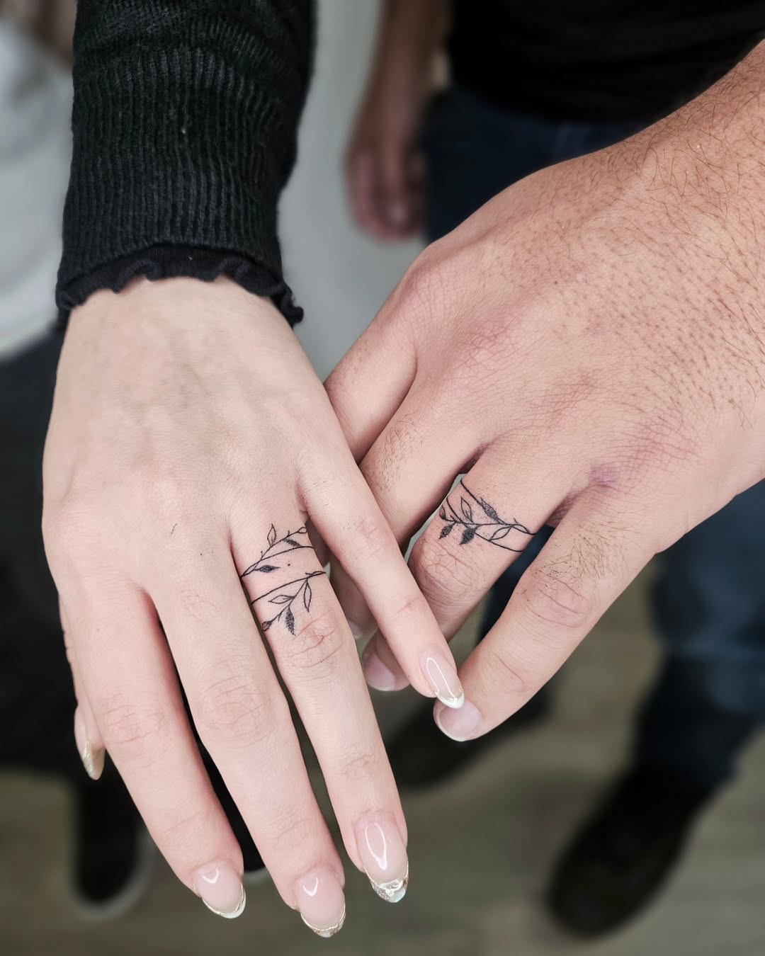
3) Rope-Knot Pair
A softly shaded rope wraps the ring finger and ties into a secure knot. As a matched set, it’s a natural idea for couples marriage: the knot is a universal promise, and the rope texture adds depth without crowding the finger.
Why people love it: it nods to Celtic symbolism frequently celebrated in Claddagh and knotwork rings—fidelity, friendship, love—without copying jewelry directly.
Pro tip: ask for slightly larger knot heads on wider fingers for men and a slimmer twist for women; shade lightly so the “fibers” stay readable after healing. This is a strong marriage marker when metal rings aren’t practical for work.
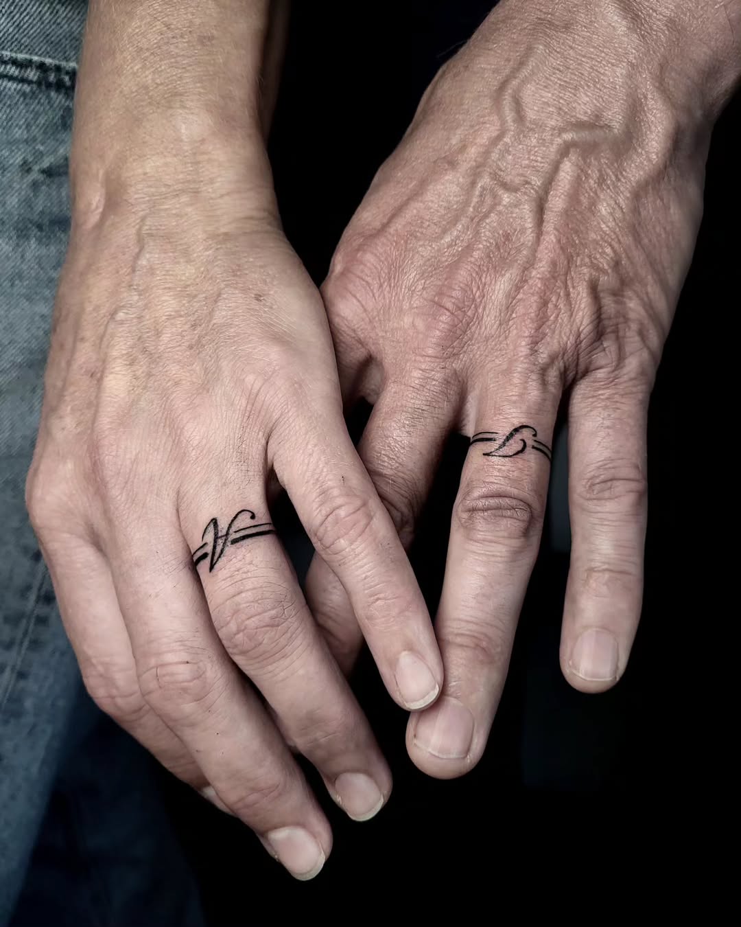
4) Matching Minimal Waves
Two spare wave strokes meet around the ring finger—clean, continuous, and wonderfully restrained. Perfect for couples, surfers, or anyone whose story is tied to the coast.
Design notes: a single flowing line ages better than tiny dots; your artist can place the crest on the top of the hand for visibility or tuck it palm-side if you prefer privacy.
Wedding adaptation: mirror the curves so they flow toward each other at the inner seam; it’s a poetic design wedding detail that feels personal even without text.
5) Initial Monogram on a Solid Band
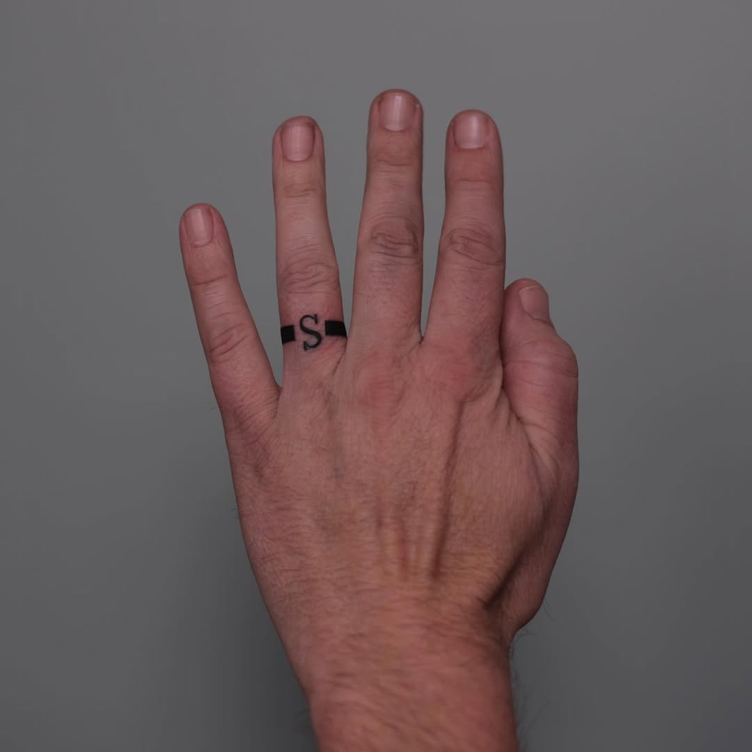
A matte band breaks for one bold initial—here, a single letter sits like a seal. It’s a confident option for men who want something unmistakably personal but not ornate, and just as strong for women who prefer typography over symbols.
Styling tips: choose a typeface with open counters (think classic serif or clean grotesque); tight loops can blur on the finger over time. If you both share initials, invert the fill—one partner with a filled band and cut-out letter, the other with a thin outline and filled letter—subtle, graphic, and photogenic at ceremonies.
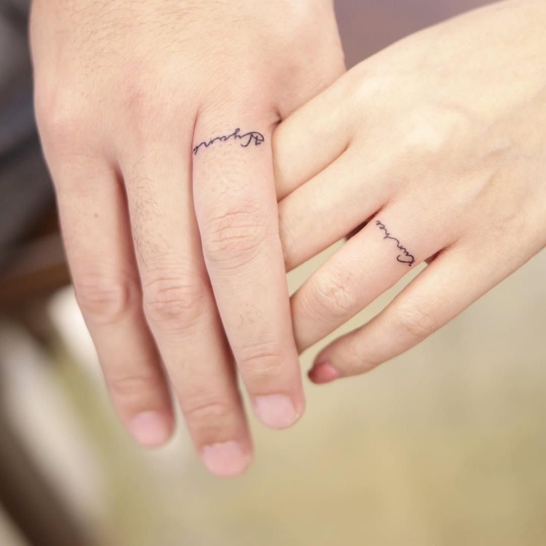
6) Micro Cursive Names
Two hand-penned names glide along the side of the ring finger, almost like a secret note you carry daily. It’s a romantic choice for married couples who love script and story.
Technical musts: ask for a slightly taller x-height and fewer flourishes; ultra-tiny loops are the first to soften. Place it lateral-side rather than on top to reduce sun exposure.
Alternative: combine one micro name with a single dot or tiny flower on the opposite seam—pretty designs for women who want a gentle accent without losing legibility.
7) Minimalist “Wave-Heart” Pair in Blue Linework
A petite line motif—part wave, part heart—wraps low on the finger in airy blue ink. Colored linework is trending again; when done sparingly, it feels youthful and contemporary for couples.
Color guidance: Blues and soft greys age more gracefully than bright reds in high-friction zones. Keep lines medium-weight; very fine blue can fade quickly.
Wedding day designs: stack with a thin metal band above it; the contrast between steel and ink looks editorial in photos and still reads clearly IRL.
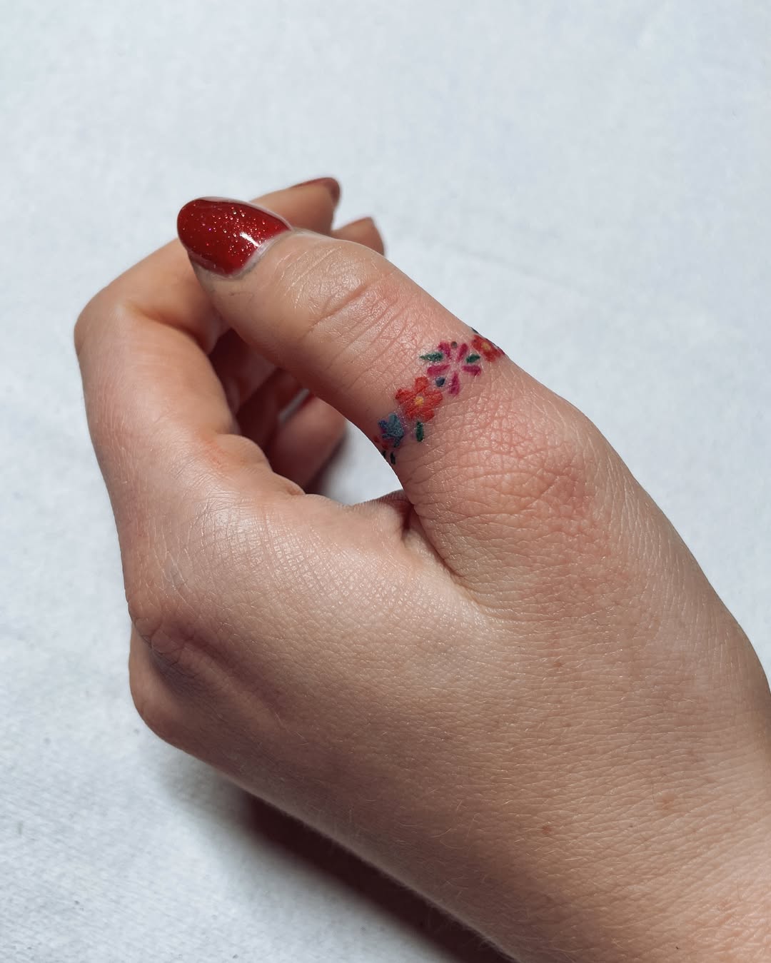
8) Constellation-Dot Bouquet
A scatter of micro-dots rises like a constellation above a tiny stem-and-petal motif placed high on the ring finger. It reads as jewelry you sketched on your hand—airy, modern, and delicate for women who want a hint of flower without a full wreath. Ask your artist for slightly larger dots at the top and lighter ones below; the taper creates lift and keeps the composition readable after healing. For a wedding spin, mirror the dot cluster on a partner’s finger as a minimalist “star map”—simple ideas for couples that photograph beautifully with metal bands.
9) Watercolor Wildflower Band
Tiny blossoms—peach, magenta, and teal—form a continuous ring around the thumb base. The trick here is restraint: loose petals, a few dark leaf accents, and enough negative space so the colors can breathe. This is a lovely pick for women who prefer designs for women that feel hand-painted rather than outlined. Request a low-saturation palette and mid-weight leaves so the hue holds in a high-motion zone; consider echoing one bloom as a boutonnière dot on a partner for subtle couple symmetry at a spring marriage ceremony.
10) Signet Illusion with Gem Setting
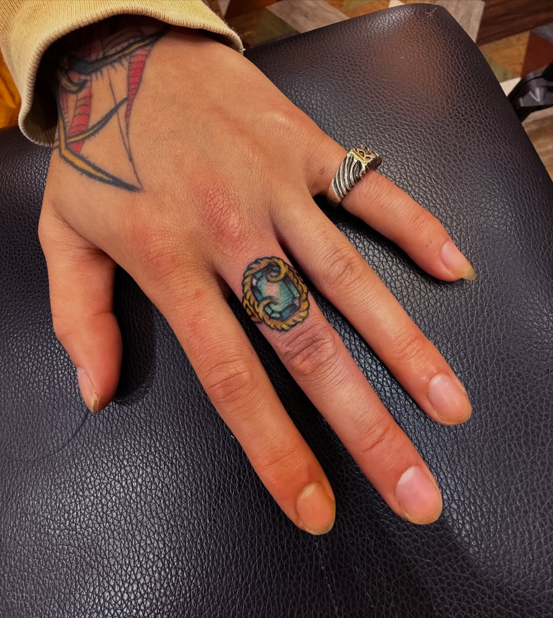
A classic signet silhouette—rope border, beveled shoulders—frames an aquamarine “stone.” This trompe-l’oeil approach is fabulous for men who love heritage jewelry but can’t wear hardware, and just as bold for women who long for a vintage design. Ensure that the “gem” facets are prominent, with a cool grey for shadow and a pastel mint shine for highlights; minute facets blur on the finger. For wedding designs, replace the crest with a micro tree or family crest instead.
11) Thorned Band for Two
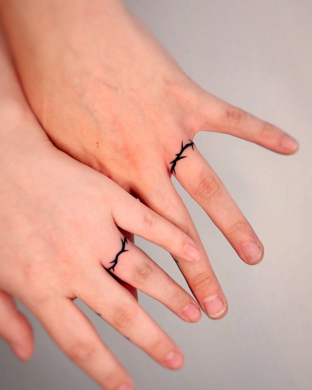
A pared-back thorn motif wraps each ring finger—clean angles, no shading, maximum attitude. It’s the perfect counterpoint for couples who want tenderness with an edge. Placement slightly below the first crease keeps the points crisp. Consider a softer silhouette for women and a heavier spine for men; the contrast reads well in photos and nods to complementary personalities. The motif also plays nicely with gothic designs—a subtle reference if you love medieval iconography without going full Claddagh or cross.
12) Full Set of Gothic Bands
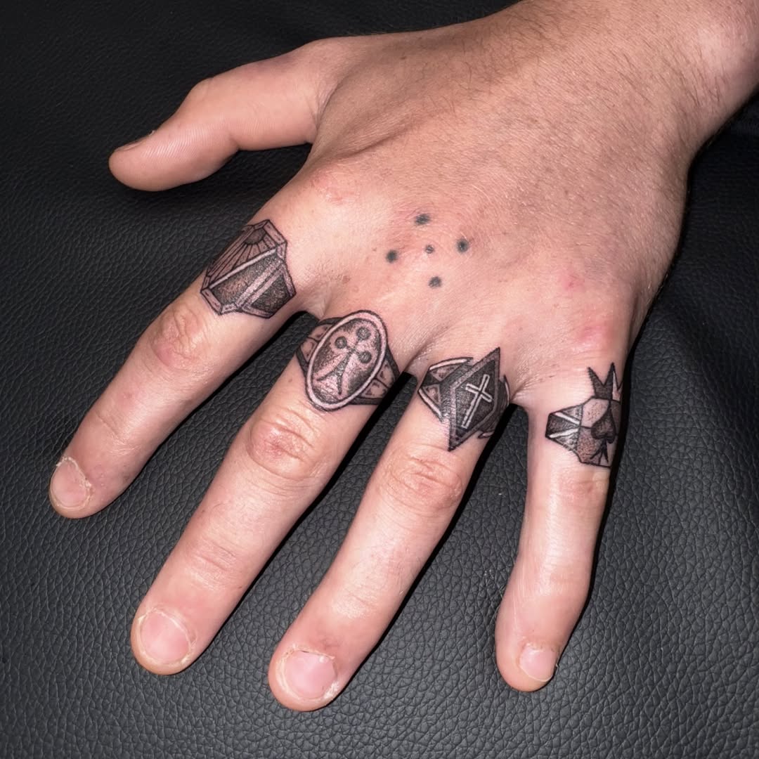
Five distinct ring tattoos—coffin, icon seal, shield with cross, arrow-set triangle, and sacred-heart spade—turn the hand into a miniature reliquary. Rich blackwork hatching gives each “metal” volume while staying legible on small real estate. This tattoo collection is unapologetically for men who want a narrative across multiple digits, though a single symbol adapted for women can be equally striking. Keep each emblem broad with one high-contrast read; too many micro details soften fast on-hand skin. Paired with a simple band on the ring finger, the set can still feel wedding-appropriate for the right couple.
13) Laurel-Leaf Wrap for Two
A slender laurel sprig curves into a ring, alternating leaves and airy gaps so the design can flex as you move. It’s elegant for married couples who want matching nature-driven wedding designs without overt symbolism. Ask for slightly different leaf counts—hers lighter, his a touch bolder—so each ring feels tailored. A single dot “berry” on the inner seam makes a sweet anniversary secret.
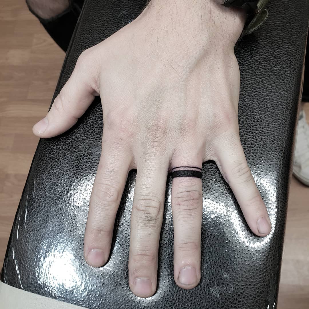
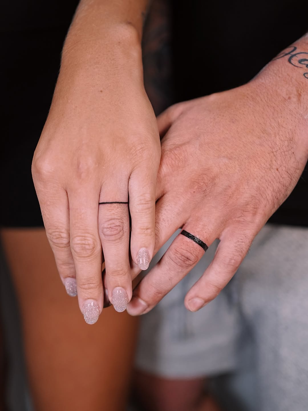
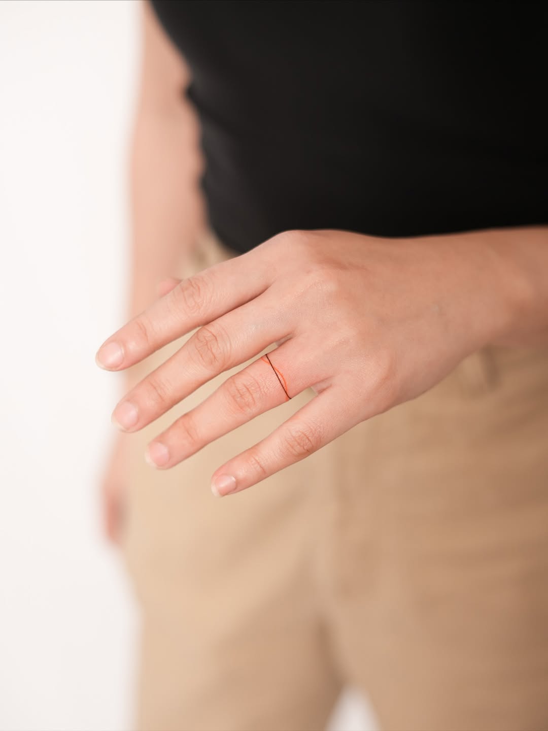
14) Ultra-Minimal Solid Bands
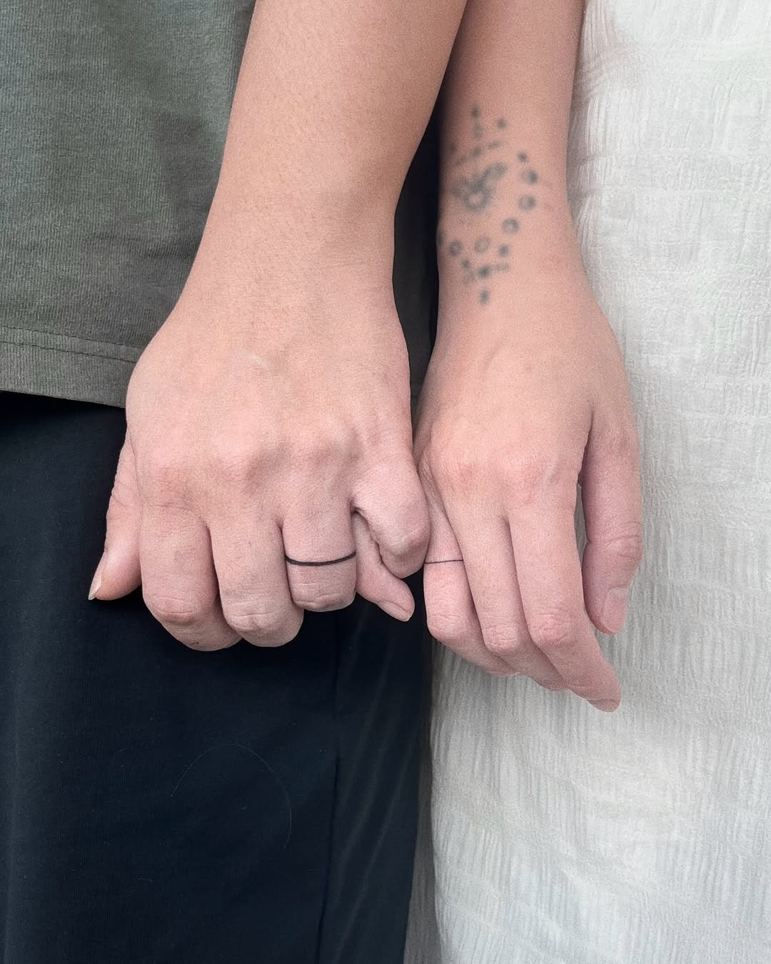
One ring is mid-weight with a matte finish; one is a thin line. This is actually the most minimalist ring design in this collection—and it’s often the most traditional. Perfect for couples who value understatement, for jobs involving physical labor where jewelry can snag, or for temporary use until a ceremony. Your ring artist should curve the cutting guide with your finger slightly bent to avoid a “step effect” where lines meet. If you’d like to redo this design in the future, a little date or small initials on the inner seam are all you need.
15) Classic Claddagh Pair
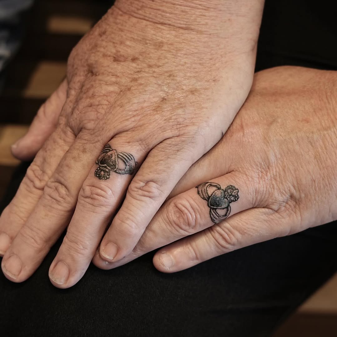
Two shaded Claddagh designs on each ring finger—a crowned heart between hands—are rendered in a subtle grey tone so your “metal” looks like aged silver. This is a tradition-filled ring design for couples’ marriage for couples who desire a wedding ring with meaning.
The elements represent LOVE (heart), LOYALTY (crown), and FRIENDSHIP (hands). Be sure to keep your heart element wide and your crown simple enough to read on your ring/wedding ring/wedding rings after all these years. Also great for men’s fingers after years of wear. Works beautifully for men and for women; if you like personalization, tuck an anniversary micro-date along the inside seam.
16) Thread-Line Band with Red Heart Knot
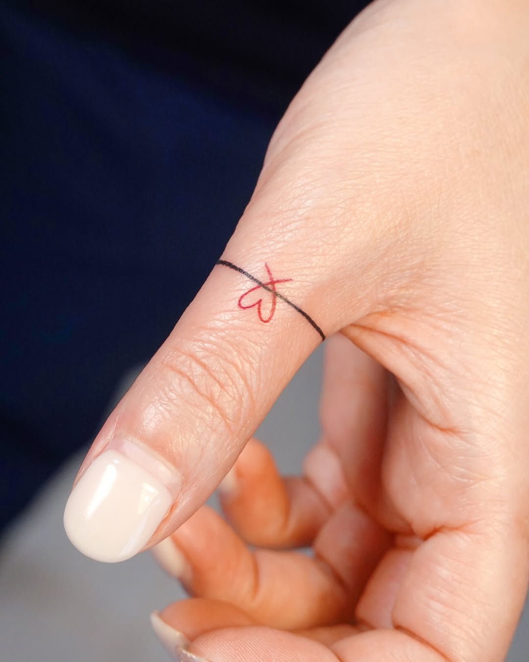
A single charcoal line encircles the thumb like thread, interrupted by a tiny red heart tied with an X. This is soft, modern romance for women who prefer airy designs over heavy bands. The color pop is subtle enough for daily wear but still photographs well for an intimate marriage ring with airy designs for women if you like designs like this for women’s ring designs.
17) Bold Twin Labyrinth Bands
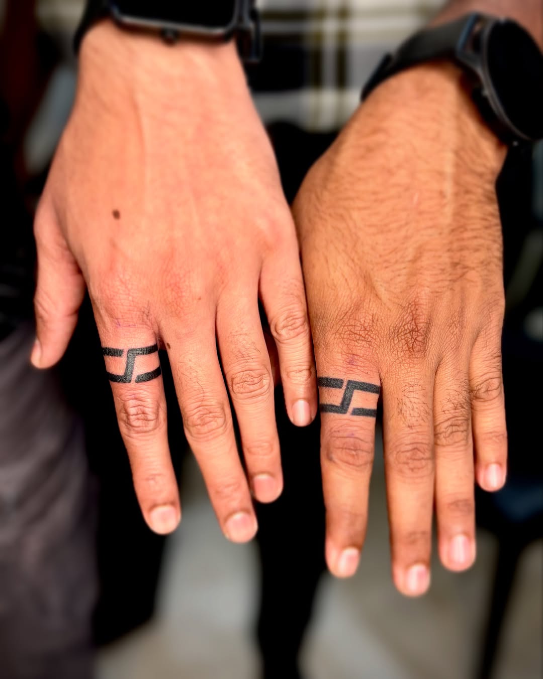
Two identical blackwork designs frame ring fingers in architectural flair—square turns, heavily filled in, no shadowing. It’s a bold statement for couples who live in straight lines and monochromatic wardrobes, especially bold for men who want impact without symbols. Keep negative space generous so the pattern doesn’t blur. For a wedding nod, mirror the maze so each path points toward the other partner’s hand—a smart, quiet story cue.
18) Triple Band + Botanical Accent
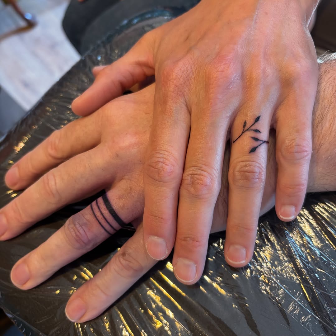
One partner wears a dense triple stripe—a thick base with two thinner guards—while the other has a delicate twig with buds that completes the circle. Together they read “strength and growth,” a refined set of ideas for couples where each ring complements the other. Placement slightly below the first crease keeps lines crisp. The twig offers a whisper of flower without petals, perfect for women; the band is a durable pick for men who work with their hands.
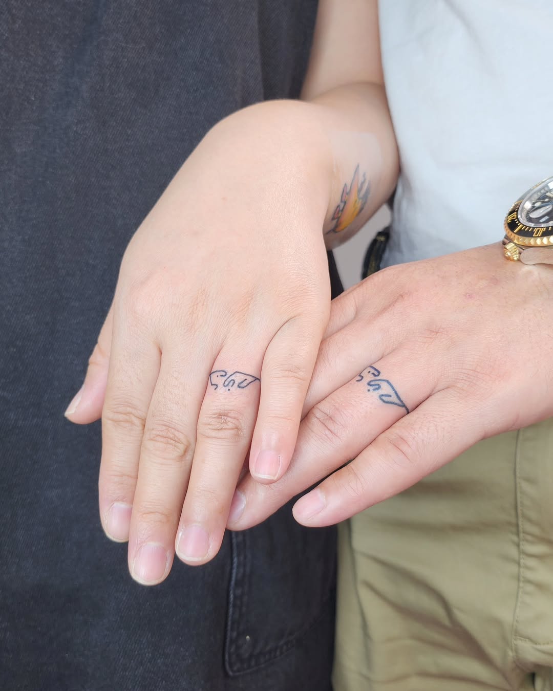
19) Shared Initial Monograms
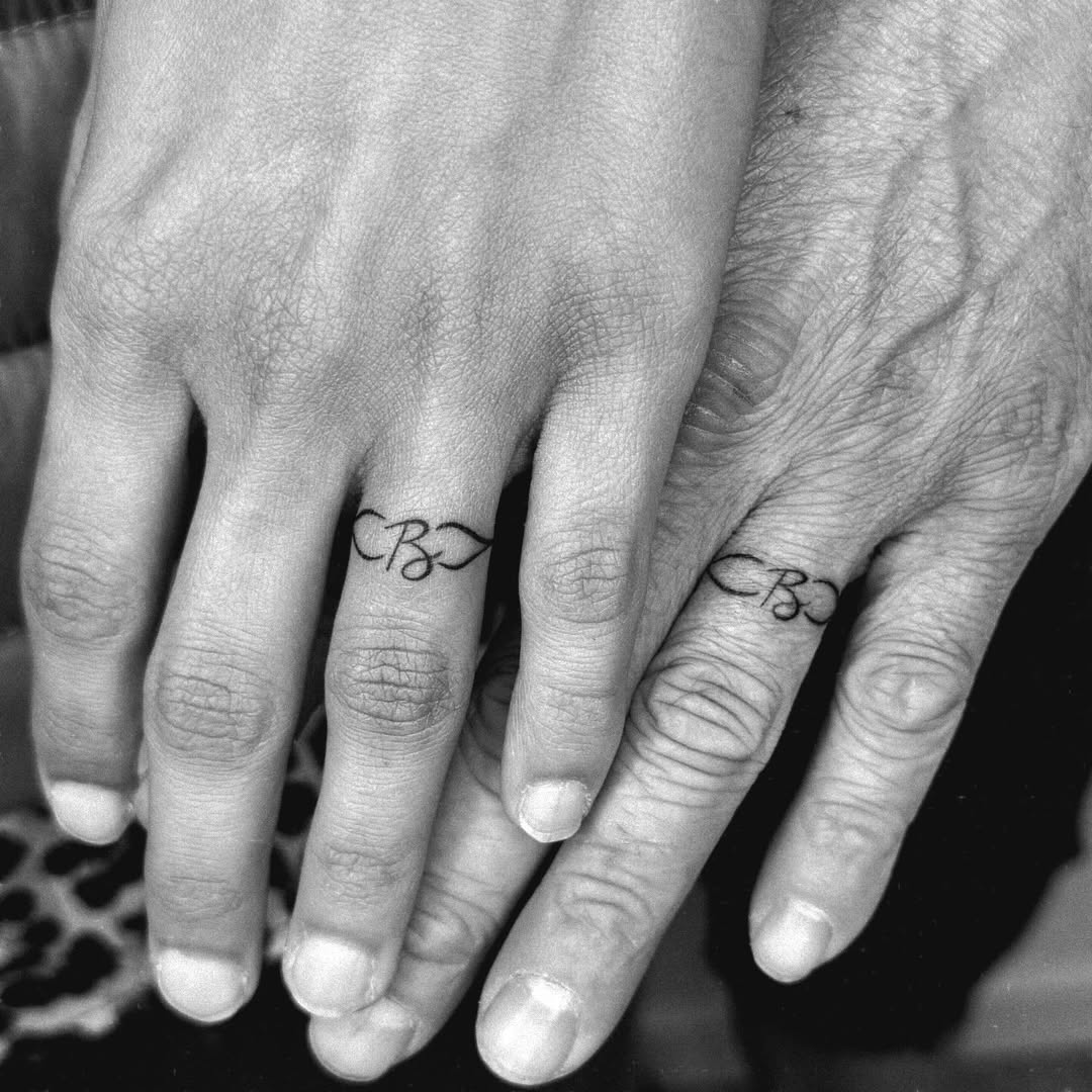
Matching cursive initials—C and B—are centered on slim bands, tails flowing toward the inner seam. Script rings feel intimate, like notes you carry daily. Choose open counters and avoid hairline joins so the letter stays clear on a moving finger. Lovely for vow renewals and low-key wedding designs when metal bands aren’t practical.
20) Minimal Line + Chevron Mix
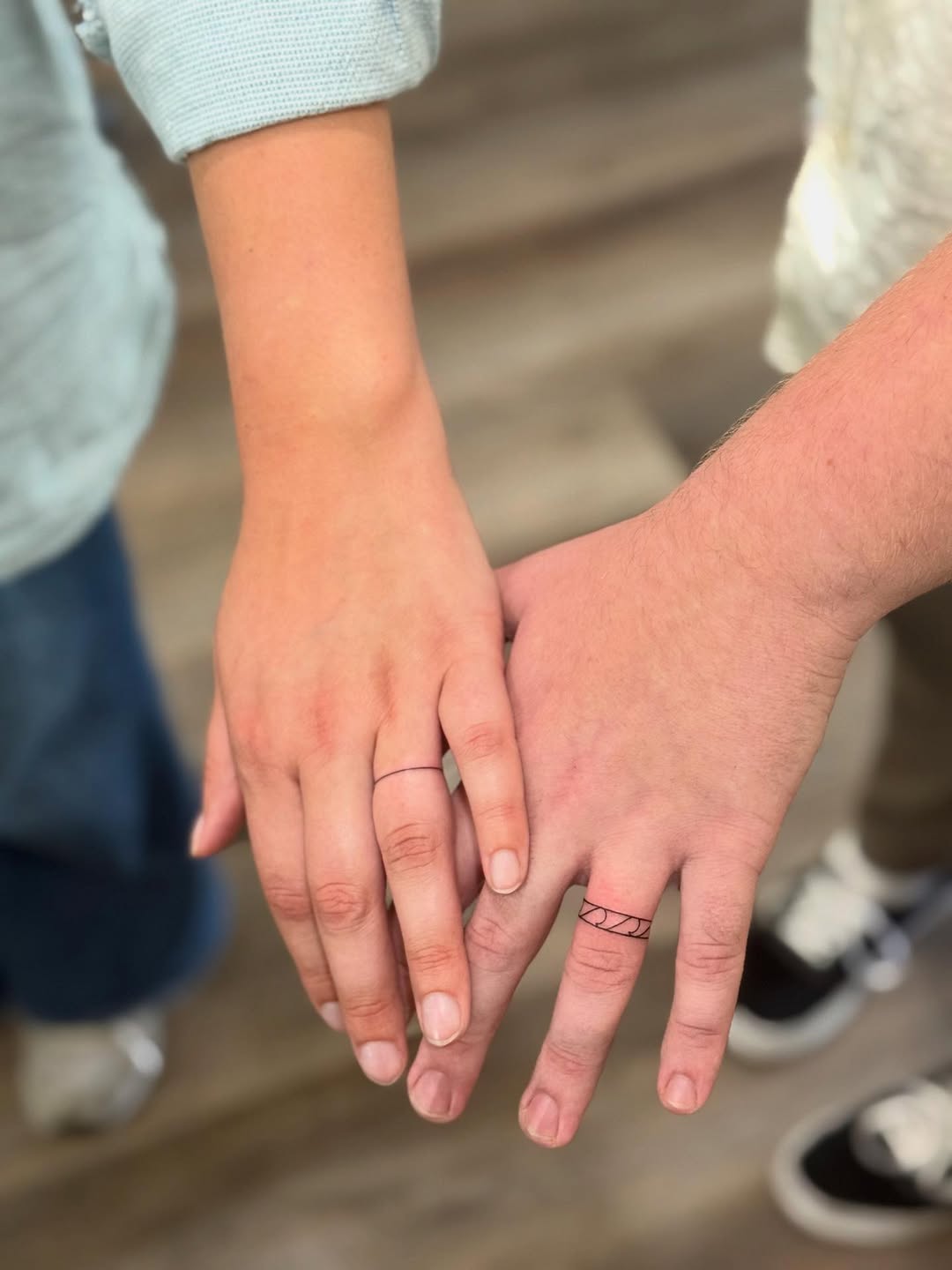
A whisper-thin band on one partner; a repeating chevron wrap on the other. The contrast is intentional—one minimal, one patterned—yet the pair still syncs through scale and placement. Great for couples who want individuality within a shared theme. If you love lore, the forward-pointing chevrons echo “onward,” a delightful marriage mantra.
21) Bold Single-Letter Pair
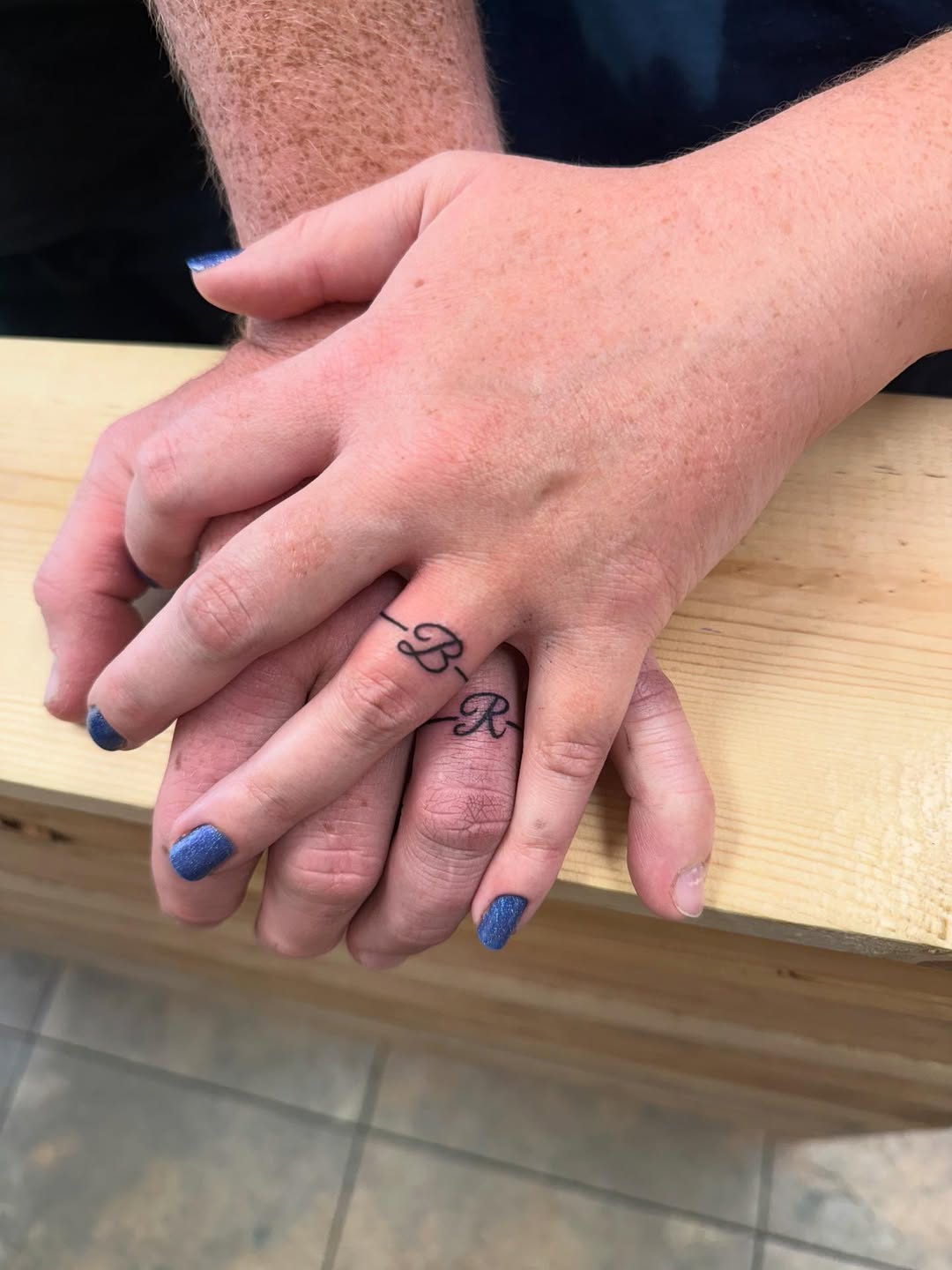
Two ring fingers marked with confident serif initials—B and R—no extra flourishes, just a strong black line. It’s a straight-to-the-point option for men and for women who like typography and clarity. Ask your artist to size the cap height slightly taller than the band’s width so the letter breathes. If you ever expand the set, a tiny tree or dot date on the inner seam adds meaning without changing the front read.
22) Bold Guarded Band + Slim Partner Line
One ring is a dark “guarded” band—matte fill bordered by thin rails—while the partner wears a whisper-thin line. Side by side the set reads “strength and restraint,” a refined choice for couples who like clean geometry. On the heavier ring, keep the center fill slightly textured so it heals like brushed metal; the slim line suits minimalist designs for women or anyone planning a low-key wedding where subtlety wins. Ask your artist to wrap stencils with the finger flexed to avoid a visible seam on the hand.
23) Sun-Ray & Tally Marks
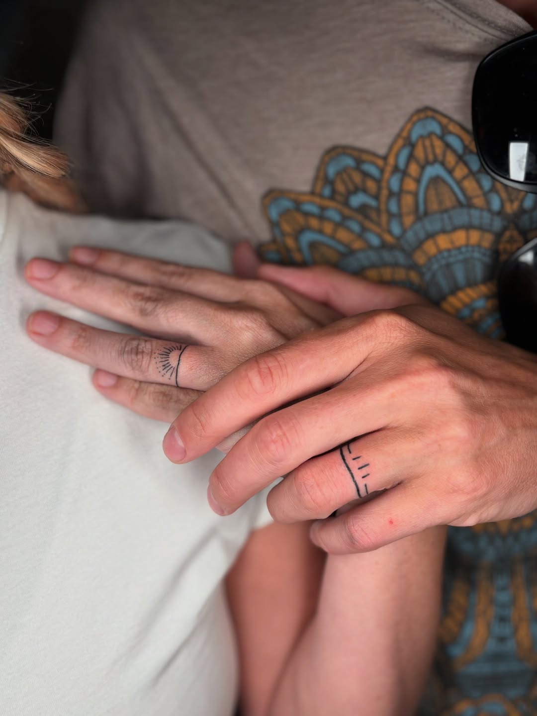
A tiny sunrise motif arcs across one ring finger; the other carries four vertical ticks and a cap line—private shorthand only you two decode. This is romance in code, perfect for married couples who prefer symbolism over names. Keep rays few and bold so they stay legible; the tallies can mark years together or wedding-date numerals. The set photographs softly and still read at conversation distance—smart editorial ideas when you want a story without ornament.
24) Heart + Thread Lines in Red and Black
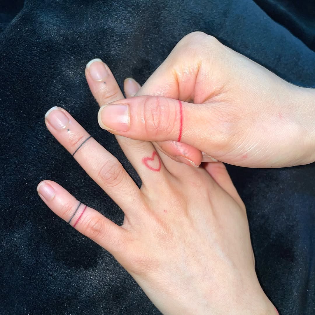
Two graphite-soft bands circle one partner’s fingers while a small red heart sits between them; the other partner wears a fine red line on the thumb. The split palette feels modern and a little fairy-like—light, bright, and happy. Keep red lines medium-weight so they don’t fade to pink too quickly. A sweet pick for women and equally wearable for men who want color that’s still understated at a civil marriage ceremony.
25) Guard-Rail Band
A thick core band rides between two crisp outlines, all in rich black. It’s a classic workhorse for men who need clarity and resilience on a high-motion hand. Ask for a micro bevel—a slight taper at the edges—so the fill doesn’t bleed into the rails over time. For a design’s wedding touch, add a tiny inner-seam dot for the ceremony date.
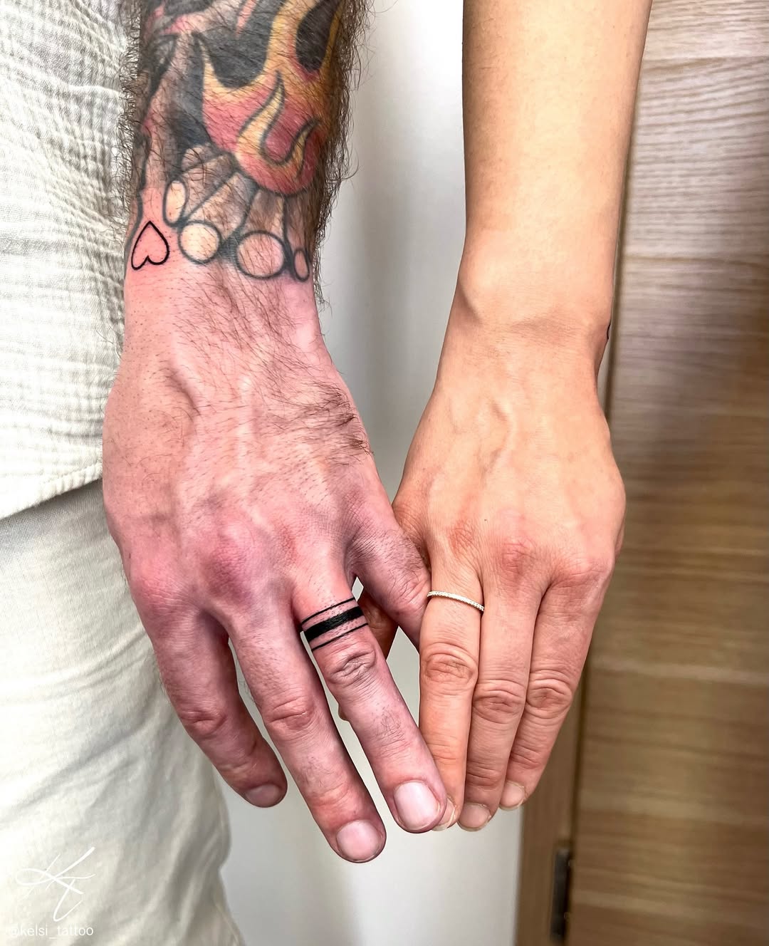
26) Matte vs Microline
One partner chose a velvet-black band, the other a single hairline ring. The juxtaposition is elegant: bold solidity meets whisper-thin minimalism. Great for couples who want their rings to mirror personality. To help the microline last, place it slightly below the first crease and avoid daily exfoliants. The heavier band remains photogenic in every light—perfect for beach or backyard wedding shots.
27) Twin Slim Bands, Travel-Proof
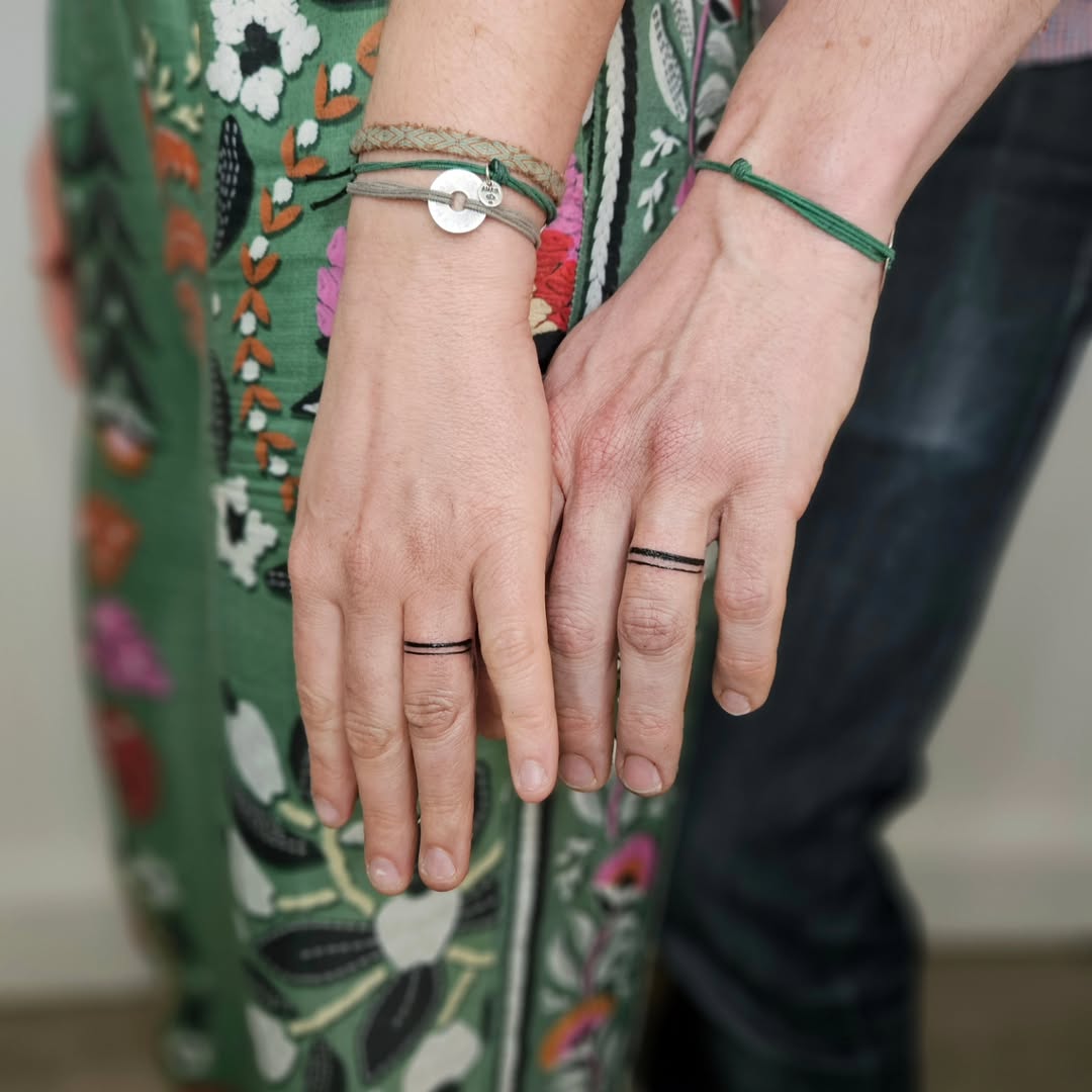
Here, both rings are narrow, identical, and matte. It’s the ultimate “no-drama” set—comfortable under gloves, gym-friendly, and still ceremonial. This style suits everyone—equally strong for men and for women—and works as a placeholder or permanent solution when metal bands don’t fit your lifestyle. If you want a secret flourish, tuck a leaf, flower dot, or tiny initial on the palm seam.
28) Handwritten Date Bands
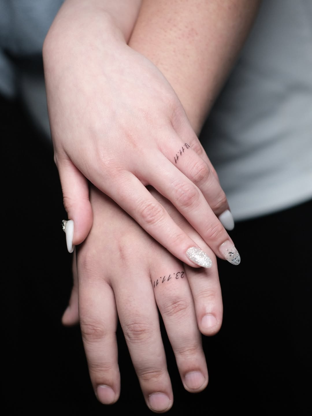
Wedding or anniversary numerals flow along the sidewall of each ring finger in delicate script. Dates are timeless because they don’t require explanation—every glance is a reminder. Ask your artist to increase x-height and reduce flourishes so the figures breathe on the finger; side placement limits sun fade and keeps the front view clean. A lovely, intimate option for married couples who want meaning without a visible band up front.
29) Whisper-Thin Midnight Band
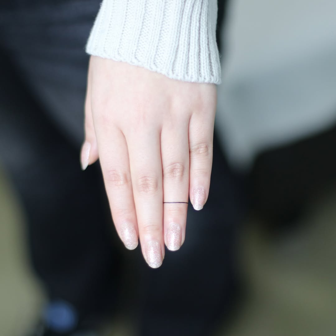
A single hairline circle sits perfectly level on the ring finger, just below the first crease, so it reads crisp but never shouts. This is the ultimate minimalist promise—quiet and elegant for women who want a ceremony-ready mark that looks like inked jewelry.
Why it works: one confident stroke ages better than filigree on the hand; the negative space around it becomes part of the design. For a design’s wedding detail, add a micro dot on the inner seam to mark your date—private, meaningful, and invisible in photos.
30) Red Thread Promise
A delicate crimson loop—think “red string of fate”—wraps the ring finger with a tiny crossover. It feels light, optimistic, and a touch fairy without becoming whimsical. Beautiful for couples who want color that still reads refined and an easy swap for metal during a civil marriage ceremony.
Pro tip: ask your artist for a medium stroke; ultra-fine red can mute quickly. If your partner prefers black, the mix of hues makes a thoughtful his-and-hers set and keeps both rings in the same minimalist design family.
31) Polynesian Guard + Finger Band
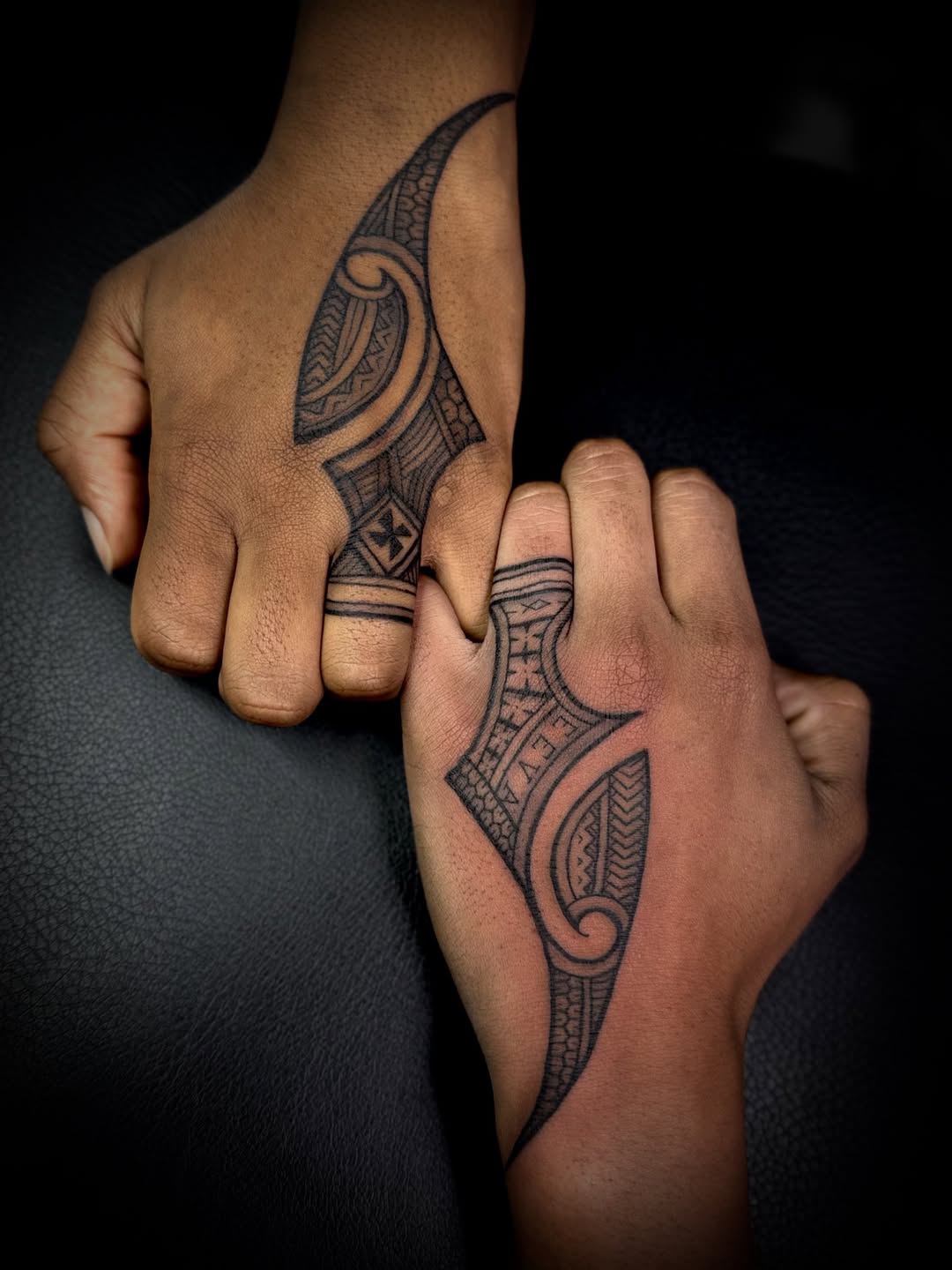
A sculptural Polynesian pattern sweeps across the back of the hand and meets a coordinated ring band on the middle finger—all bold lines, balanced negative space, and traditional motifs. It’s a museum-worthy statement for men who desire a ring tattoo with roots in a bigger story about the arm and wrist.
Design notes: Ensure panel designs have wide formats to prevent micro-texture smears; use one or two themes repeated by the ring width for harmony. As a wedding design, reflect one element out of this scheme on your loved one—a thin leaf or tip of a spear—for a harmonious, culture-sensitive duo for couples with nothing repeated on both designs.
Ring tattoos are small but represent big ideas: What do you choose to express on your body every day? From traditional designs with double rings and cursive script quotes on rings to simple rings with small symbols, great designs require harmony between clarity and meaning. If you see one design here that inspired you, especially for your wedding, with your loved one, or perhaps something for yourself, do let me know which one and why. I read all the comments and would be happy to collaborate on placement, line work, and scaling prior to your tattooing.