
Script tattoos are having a real moment again—partly because they’re personal (names, vows, mottos), and partly because the right font can feel like fashion. The catch is that lettering is unforgiving: one awkward curve, one crowded line, and the whole piece loses its elegance.
Below are 32 script tattoo ideas inspired by the designs you shared, with practical notes on placement, size, readability, and how to keep delicate lettering from turning into a blur over time.
1) Oversized Cursive Name With Dramatic Flourishes
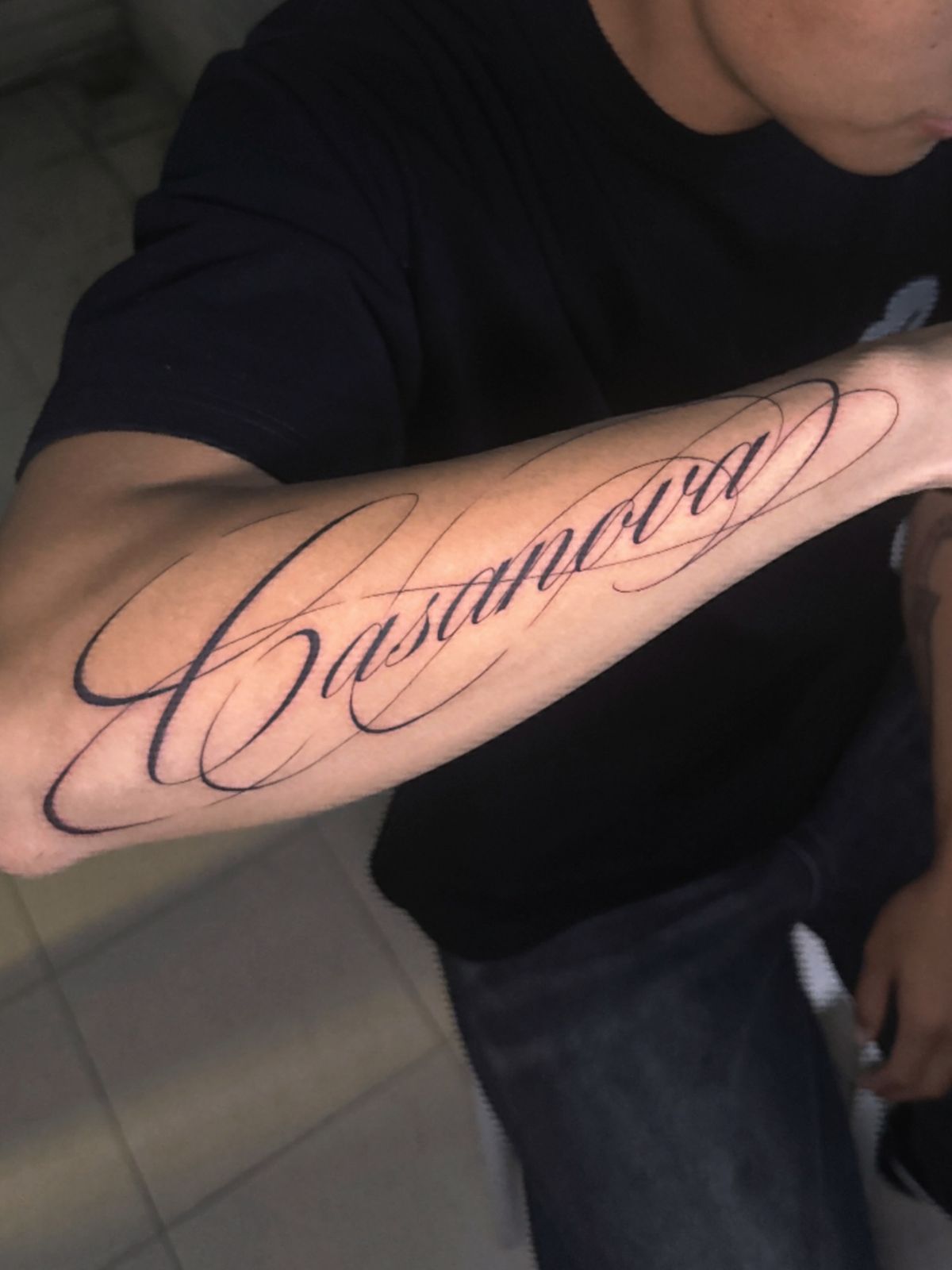
This is classic statement cursive—a single name stretched along the forearm, anchored by bold downstrokes and extra-long hairline swirls that frame the word like calligraphy on a certificate. The design choice here is confidence: big scale, high contrast, and a “signature” vibe that reads from across the room. If you want this style to stay crisp, the smartest move is to keep the thinnest loops from stacking too closely; those airy, open ovals are what stop script from “liquify-ing” as ink naturally softens with age. A stencil-first approach (most artists will map the curves carefully) matters a lot because symmetry in the flourishes is what makes this feel expensive instead of chaotic.
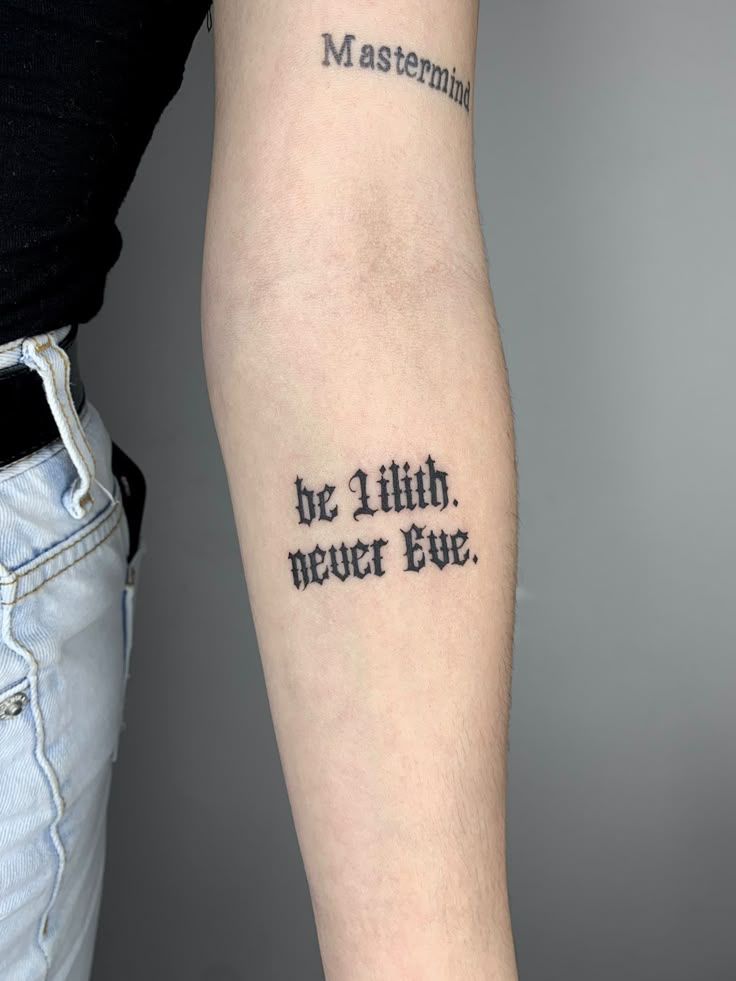
2) Split Phrase Wrist Tattoos In Gothic Lettering
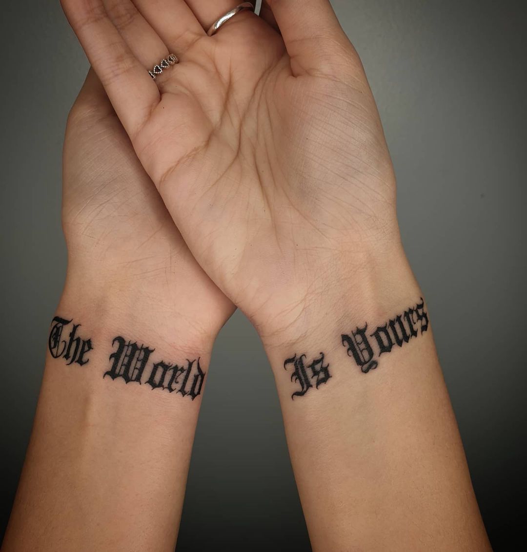
Two wrists, one message: a sharp, old-school Gothic/Chicano-leaning font that reads like a vintage headline when the hands come together. This is a smart example of placement doing the storytelling—separated, it’s intriguing; together, it lands with impact. Because wrists move constantly, the best versions of this idea use slightly thicker line weight and enough spacing inside each letter (those tiny “windows” in the type are where blowout becomes most obvious). If you’re choosing wording, short words with strong shapes work best here; long sentences can turn into a dark band fast. This style is popular with men and for women alike because it’s bold but still clean when sized correctly.
3) Shoulder Script Name Duo With Elegant Loops
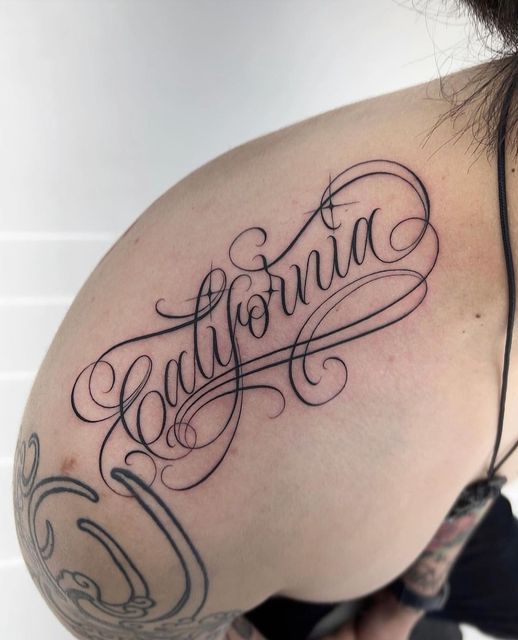
A shoulder script like this feels almost like jewelry: two names in flowing calligraphy, connected by rhythm rather than a literal symbol. The looping capitals and extended tails give it movement, and the shoulder cap is a flattering canvas because it naturally curves the lines—softening the look without losing legibility. The key decision is scale: go large enough that the hairlines don’t disappear, but not so large that the swashes wrap into the armpit area (where friction can irritate healing). If you love a daintier vibe, ask for slightly thicker “thin” strokes than traditional pen-calligraphy; that small adjustment keeps lettering readable for years.
4) Full Lower-Leg Faith Quote With Realism Elements
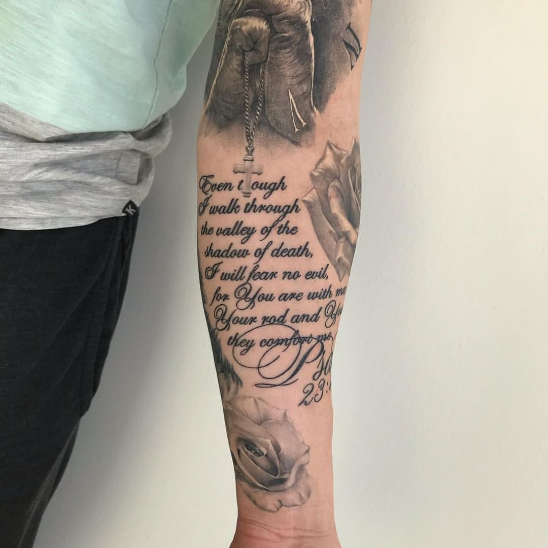
This is the “chapter” approach to script: a longer passage designed to live with imagery, built for the leg where there’s room to breathe. The script is stacked in clean lines, while the surrounding realism (hands, cross, florals) frames the text so it doesn’t feel like a plain block of writing. For longer quotes, line breaks are everything—good artists treat it like magazine layout: consistent margins, even spacing, and intentional emphasis (a larger first letter, a subtle flourish, or a standout line). If you’re doing a piece like this on the calf, don’t go too tiny—micro script on a high-motion area can blur faster than people expect. This is also a great example of mixing design styles without clutter: readable words first, artwork second.
5) Fine-Line Botanical Script Collage
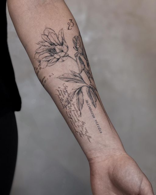
If you like your script to feel intimate, this is the blueprint: fine line florals paired with light handwritten text, like pages from a personal notebook translated onto skin. The forearm placement is ideal for this “gallery wall” effect—elements can be rotated slightly, layered, and still look intentional. Because fine-line work is delicate by nature, the most important choice is contrast: keep the script dark enough to stand out from the stems and petals, and avoid overly fancy cursive for small text (simple handwritten print often ages better). This is one of those tattoos that looks quiet at first glance and then becomes addictive up close—perfect if you want something dainty without feeling generic.
6) Chest Script Tribute With a Statement Initial
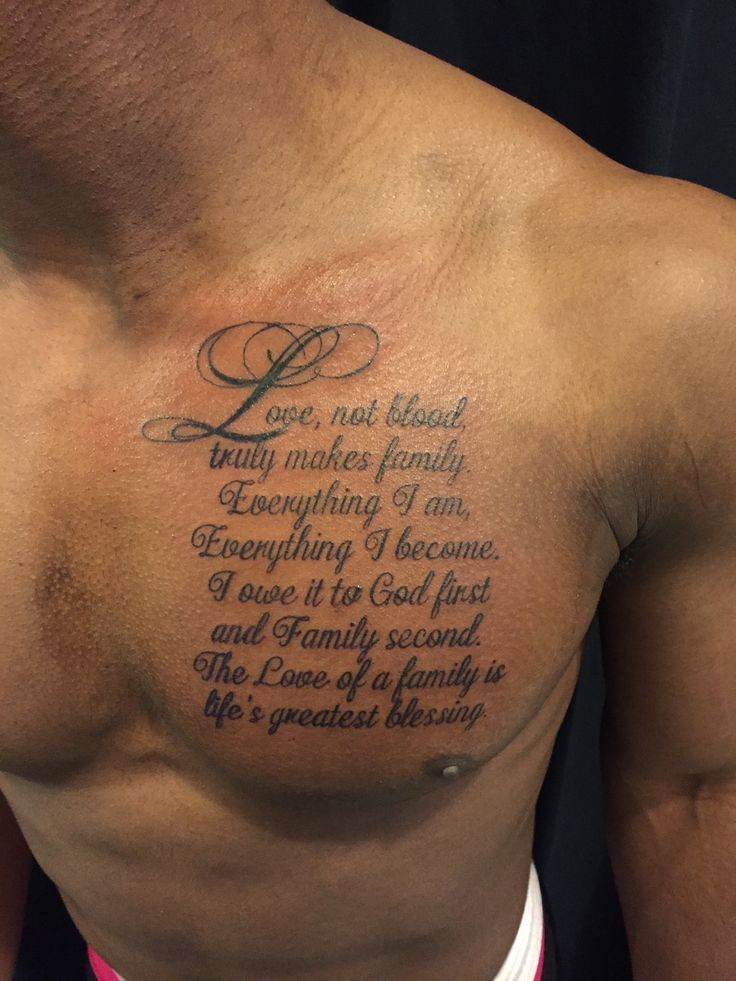
Chest lettering has a different energy: it reads like a personal manifesto, close to the heart, and it tends to feel more formal than arm placements. This design uses a large ornamental first letter (that sweeping initial is the visual anchor) and then settles into neat lines of text—great hierarchy, great flow. For this area, placement matters for comfort and symmetry: centering the block so it follows the chest’s natural shape keeps it from looking tilted when you move. If you’re using meaningful family- or faith-centered wording, the best advice is to edit ruthlessly—shorter reads stronger, and strong reads timeless. A slightly bolder script is also practical here because chest skin can shift with muscle movement, and you want the font to stay readable.
7) Minimal “Let Them” Micro-Script On the Inner Forearm
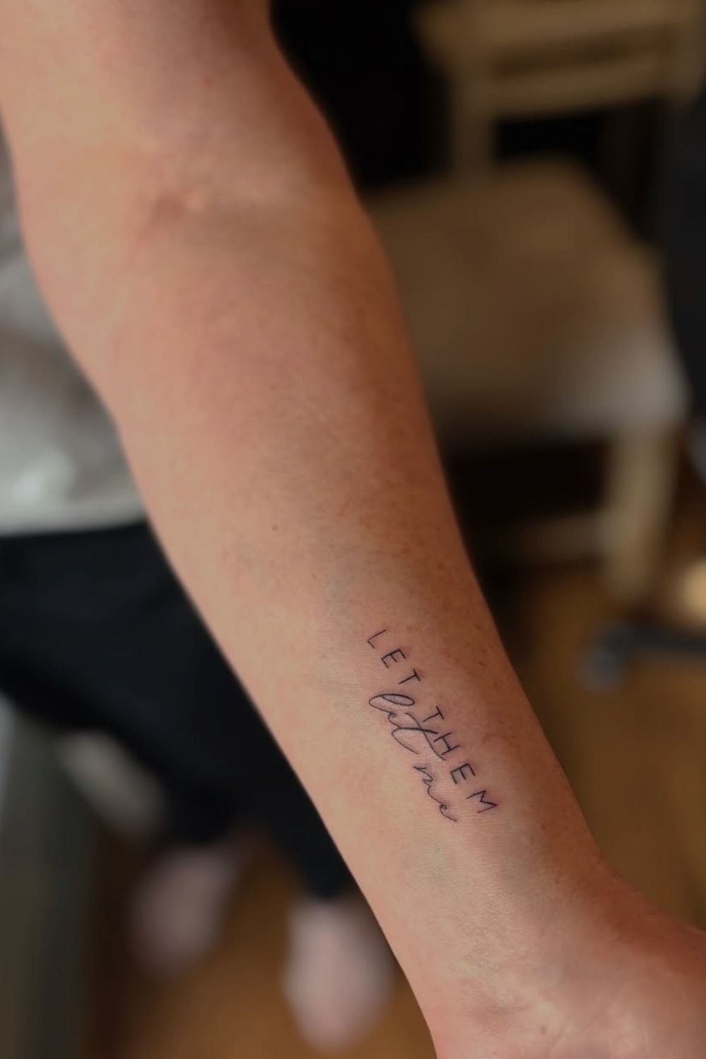
This is modern minimalism done right: small words, lots of skin space, and a clever mix of simple uppercase with a tiny cursive accent that feels like a whisper. The inner arm/forearm is popular for this style because it’s easy to glance at (a private reminder) but still visible if you want it to be. The main risk with micro script is going too thin—ask for clean line quality and enough size that each letter keeps its shape. If you love the idea but want it even more personal, keep the phrase short and choose a type style that matches your vibe: crisp and editorial, soft and handwritten, or slightly italic for motion.
8) Bold Graffiti Script With Ink-Drip Energy
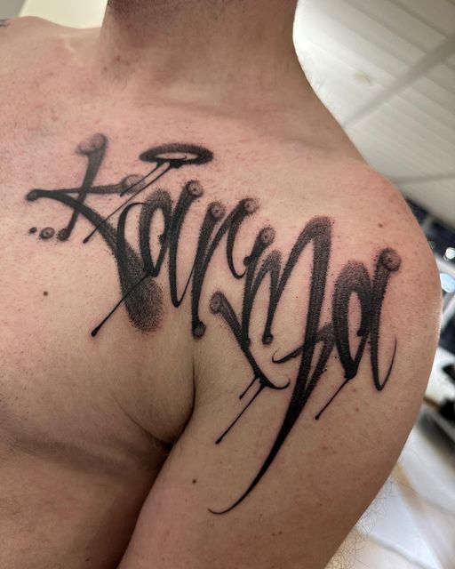
This one leans into a Chicano-adjacent street-lettering vibe—thick, smoky black fills, sharp tapering ends, and deliberate “drip” accents that make the design feel alive. The placement across the shoulder and upper arm is doing heavy lifting: it gives the word room to stretch, and it lets those long vertical strokes ride the body’s natural curve. If someone wants this style to age well, the trick is spacing—drips and tight overlaps are exactly where script can visually liquify over time, so a clean stencil and a confident line weight matter more than perfect ornamentation. It’s the kind of lettering that reads loud without needing color, and it tends to look especially strong on broader shoulders (popular with men, but it’s not gendered if you love the attitude).
9) Compact Gothic Motto With Two-Line Impact
A short phrase in Gothic font is the tattoo equivalent of a perfectly tailored black coat—structured, sharp, and hard to ignore. Here, the words are set in two lines, with thickened stems and crisp points that keep it legible even at a smaller size. On the inner arm, this is a smart placement because it stays fairly protected from sun, which helps preserve those tiny interior gaps in the letters. If someone wants this look, it’s worth choosing words with clean shapes (fewer fussy letter combinations) so the message stays readable rather than turning into a dark rectangle.
10) Minimal Stacked Quote In Clean Type
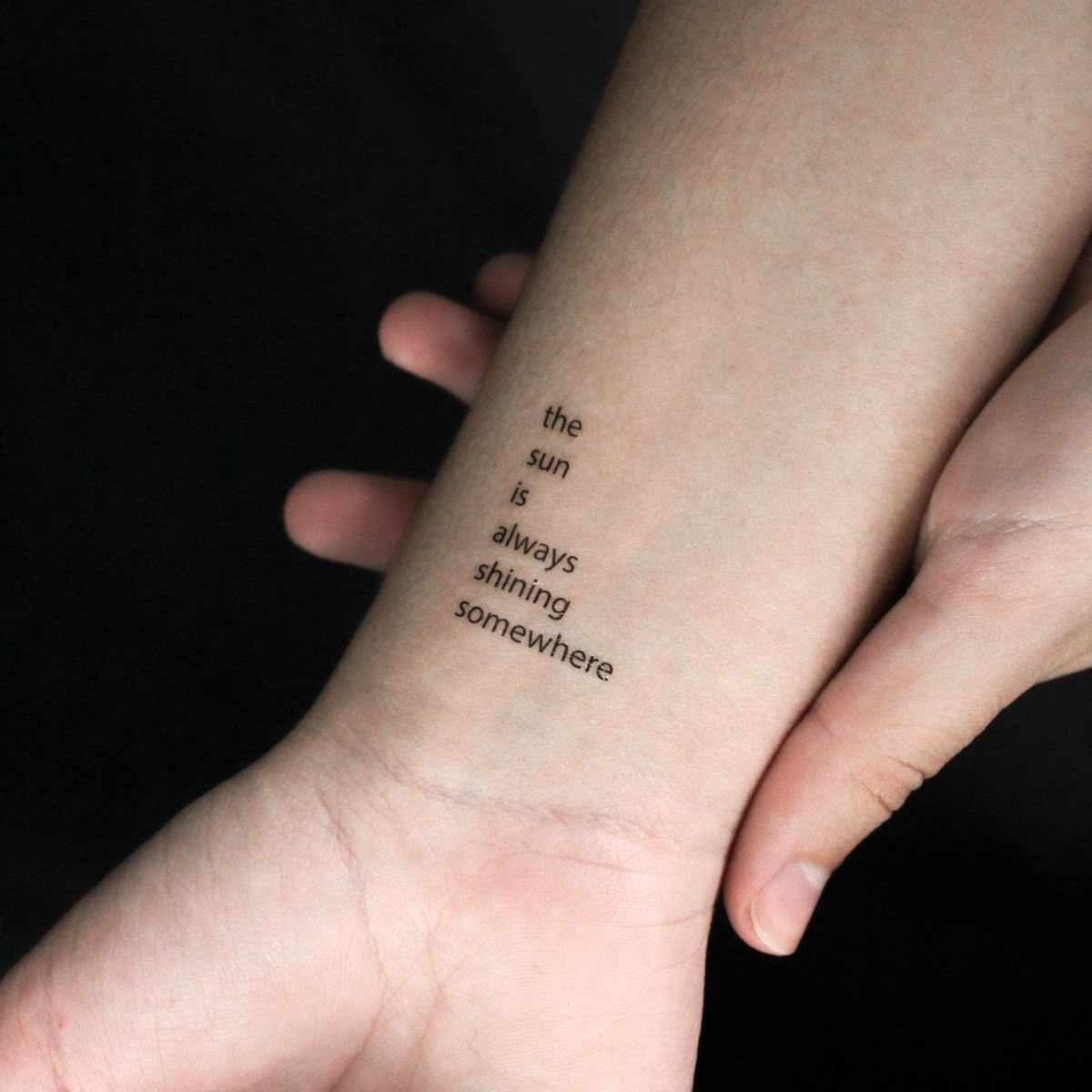
This is modern micro-typography done with restraint: a short quote broken into a vertical stack, using a simple, editorial font that feels almost printed. The effect is quiet but powerful—the kind of tattoo you notice only when you’re close enough to have a real conversation. Because the text is small and the lines are fine, the best advice is to size it so each letter has breathing room; micro lettering that’s too tight is the fastest route to blur. For anyone chasing a dainty, minimalist look for women (or anyone who prefers subtle ink), this style is a great blueprint—clean, calm, and timeless.
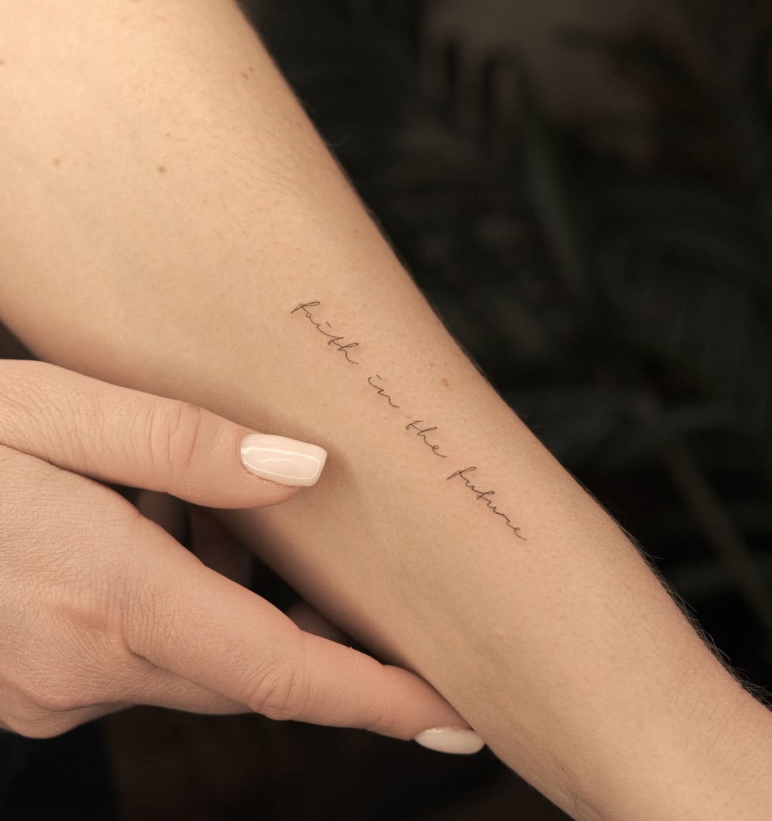
11) Faith Script Vertical Line With Elegant Flow
A vertical script phrase on the forearm can feel like a private anchor—visible when you want it, easy to cover when you don’t. The lettering here is smooth, classic cursive, with gentle thick-to-thin transitions that keep the phrase readable without screaming. The success of this idea is balance: the script is refined, but not so thin that it disappears. If someone is worried about aging, ask the artist to slightly thicken the lightest hairlines while keeping the overall elegance—tiny tweaks like that make a big difference in long-term clarity.
12) Ultra-Fine Handwritten Sentence With Airy Spacing
This delicate handwritten line feels like something pulled from a margin of a notebook—intimate, almost whispered. The fine line approach is gorgeous, but it’s also where technical skill matters most: consistent ink depth, steady spacing, and letterforms that don’t collide. On the inner arm, the phrase sits like a quiet reminder, and the airy spacing is exactly what keeps it from aging into a smudge. If you want this vibe, keep the sentence short and avoid overly loopy cursive—simple handwritten lettering tends to stay readable longer.
13) Whisper-Thin Micro Script Along the Forearm
This is micro script at its most refined: a very thin, slightly slanted handwritten line that looks effortless—until you remember how hard it is to tattoo cleanly. The placement along the forearm is flattering and minimalist, and the length makes it feel like a subtle bracelet of meaning rather than a headline. For longevity, this is the style where you don’t want the smallest possible size; giving the letters a touch more height keeps them crisp as the ink settles. If you’re collecting small, personal ideas in one area, this is a great piece to build around.
14) Tiny Single-Word Script With Playful Energy
Sometimes one word is enough—especially when it’s placed with intention. This tiny script sits lightly on the arm, with a soft, flowing baseline and a simple cursive rhythm that reads sweet rather than serious. The charm here is the understatement: it feels like a private joke, a song lyric, or a nickname you don’t need to explain to strangers. If you want a micro tattoo like this, prioritize a clean font choice and make sure the “thin” parts aren’t hairline-thin; that little bit of extra ink is what keeps small words from fading into mystery.
15) “Not All Those Who Wander Are Lost” Classic Serif Quote On The Forearm
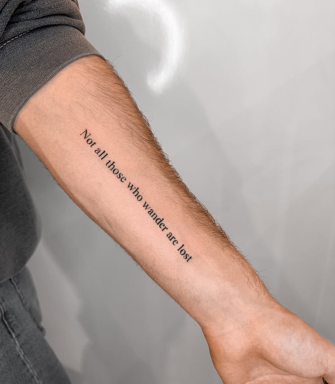
This quote is done in a straightforward serif font—clean, bookish, timeless. It runs diagonally down the forearm, which keeps a long sentence from feeling like a block of text. The letters are evenly spaced, medium-light in weight, and very readable from a distance.
It’s the kind of typography that feels intentional without being trendy, like a line pulled from a favorite novel and set permanently where it can travel with you.
16) “Chest Proud. Chin High” Micro Script On The Collarbone/Shoulder
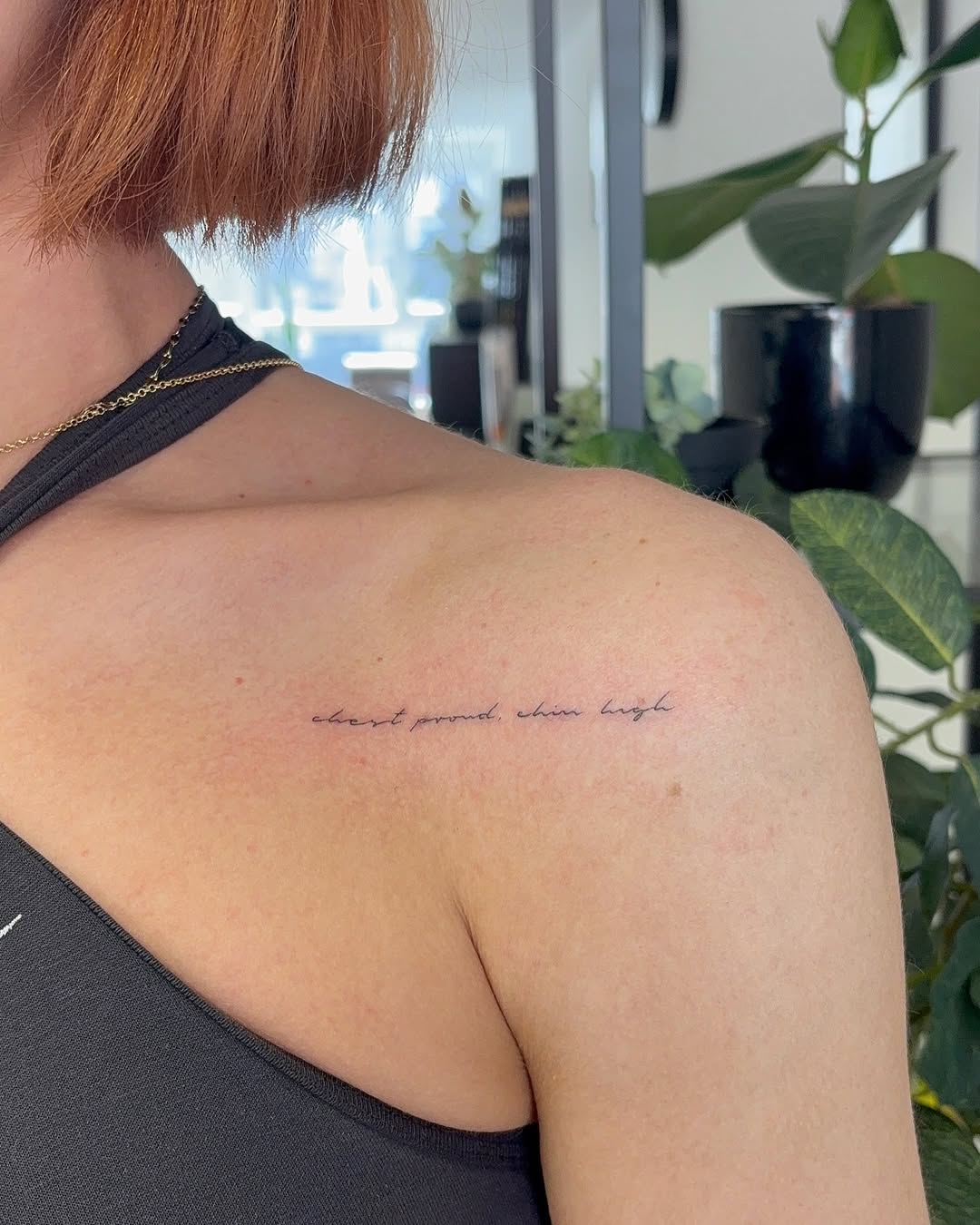
This is the definition of discreet confidence. The phrase chest proud. chin high sits as a tiny cursive line along the upper chest/shoulder area. The writing is so fine it almost looks like a whisper—something meant more for the wearer than the room.
The placement is what elevates it: collarbone script reads like jewelry, especially with a simple tank top. It’s minimal, but the message hits.
17) Ornamental Tribal-Style Lettering As A Full Forearm Statement
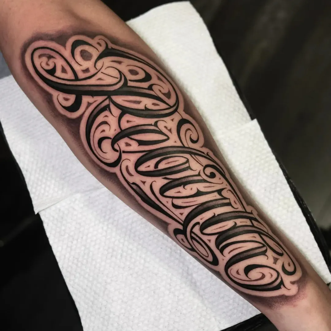
This tattoo leans into shape and movement more than easy readability. Thick black curves, carved negative space, and repeated spiral motifs create an ornamental “lettering-as-design” look—almost like the word is hidden inside a tribal framework. The result feels bold and architectural, like wearable typography.
It’s a high-commitment style: big coverage, heavy contrast, and a lot of visual weight. If someone wants script that looks like art first and text second, this is the lane.
18) “Memento Mori” Dramatic Calligraphy With Flourishes
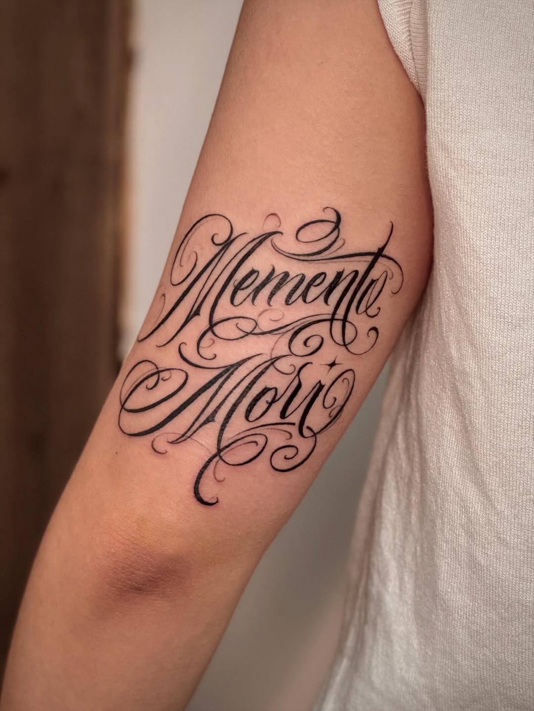
Memento Mori is written in sweeping, high-contrast calligraphy, with thick downstrokes and thin hairline exits that curl into decorative swirls. The words stack into a compact shape that fills the arm nicely without looking crowded.
This is script as theatre—in the best way. It carries the weight of the phrase, and the dramatic flourishes make it feel timeless, like something etched into an old bookplate or a vintage sign.
19) “Maldito Distinto” Long Flowing Script Down The Forearm
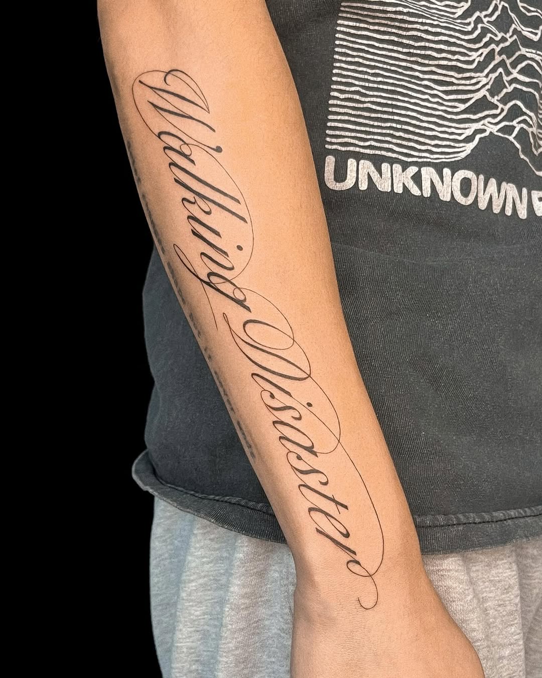
This is sleek, stylish, and built for movement. Maldito Distinto runs long along the forearm in elegant cursive, with exaggerated loops that stretch like ribbons. The letters are tall and narrow, which keeps the phrase readable even at length.
The placement emphasizes the rhythm of the handwriting—your eye follows the words the way you’d follow a signature across a page. It’s expressive without being messy.
20) Large Signature-Style Script Across The Hand/Wrist
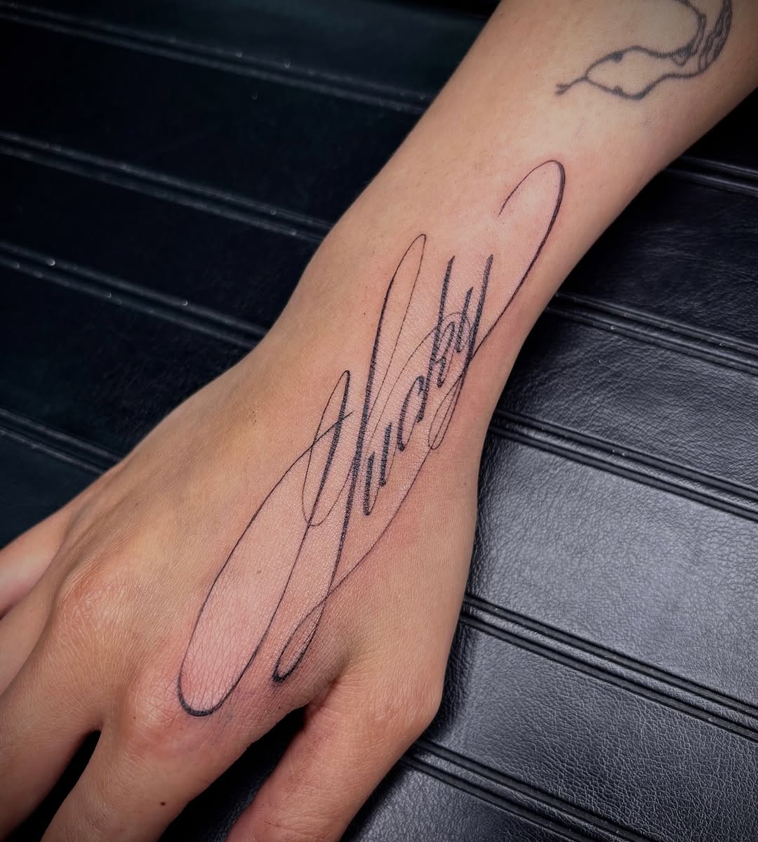
This one is pure signature energy: a single word in highly stylized script (reading like “Shady”) with huge looping strokes that extend beyond the letters. The linework is thin but confident, and the oversized swoops make it look like an autograph captured mid-motion.
Hand placement instantly turns any script tattoo into a statement. It’s bold, fashion-forward, and impossible to ignore—perfect for someone who treats lettering like a personal logo.
21) “Mercy” Script Cheek Tattoo With Face Accents
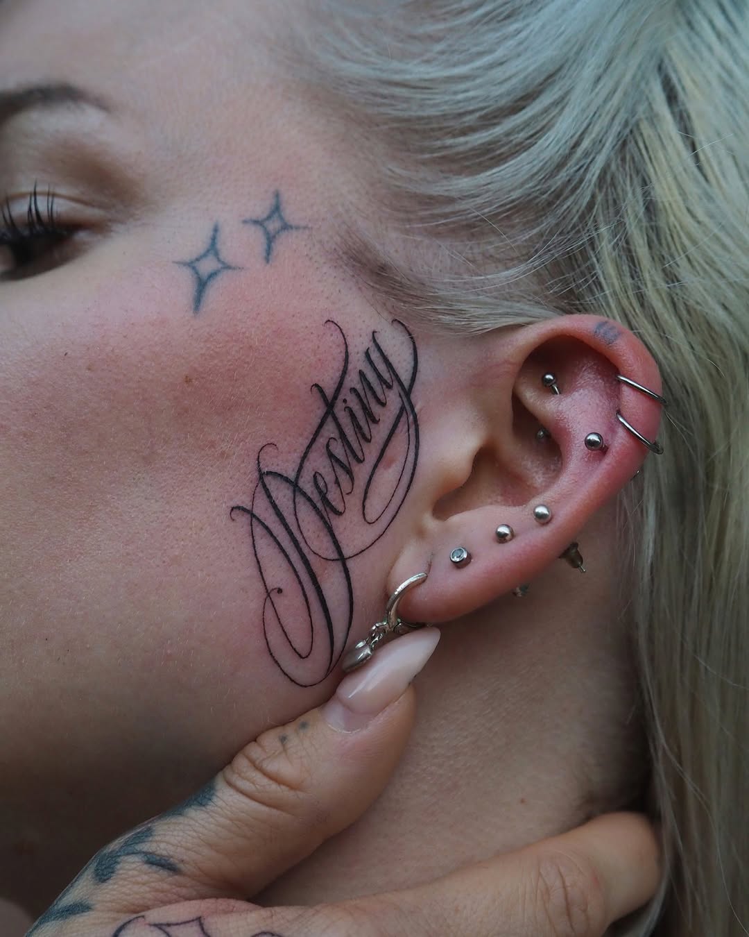
This is one of the most striking placements in your set: Mercy is written in stylized script on the cheek near the ear, with tall, flowing strokes and tight inner letter spacing. The calligraphy is decorative but still readable, and it sits beautifully with the natural curve of the face.
The surrounding details—multiple ear piercings and small sparkle/star tattoos near the outer eye—frame the word like a styled portrait. It feels deliberate, curated, and very editorial.
22) Whisper-Thin Name Pair With A Heart Divider
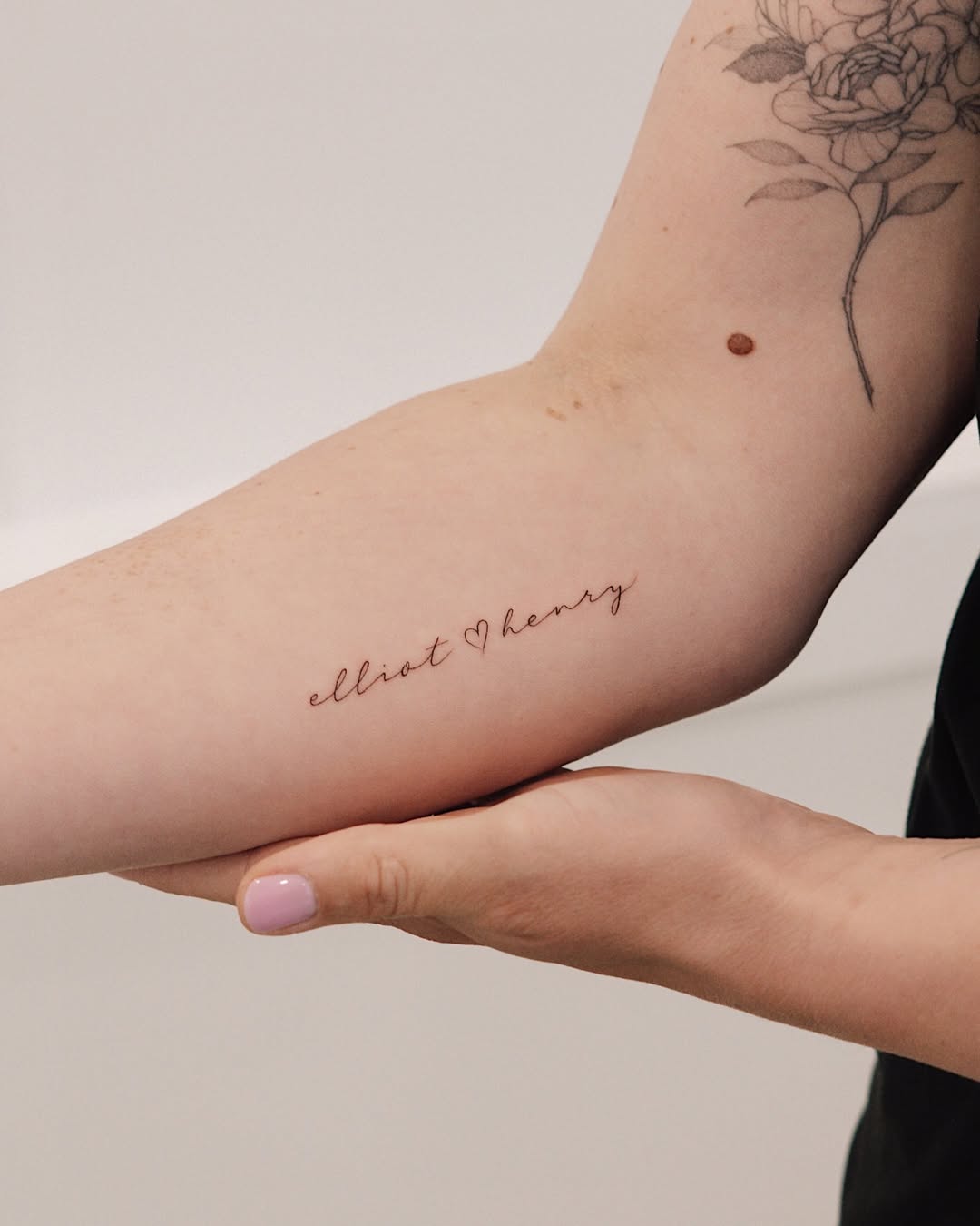
This is peak fine line sweetness: two names—“elliot” and “henry”—linked by a tiny heart, written in light cursive that sits neatly along the inner arm. What makes it feel modern (not “random text”) is the spacing: each letter has breathing room, the baseline is gently slanted, and the heart functions like punctuation rather than decoration. If you want this dainty look to last, ask for slightly bolder downstrokes on the first letters (e, h) and a touch more space between connected letters—tiny joins are the first place ink can blur over time. This kind of script is especially flattering on the forearm or inner bicep because the body naturally frames the line.
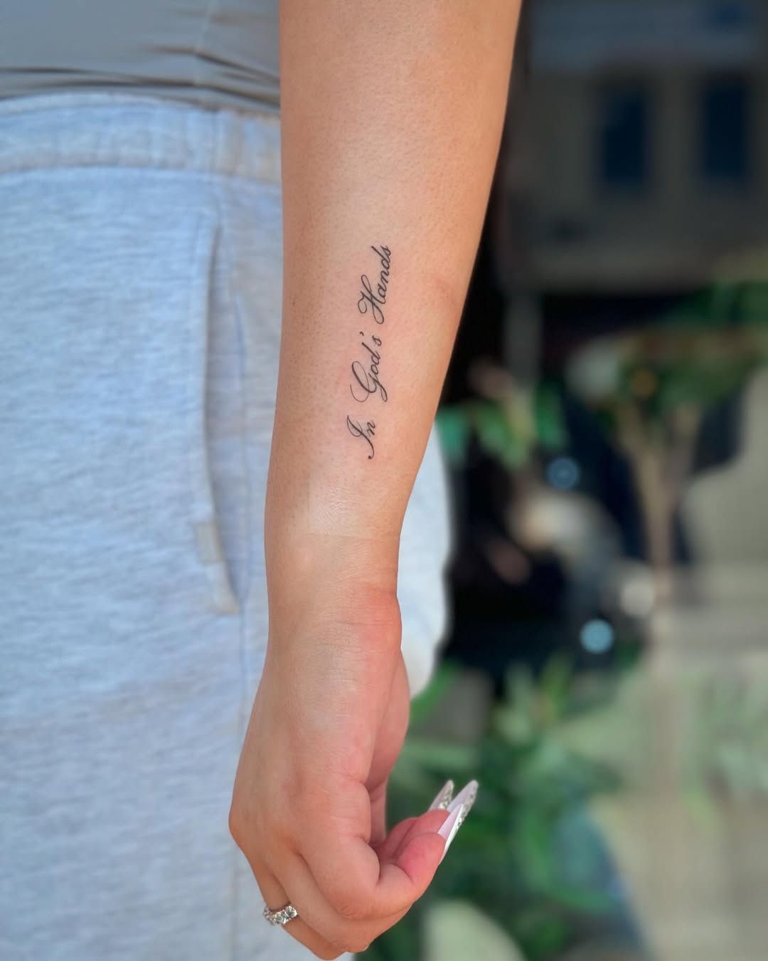
23) Vertical Faith Phrase With Classic Calligraphy Contrast
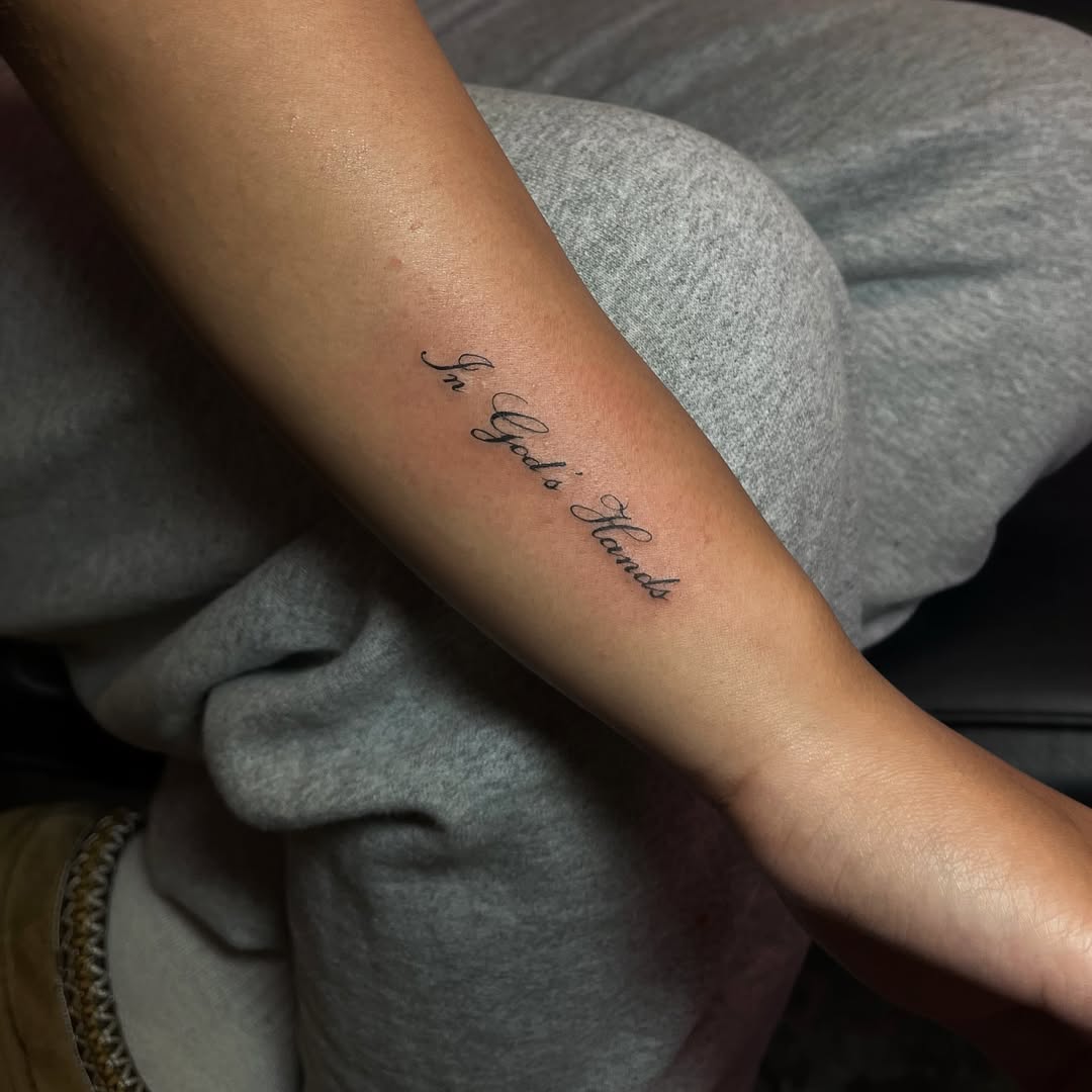
“In God’s Hands” is placed vertically along the inner forearm, a smart choice for a phrase you want visible but not loud. The lettering style mixes thin entry strokes with darker, confident downstrokes—exactly what you want for legibility in smaller script. The vertical orientation also keeps the phrase from “stretching” visually when the arm moves. If you’re borrowing this idea, ask your artist to test the phrase at two sizes on a stencil first: one that’s ultra-minimal, and one that’s just a hair larger. Most people regret going too small with script long-term, especially on areas that get sun.
24) Chicano-Inspired Hand Lettering With Blackletter Power
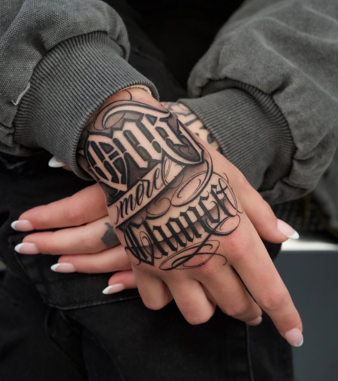
This is the bold counterpoint to dainty cursive: a hand piece that blends heavy blackletter with flowing script, reading “Stay / more / humble.” The stacked layout and ornamental flourishes are very Chicano-influenced—think of the West Coast lettering lineage popularized in tattoo culture and frequently celebrated by outlets like Inked Magazine and communities like Tattoodo. The design works because it respects the hand’s shape: the biggest letters sit across the broadest area, and the swashes fill negative space without turning into clutter. If you want this style, pick an artist who truly specializes in design-driven lettering (not someone “trying it once”). Ask how they refine curves—many will subtly “warp” lines (a digital liquify adjustment) so the script reads straight once it’s on a living, moving hand.
25) Statement Script On The Foot With Dramatic Flourishes
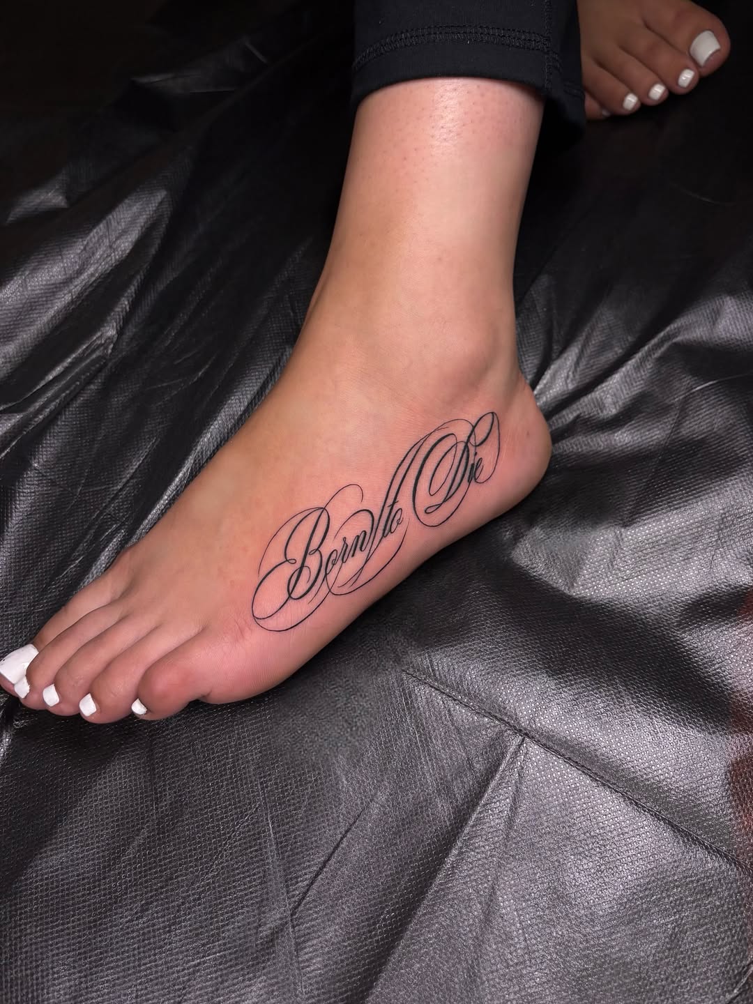
“Born to Die” sits along the side of the foot in oversized cursive with long, elegant loops—dramatic without needing extra symbols. The secret here is flow: the phrase follows the natural line from mid-foot toward the heel, so the tattoo looks intentional from every angle. Foot tattoos can fade faster, so if you love this idea, consider slightly thickening the main strokes and keeping the thinnest hairline flourishes minimal (those ultra-fine tails are the first to soften). This is a great placement choice for anyone who wants script that feels personal and a little hidden—easy to show, easy to cover.
26) Classic Single-Name Script With Clean Calligraphy Balance
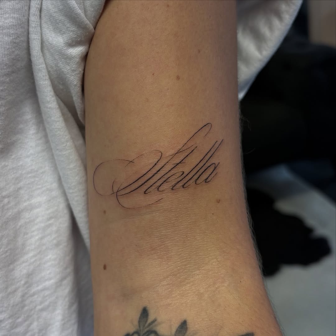
“Stella” is rendered in smooth, confident script with a large leading flourish and tall, elegant ascenders. It’s the kind of name tattoo that looks timeless because the letters are clear—no cramped connections, no trendy gimmicks. If you’re doing a single word like this, pay attention to the “weight distribution”: you want the thickest parts of the letters to be consistent so the whole word reads as one unit. This style works beautifully on the inner forearm, upper arm, or even the shoulder if you scale it slightly larger.
27) Minimal One-Word Script That Feels Like A Private Note
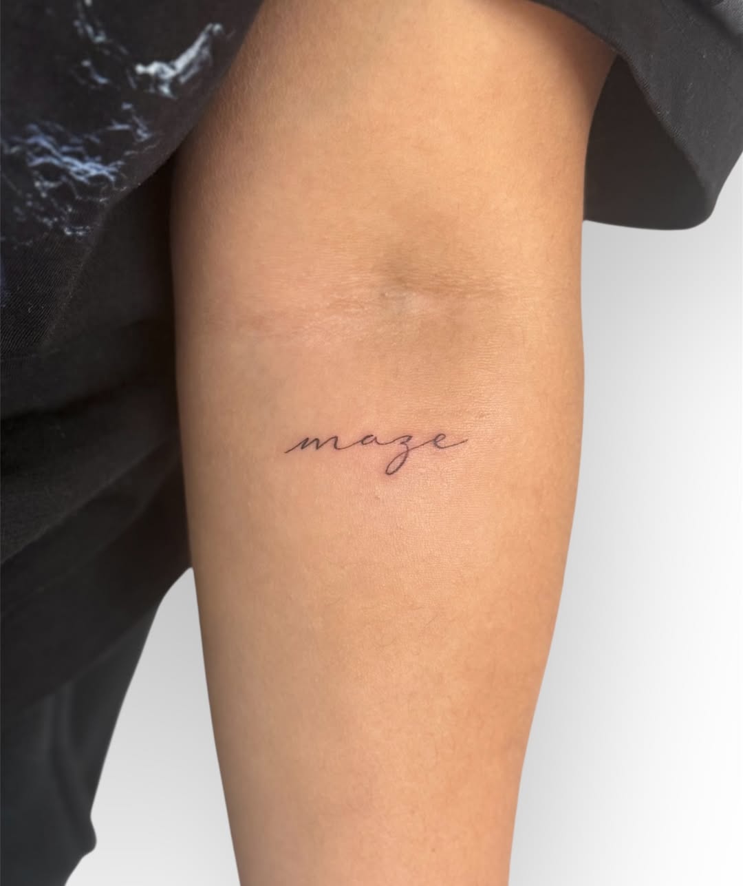
One word—“maze”—done in tiny, understated script near the inner arm. This is the modern minimalist approach: small, clean, and intentionally “quiet.” The win here is restraint: the letters are simple, with just enough curve to feel handwritten, but not so much flourish that it becomes unreadable. For minimal script like this, ask your artist to avoid ultra-thin needles if your skin tends to blur ink—slightly thicker lines can still look fine line while aging more gracefully. This kind of tattoo is also a favorite for for women who want subtle ideas that don’t dominate the arm.
28) Tiny Name With A Red Heart Accent For Soft Contrast
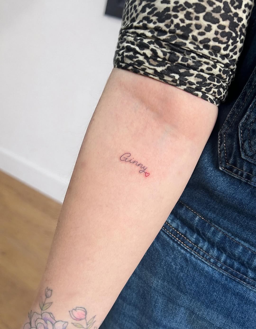
“Ginny” is written small in delicate cursive, finished with a tiny red heart—sweet, simple, and visually memorable because of that single pop of color. This is a great example of how minimal script doesn’t have to be plain: one micro-color accent can make the tattoo feel more custom without adding extra imagery. If you choose a red detail, ask for the brand of ink and aftercare advice specifically for color—reds can heal differently on different skin tones. Placement-wise, the forearm keeps it easy to see and easy to style with existing tattoos without competing.
29) Bold Gothic Wordmark Across The Lower Torso
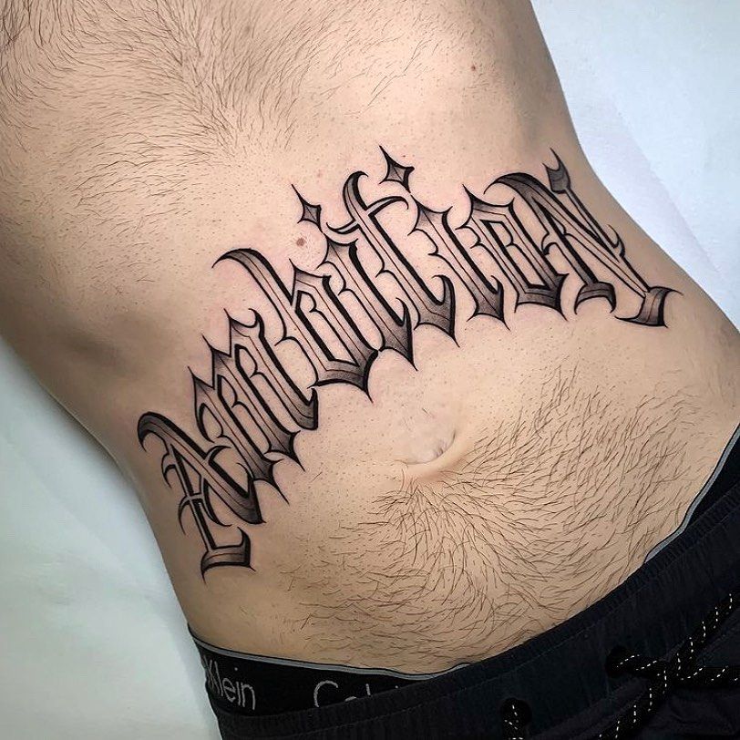
This Gothic-leaning piece uses sharp blackletter to spell out a single, oversized word across the lower abdomen, turning the stomach into a true “banner” space. The thick outlines, pointed terminals, and small star accents make it feel very Chicano-adjacent—bold, graphic, and built for impact. It’s also a very specific placement choice that reads especially strong on men, because the letter spacing can stretch cleanly across a wider torso without losing legibility. If someone wants this look, the best request is simple: a crisp blackletter font with consistent stroke weight, plus enough negative space inside the letters so it doesn’t turn into one dark block over time. This is the kind of lettering where a clean stencil and an artist who specializes in script/blackletter makes all the difference.
30) Oversized “Chocolate” Script With Heavy Fill And Smooth Shadowing
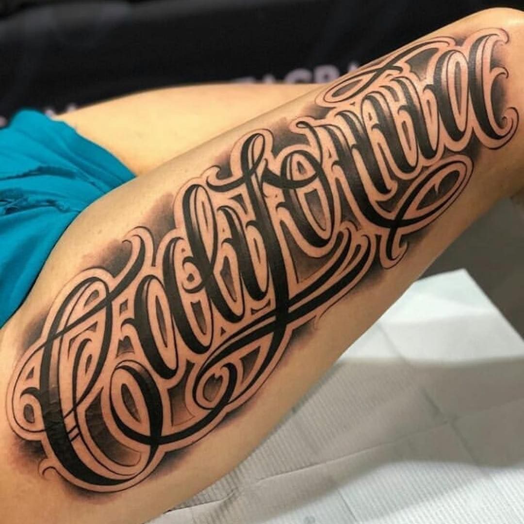
This is statement lettering done the classic way: the word “chocolate” in dramatic cursive, packed with thick fills, long loops, and soft shading that gives the script a lifted, almost dimensional finish. The design is intentionally loud—perfect for a big leg placement (upper thigh) where the curves have room to breathe and the flourishes don’t get cramped. What keeps it readable is the rhythm: tall ascenders, wide bowls, and clean counters inside letters like “o” and “a.” If you’re borrowing this idea, ask your artist to lightly “shape” the baseline so the word looks straight once it wraps around the leg—many lettering artists will do a subtle layout adjustment (sometimes even a liquify-style tweak) so it reads cleanly from the front.
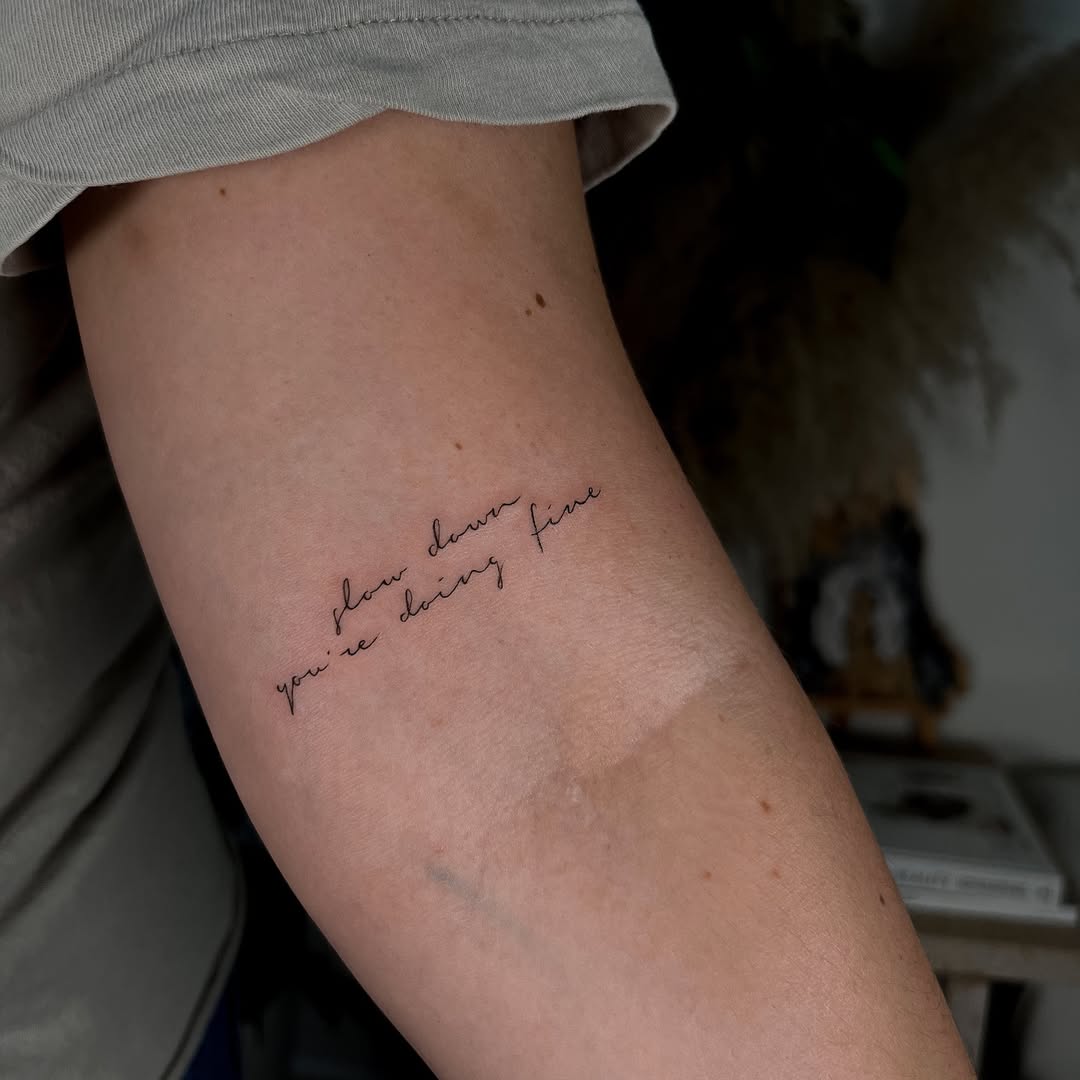
31) Handwritten Quote In Fine Line For Quiet Reinvention Energy
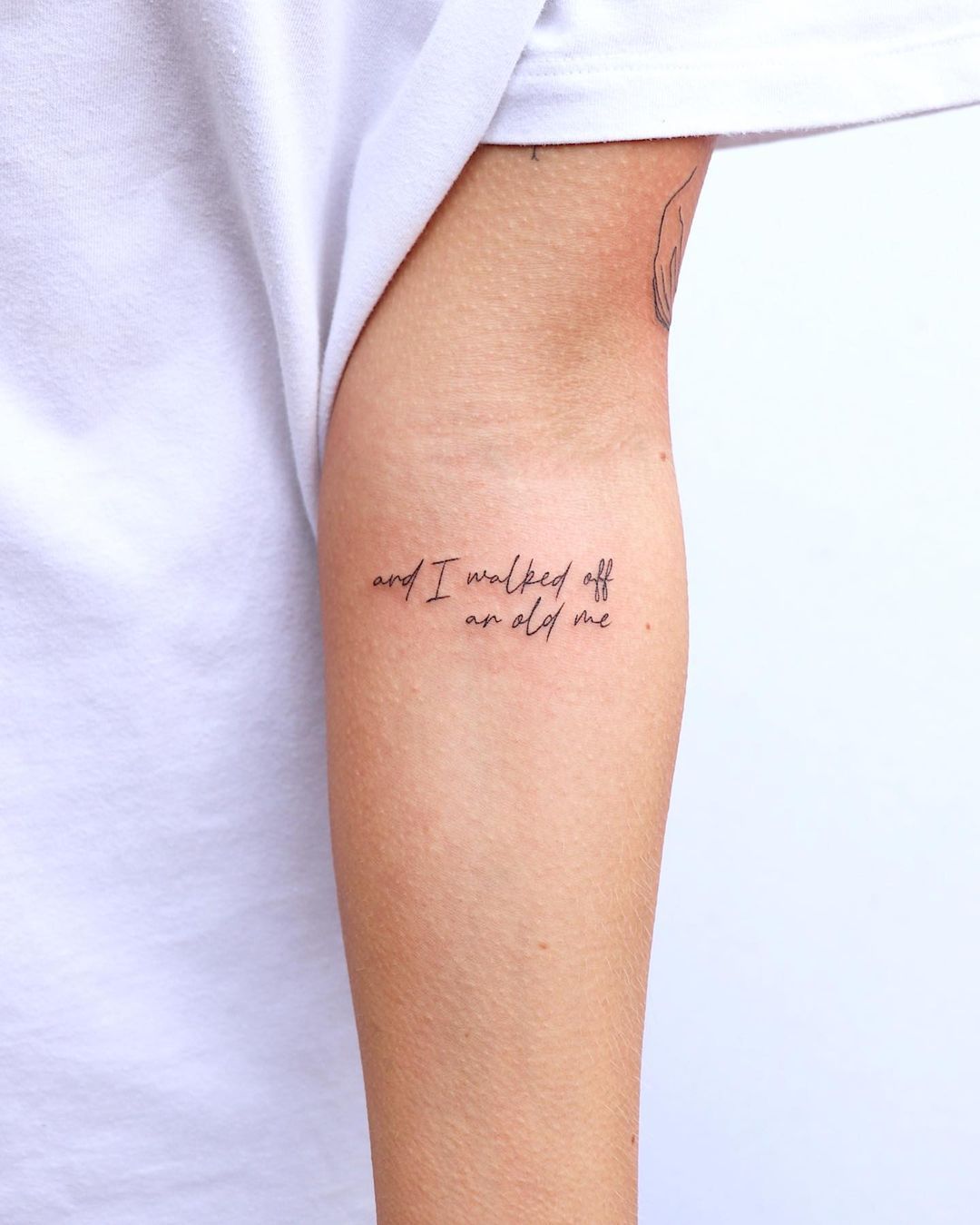
“And I walked off an old me” is the kind of phrase people choose after a hard season—simple words, small scale, and emotionally specific without being performative. The handwriting style is intentionally imperfect, like a note to yourself, which makes it feel more human than polished calligraphy. The fine line approach works best here because the quote isn’t trying to be decorative; it’s trying to be true. For longevity, the one thing to watch is spacing: ask for slightly more room between letters in tight clusters so the phrase stays readable as the ink settles. This is a great arm/forearm idea for anyone who wants something personal that doesn’t dominate the skin.
32) Micro “Honey” Ankle Script That Styles Like Jewelry
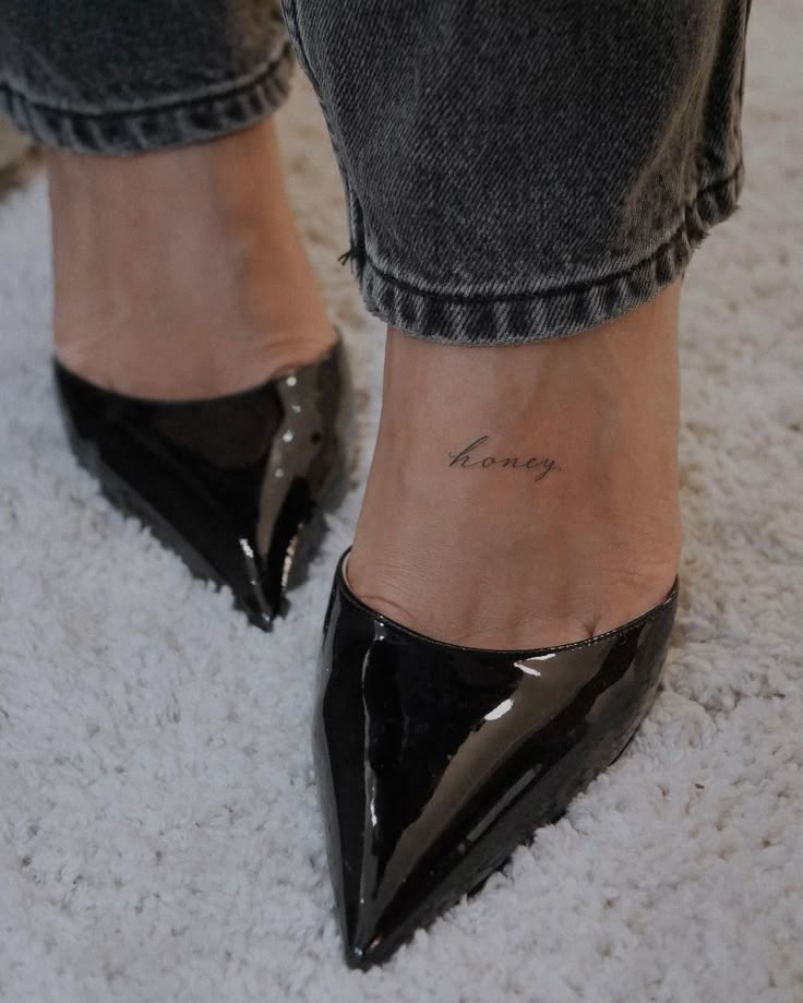
This tiny “honey” script sits near the ankle like a minimalist charm—soft, dainty, and intentionally low-contrast. The placement is clever because it reads as a subtle detail when you’re barefoot, but it also peeks out with cropped denim and shoes, almost like a signature. The styling in this image is a perfect match for the vibe: casual jeans and sleek black pointed flats, which makes the tattoo feel polished rather than precious. If someone wants this exact effect, the best approach is a thin cursive font with gentle curves (no overly sharp points), and a size that’s small but not microscopic—ankle tattoos can blur if the letters are packed too tight.
The best script tattoos aren’t just about what the words say—they’re about how the lettering sits on the body, how the font holds up over time, and whether the design still feels like you five years from now. If you’re choosing between styles, start with placement and readability, then let personality handle the rest. If you want, drop a comment with the word/phrase you’re considering and where you want it (wrist, shoulder, forearm, leg), and I’ll suggest 2–3 script styles that will age beautifully.